It’s a colder-than-usual, early October Friday afternoon in the PhD offices of Brian Hoskins. The week is tired, motivation is waning and most importantly – Sappo is only 30 minutes away. As the collective mind of each office meanders further and further from work, someone inevitably pipes up with:
“Has anyone done their weather game predictions this week?”
Some mutterings might move around the room – grumbling about the unpredictability of rainfall in Singapore, or a verbal jab at the cold front that decided to move across Reading about 6 hours too early – until, as predictably as ENSO, a first year cautiously asks,
“…What’s the weather game?”
Which is then met with a suitable response, such as:
“The Weather Game? It’s a bit like fantasy football, but for us weather nerds – you’re going to love it!”.
At least, that’s how I like to describe it.
The game was hotly contested this Autumn, with huge sign-up and participation across the entire term.
A particular shoutout to the Undergraduates, who were out in force and took 50% of the top 10 spots!
Plotting the cumulative scores for the top 32 players of the term, we are treated to a blindingly colourful cascade (thanks excel?) of points totals:
From this, it is clear that our eventual winner had led the pack for a solid five weeks by the competition end – although I’m sure they were a little nervous in those final two weeks. We can also see the dreaded “flatline” – players who clearly got off to a good start but then, for whatever reason, never submitted another prediction for the remainder of the game. Another interesting feature of these plots is the occasional downward bump – a symptom of the dreaded negative score, which were (thankfully) relatively few and far between.
The illustrious awards ceremony was held in WCD on the 8th of December. Category winners were treated to a bar of tasty chocolate, and the overall winner was gifted a delightful little ThermoPro Bluetooth Thermometer & Hygrometer. This seemed an ideal prize for students who might want check if their flat-share thermostat is being undemocratically switched on while they are out at lectures. Of course, a wooden spoon was given to the last place that played at least 8 of the 10 weeks (and if you’re having that much fun with the weather – can you really ever lose?).
With all of that said, we now put our winners’ names in lights (or on the blog) – immortalising them in the records of Weather Game glory.
Wooden Spoon: Catherine Toolan
Oil and Gas – 66.8 points – 32nd place
Best Pseudonym: Meg Stretton
The SIF Lord
External: Thomas Hall
Noctilucent – 518.6 points – 2nd place
Postgraduate: Caleb Miller
I own a sphere – 414.4 points – 8th place
Staff: Patrick McGuire
WindyCrashLandingOnYou – 432.4 points – 7th place
Overall Winner: Nathan Ng
Come Rain or (Keith) Shine – 534.3 points – 1st place
The Weather Game will be back in Spring of 2024. We are excited to run it, and hope to see many new and familiar faces (well, pseudonyms) there.
Summer might seem like a distant memory at this stage, with the “exact date of snow” drawing ever closer and Mariah Carey’s Christmas desires broadcasting to unsuspecting shoppers across the country. But cast your minds back four-to-six months and you may remember a warmer and generally sunnier time, filled with barbeques, bucket hats, and even the occasional Met Ball. You might also remember that, weather-wise, summer 2023 was one of the more anomalous summers we have experienced in the UK. This summer saw 11% more rainfall recorded than the 1991-2020 average, despite June being dominated by hot, dry weather. In fact, June 2023 was also the warmest June on record and yet temperatures across the summer turned out to be largely average.
Despite being a bit of an unsettled summer, these mixed conditions provided the perfect opportunity to study a notoriously unpredictable type of weather: convection. Convection is often much more difficult to accurately forecast compared to larger-scale features, even using models which can now explicitly resolve these events. As a crude analogy, consider a pot of bubbling water which has brought to the boil on a kitchen hob. As the amount of heat being delivered to the water increases, we can probably make some reasonable estimates of the number of bubbles we should expect to see on the surface of the water (none initially, but slowly increasing in number as the temperature of the water approaches the boiling point). But we would likely struggle if we tried to predict exactly where those bubbles might appear.
This is where the WesCon (Wessex Convection) field campaign comes in. WesCon participants spent the entire summer operating radars, launching radiosondes, monitoring weather stations, analysing forecasts, piloting drones, and even taking to the skies — all in an effort to better understand convection and its representation within forecast models. It was a huge undertaking, and I was fortunate enough to be a small part of it.
In this blog I discuss two of the ways in which I was involved: launching radiosondes from the University of Reading Atmospheric Observatory and evaluating the performance of models at the Met Office Summer Testbed.
Radiosonde Launches and Wiggly Profiles
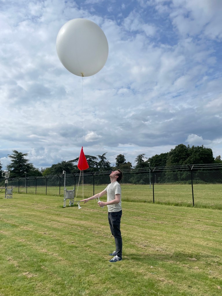
A core part of WesCon was frequent radiosonde launches from sites across the south and south-west of the UK. Over 300 individual sondes were launched in total, with each one requiring a team of two to three people to calibrate the sonde, record station measurements and fill balloons with helium. Those are the easy parts – the hard part is making sure your radiosonde gets off the ground in one piece.
You can see in the picture below that the observatory is surrounded by sharp fences and monitoring equipment which can be tricky to avoid, especially during gusty conditions. In the rare occurrences when the balloon experienced “rapid unplanned disassembly”, we had to scramble to prepare a new one so as not to delay the recordings by too long.
The University of Reading Atmospheric Observatory, overlooked by some mid-level cloud streets.
After a few launches, however, the procedure becomes routine. Then you can start taking a cursory look at the data being sent back to the receiving station.
During the two weeks I was involved with launching radiosondes, there were numerous instances of elevated convection, which were a particular priority for the campaign given the headaches these cause for modellers. Elevated convection is where the ascending airmass originates from somewhere above the boundary layer, such as on a frontal boundary. We may therefore expect profiles of elevated convection to include a temperature inversion of some kind, which would prevent surface airmasses from ascending above the boundary layer.
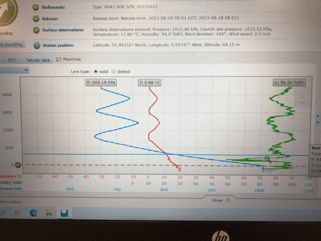
However, what we certainly did not expect to see were radiosondes appearing to oscillate with height (see my crude screenshot below).
“The wiggler”! Oscillating radiosondes observed during elevated convection events.
Cue the excited discussions trying to explain what we were seeing. Sensor malfunction? Strong downdraughts? Not quite.
Notice that the peak of each oscillation occurs almost exactly at 0°C. Surely that can’t be coincidental! Turns out these “wiggly” radiosondes have been observed before, albeit infrequently, and is attributed to snow building up on the surface of the balloon, weighing it down. As the balloon sinks and returns to above-freezing temperatures, the accumulated snow gradually melts and departs the balloon, allowing it to rise back up to the freezing level and accumulate more snow, and so on.
That sounds reasonable enough. So why, then, do we see this oscillating behaviour so infrequently? One of the reasons discovered was purely technical.
Most retrieving stations are set to stop collecting data when they measure that the radiosonde is descending, as this is typically assumed to be caused by the balloon being popped. So there actually may be more of these events than we expect, we just haven’t been observing them. Another, more speculative reason could be the conditions which favour large amounts of snow to develop at mid-levels. In each of the three launches where we observed oscillating profiles, the weather we were measuring was associated with elevated convection which often leads to deeper ascent than surface-based convection.
If you would like to read more about these events, a paper is currently being prepared by Stephen Burt, Caleb Miller and Brian Lo. Check back on the blog for further updates!
Humphrey Lean, Eme Dean-Lewis (left) and myself (right) ready to launch a sonde.
Met Office Summer Testbed
While not strictly a part of WesCon, this summer’s Met Office testbed was closely connected to the themes of the field campaign, and features plenty of collaboration.
Testbeds are an opportunity for operational meteorologists, researchers, academics, and even students to evaluate forecast outputs and provide feedback on particular model issues. This year’s testbed was focussed on two main themes: convection and ensembles. These are both high priority areas for development in the Met Office, and the testbed provides a chance to get a broader, more subjective evaluation of these issues.
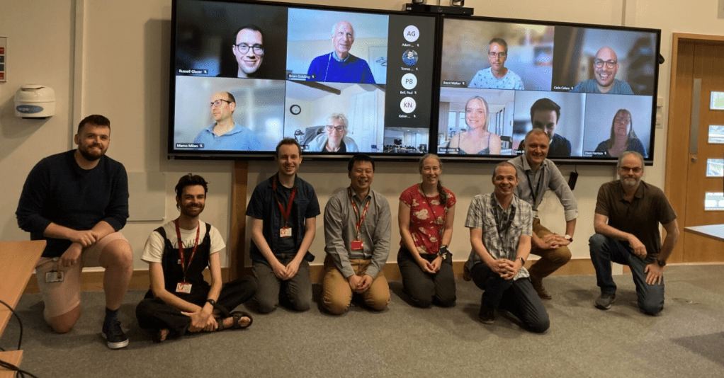
Group photo of the week 2 testbed participants.
Each day was structured into six sets of activities. Firstly, we were divided into three groups to perform a “Forecast Denial Experiment”, whereby each group is given access to a limited set of data and asked to issue a forecast for later in the day. One group only had access to the deterministic UKV model outputs, another group only had access to the MOGREPS-UK high-resolution ensemble output, and the third group has access to both datasets. The idea was to test whether ensemble outputs provide added value and accuracy to forecasts of impactful weather compared to just deterministic outputs. Each group was led by one or two operational meteorologists who navigated the data and, generally, provided most of the guidance. Personally, I found it immensely useful to shadow the op-mets as they made their forecasts, and came away with a much better understanding of the processes which goes into issuing a forecast.
Next, we performed a similar activity only this time using outputs from a new tool called IMPROVER. IMPROVER is designed to blend the various model outputs and present the strongest aspects of each one in a single set of visualisations. Once again, it was really interesting to see how the neighbourhood processing included within IMPROVER was used to provideadditional confidence to the forecasts issued from the previous activity. After this, we would get a brief update from the current WesCon director about the current goings-on with the field campaign. Some time was also very graciously set aside during these sessions to let the students in the testbed present some of their work.
After lunch, we would begin the ensemble evaluation activity which focussed on subjectively evaluating the spread of solutions in the high-resolution MOGREPS-UK ensemble. Improving ensemble spread is one of the major priorities for model development; currently, the members of high-resolution ensembles tend to diverge from the control member too slowly, leading to overconfident forecasts. It was particularly interesting to compare the spread results from MOGREPS-UK with the global MOGREPS-G ensemble and to try to understand the situations when the UK ensemble seemed to resemble a downscaled version of the global model. Next, we would evaluate three surface water flooding products, all combining ensemble data with other surface and impact libraries to produce flooding risk maps. Despite being driven by the same underlying model outputs, it was surprising how much each model differed in the case studies we looked at.
Finally, we would end the day by evaluating the WMV (Wessex Model Variable) 300 m test ensemble, run over the greater Bristol area over this summer for research purposes. Also driven by MOGREPS-UK, this ensemble would often pick out convective structure which MOGREPS-UK was too coarse to resolve, but also tended to overdo the intensities. It was also very interesting to see the objective metrics suggested that WMV had much worse spread than MOGREPS-UK over the same area, a surprising result which didn’t align with my own interpretation of model performance.
Overall, the testbed was a great opportunity to learn more about how forecasts are issued and to get a deeper intuition for how to interpret model outputs. As researchers, it’s easy to look at model outputs as just abstract data, which is there to be verified and scrutinised, forgetting the impacts that it can have on the people experiencing it. While it was an admittedly exhausting couple of weeks, I would highly recommend more students take part in future testbeds!