By Juan Pablo Garcia Valencia (j.p.garciavalencia@pgr.reading.ac.uk)
In January of 2026, I paused my PhD to do a 3-month fellowship at the Parliamentary Office for Science and Technology (POST).
This blog aims to give a summary of my experience, as well as some tips, tricks, and things to keep in mind if you’re interested in working in policy or science communication.
What is POST?
The Parliamentary Office for Science and Technology (POST) is an impartial research and knowledge exchange service based in the UK Parliament. Their role is to ensure that members of parliament (including the House of Commons and House of Lords) have access to cutting-edge research evidence and expertise. It covers emerging or complex physical and social science topics, including health, the environment, housing and computing.
The Fellowship
I first heard about the POST fellowship through a departmental seminar given by a previous POST fellow (shout out Helen Hooker!). From that moment, I knew it was an opportunity I couldn’t miss, as it aligned perfectly with my interest in the science–policy interface.
The fellowship provides an opportunity to gain real-world experience in the communication of research to policymakers. In this 3-month placement, fellows get the chance to research, write and publish an in-depth research briefing, called POSTnote, on a matter that was either requested by a Parliamentarian or identified as a topic of interest.
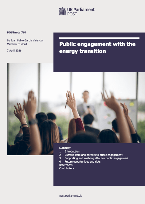
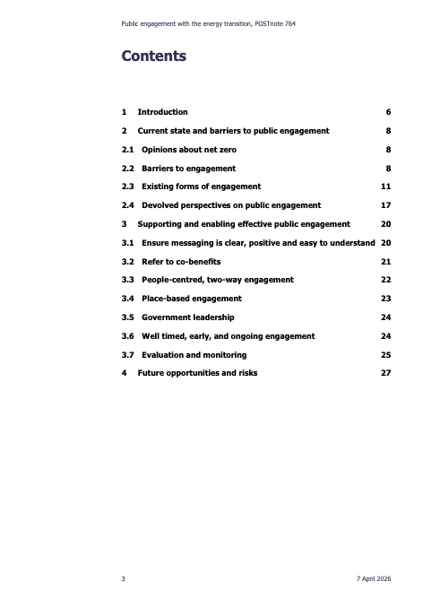
The front page and the list of contents of the POSTnote – Here is the full briefing.
How does it work?
Before you join, your research topic is agreed upon at a board meeting and communicated to you. Occasionally, you may get a choice between two topics, but most of the time, you are assigned a question that requires investigation.
The topic will not be related to your PhD, and this is intentional. The aim is to help you write a briefing for parliamentarians who may have no prior knowledge of the subject. In many ways, the less you know at the start, the more likely you are to explain the topic in a simple, clear, and accessible way.
To help you understand the topic, there is an extensive consultation process involving experts and stakeholders. By interviewing leading figures in the field, from academics to government officials, you will get a good understanding of the main themes, problems and concepts related to your topic and be able to write a well-informed, up-to-date briefing.
And don’t worry if you have little to no interview experience (like I did), it’s definitely a skill that you perfect with practice, and your supervisor will help you prepare for them.
Once you’ve completed the interviews, the writing stage begins. The briefings are just over 3,500 words long, so the challenge is often to condense all the valuable information you’ve just learnt. Again, this is a fantastic opportunity to develop your writing and communication skills.
Your draft is then reviewed internally before being sent to stakeholders for external review, helping ensure that the final version is accurate, impartial, and comprehensive.
Where is it?
The fellowship is based in Parliament itself, which is one of the best things about it. The POST offices (not to be confused with the actual post office inside Parliament…) are based just outside of the Palace of Westminster, about a 5-minute walk, in a nice and modern building. Most days, we would walk over to the Palace for lunch to enjoy the incredible views of the Terrace Cafeteria, one of the various (subsidised!) cafeterias in Parliament.
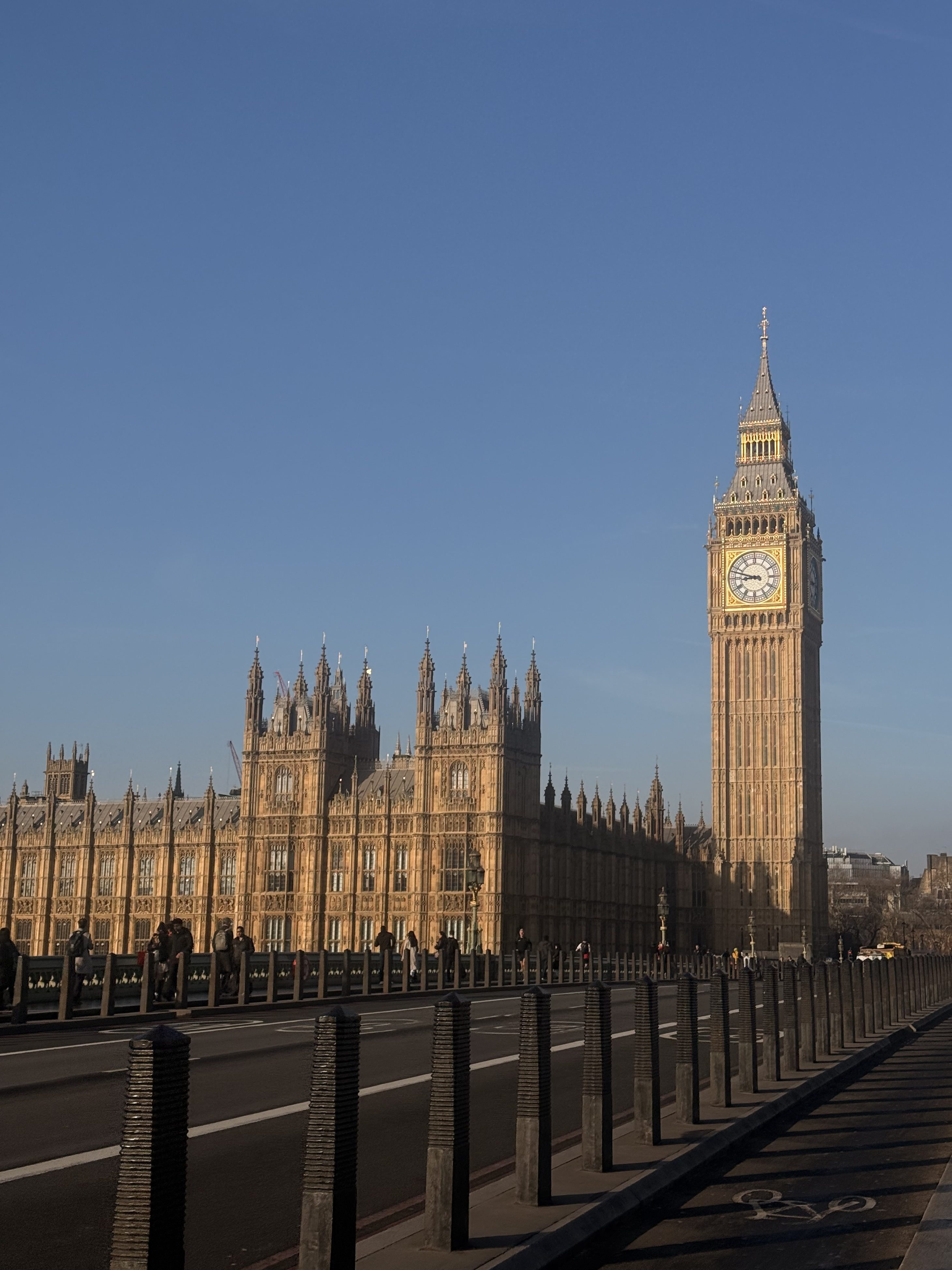
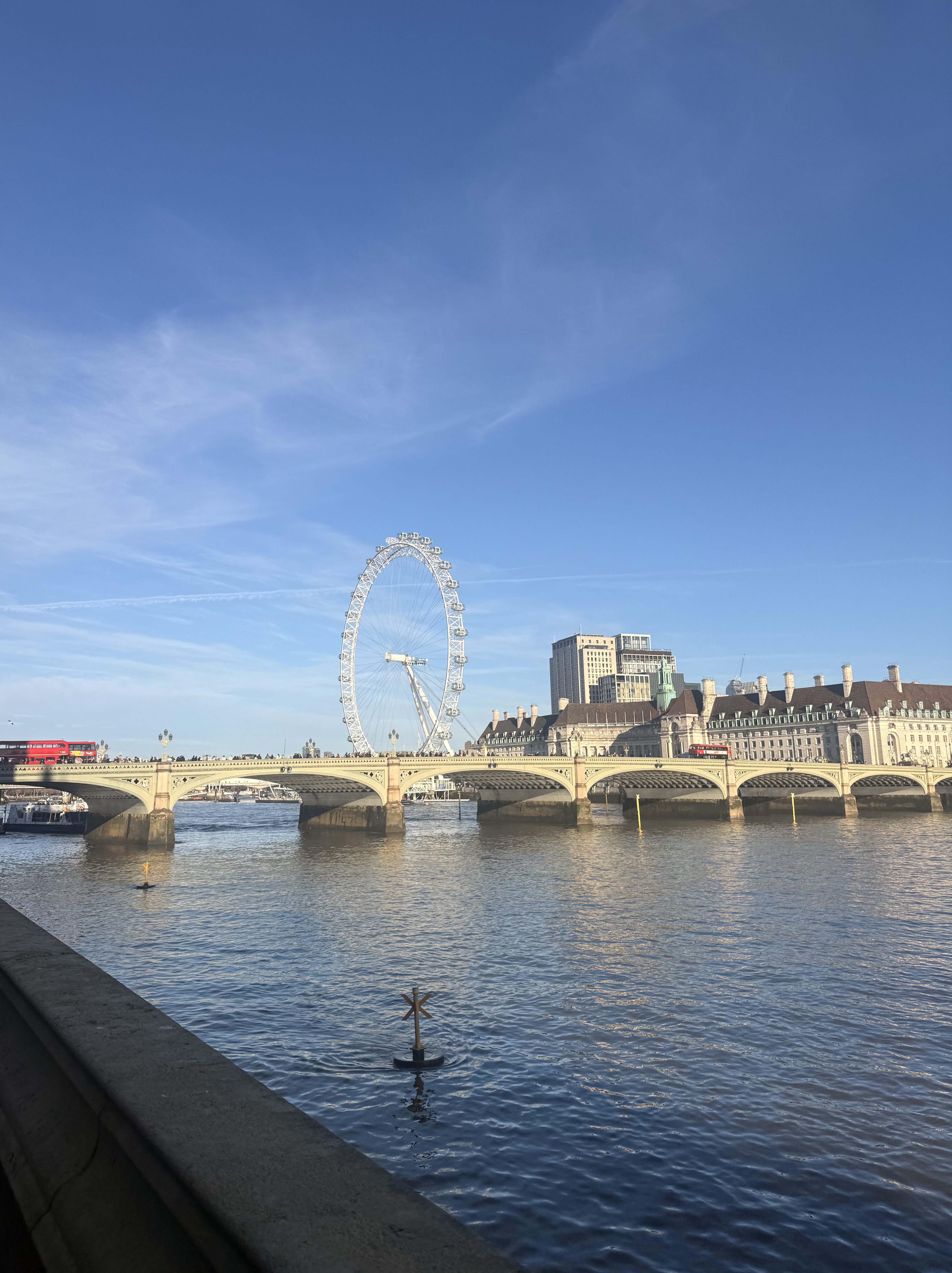
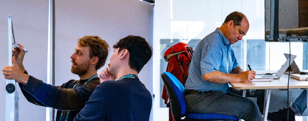
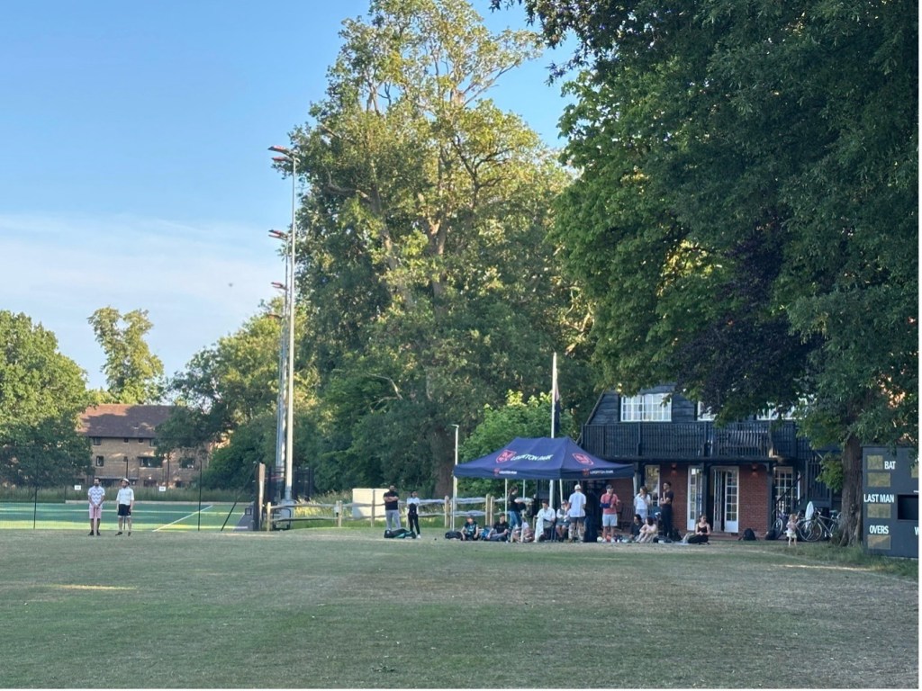
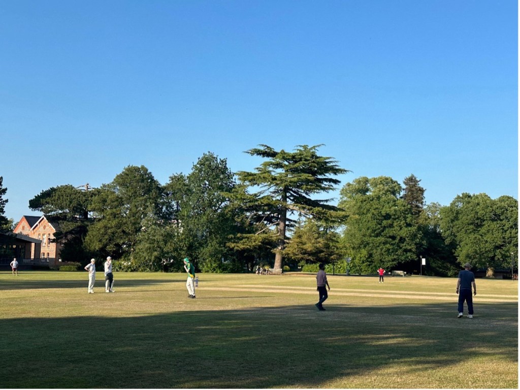
Pictures outside the Parliament
During your time there, you’re highly encouraged to make the most of being in such an amazing place by joining a Parliament tour, signing up to events in the Speaker’s House, going to the chamber for Prime Minister’s Questions (PMQs) or oral questions, attending the ‘All Parliamentary Party Group’ meetings, and so many other interesting things there are to do.
At these events, it’s not uncommon to bump into politicians, public figures, and other fascinating people, which never failed to amaze me. Also, you can bring one or two guests into the Palace, which makes for great lunchtime catch-ups!
Application process, tips and tricks
I believe the application process has changed slightly since I applied last year, but hopefully some of these tips are still relevant.
The first step of the application was to fill in a document with many typical application questions, like “Tell me about a time you researched a completely new topic and how you did it”. My biggest recommendation for writing good answers to these is to follow the STAR method, focusing mainly on the Action and Result. This is what they are going to be most interested in: what exactly did you do, and what impact did it have?
I also had to write a mock POSTnote. I spent some time identifying a topic that wasn’t already covered on the POST website but was currently relevant in political discussions. Reading one or two existing POSTnotes helped me get a feel for the tone and structure before writing my own briefing as clearly, impartially, and evidence-based as possible (the one on Public engagement with the energy transition could be a good start 🙂 ). A top tip to be impartial is to always state who said the point you’ve just made, i.e. “Researchers say…” or “The IPCC stated that…”.
For the interview, roughly half of the questions focused on general competencies, while the rest was on the mock POSTnote. The emphasis wasn’t so much on the topic itself, but on your process. For example:
- How did you choose the topic?
- How did you organise your research and manage your time?
- How did you ensure impartiality?
Caveats
It’s worth noting that your experience may differ considerably depending on where you’re placed.
Some fellows are based in Select Committees, where they engage more directly with science and policy by supporting scrutiny of government activity. Others are placed in the House of Commons Library, where they undertake work similar to POST but generally without the extensive interview process.
One thing I would strongly recommend is attending in person as much as possible. This had a huge impact on my experience. Many of the most interesting opportunities arose spontaneously, and I was only able to take advantage of them because I happened to be in the office when someone mentioned them. Being physically present is one of the best ways to make the most of your time in Parliament.
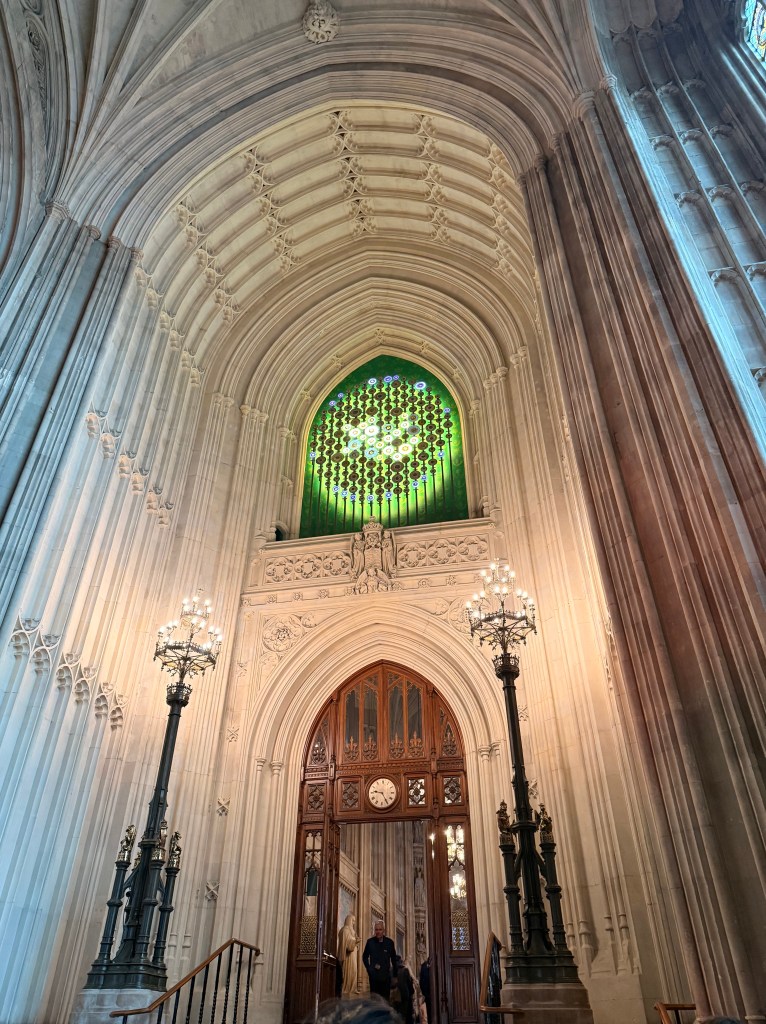
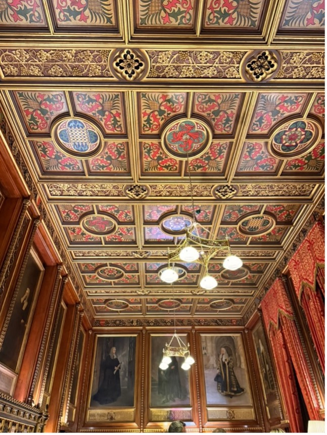
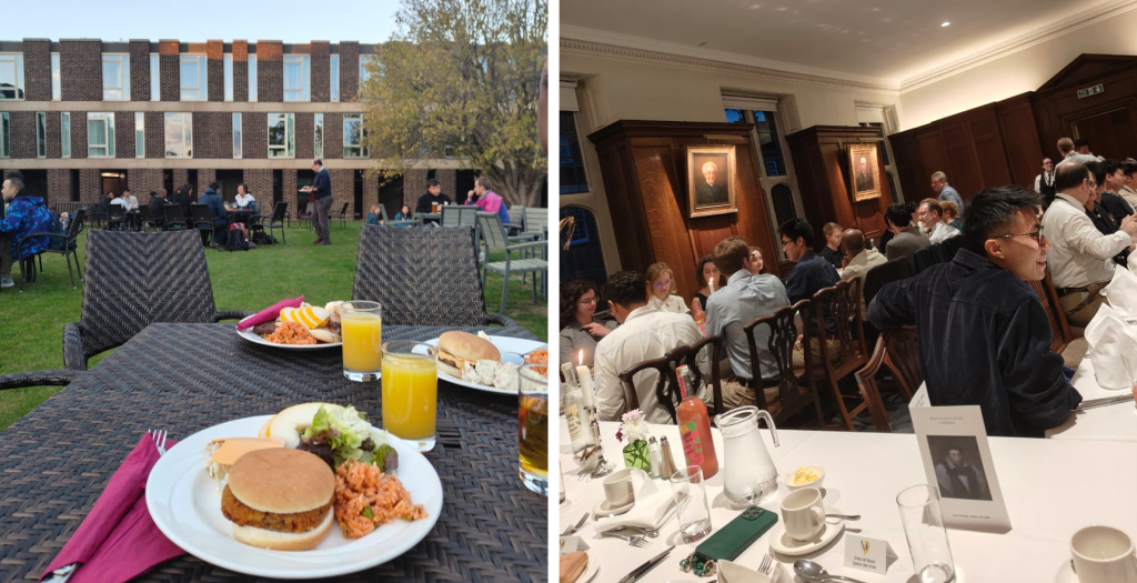
Pictures inside Parliament
Challenges and things to keep in mind
Although the experience was overwhelmingly positive, there are a few challenges worth highlighting.
Firstly, I cannot stress enough how quickly the three months go! Deadlines can creep up surprisingly fast, making organisation and time management essential. Fortunately, because so many fellows have completed the programme before, there is an excellent Gantt chart and timeline available to help structure your work. I found this incredibly useful, although others preferred to develop their own systems.
Another challenge is impartiality. When working for POST, you are expected to remain politically impartial both inside and outside the workplace, as you are effectively representing Parliament. This means thinking carefully before posting strongly partisan opinions on social media, for example.
This can sometimes feel frustrating, particularly for scientists working in climate-related fields in the current political landscape. However, it is also an incredibly valuable skill that is difficult to develop elsewhere. I came to view it as an important learning experience rather than a limitation.
Overall
To summarise, I would strongly encourage anyone with even a passing interest in policy, parliamentary processes, or science communication to apply for the fellowship. It’s a unique opportunity to learn how Parliament works while helping policymakers engage with emerging scientific issues.
Feel free to email me as well if you have any questions; I would be very happy to answer.