Chasing Rain in a Tropical Archipelago: When Do Storms Really Occur?

By Dony Christianto (d.christianto@pgr.reading.ac.uk)

“When do storms really happen?”

It sounds like a simple question—but in the tropics, there is rarely a simple answer.

We often learn this simple process: daytime heating drives peak afternoon rainfall. It is a useful idea—and in many cases, it works. But as we looked more closely at rainfall in Papua, it became clear that the atmosphere was telling a more complex story.

This work began in the field, in southern Papua near Timika. We worked with a network of Automatic Weather Stations (AWS) located across the extraordinary landscape of southern Papua (Figure 1). Across roughly 100 km, the terrain rises from sea level to mountain peaks exceeding 4,700 m. Along this steep transition, particularly in the foothill regions, rainfall reaches some of the highest values in the world, with annual totals of around 12,500 mm.

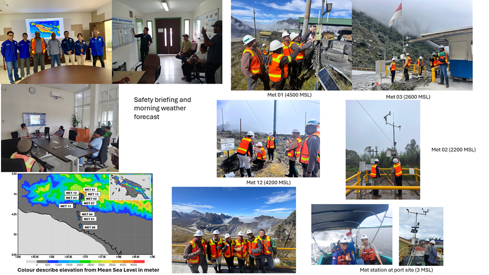
Figure 1: Automatic Weather Station network across Papua, spanning coast to high mountains, providing critical observations in a complex tropical environment.

This combination of coastline, lowland, and steep mountains creates a highly dynamic environment. Papua is not just another tropical region—it is a natural laboratory where local and large-scale atmospheric processes interact in complex ways.

The AWS data used in this study comes from a collaboration between PT Freeport Indonesia and BMKG (the Indonesian Agency for Meteorology, Climatology, and Geophysics). Maintaining these observations requires field visits, safety briefings, and working in remote areas where conditions can change rapidly. It is a reminder that every dataset has a story behind it—and that reliable ground observations remain essential, especially in regions as complex as Papua. This becomes particularly important when we consider how rainfall is commonly studied today.

Satellite products such as GPM-IMERG are widely used because they provide global coverage. In many studies, they are treated as a reference for understanding rainfall behaviour. But before relying on them, it is important to ask: how well do they represent what actually happens at the surface?

To address this, we compared satellite rainfall estimates with AWS observations in Papua (Figure 2).

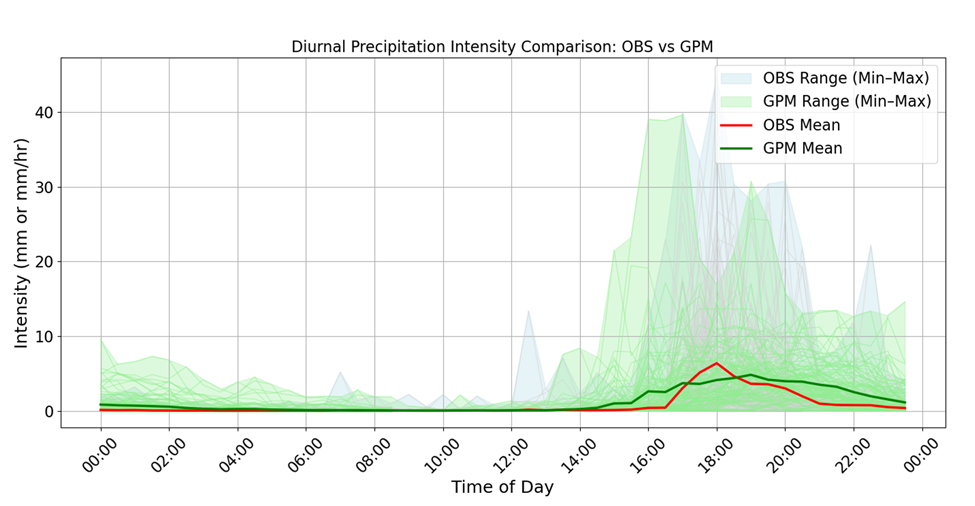
Figure 2: Comparison of diurnal rainfall intensity between ground observations (AWS) and satellite estimates (GPM-IMERG), showing a consistent delay in satellite peak timing, with observed rainfall peaking around 16:00 local time and GPM-IMERG peaking later.

What we found was consistent across the dataset: satellite rainfall peaks tend to occur later than those observed at the ground, typically by around one to three hours. This delay reflects that satellites are more sensitive to mature convective systems and therefore detect rainfall after storms have already developed.

At first glance, a difference of a few hours may not seem significant. However, in meteorology, timing is critical.

Satellite datasets are often used to evaluate weather and climate models. If rainfall timing is systematically shifted, models that appear to perform well against satellite data may not accurately represent real surface processes. This also has implications for applications such as early warning systems, where even small timing differences can influence how rainfall events are detected.

Having established this, we then turned to a more fundamental question: when does rainfall actually occur?

While rainfall in Papua often peaks in the late afternoon (around 15:00–18:00 local time), our analysis revealed a second important rainfall regime in the early morning, typically between 03:00 and 09:00 (Figure 3).

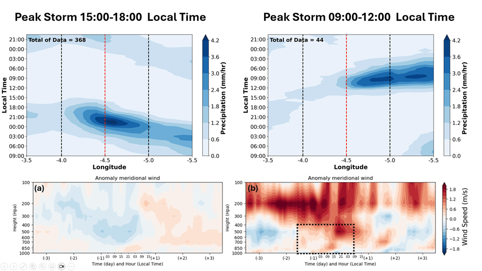
Figure 3: Contrasting rainfall regimes in Papua: afternoon storms (15:00–18:00 LT) are associated with offshore propagation from inland regions, while morning storms (09:00–12:00 LT) are linked to onshore flow bringing precipitation inland. The lower panels show meridional wind anomalies, with blue indicating southward (offshore) flow and red indicating northward (onshore) flow.

These two rainfall peaks are not simply different in timing; they are produced by different atmospheric processes.

Afternoon rainfall is largely driven by local processes. Solar heating during the day warms the land surface, causing air to rise, consequently triggering convection. In Papua, this process is strongly enhanced by the presence of mountains, which help initiate and organise storm development. These systems typically form over land and propagate towards the coast.

Morning rainfall, in contrast, often originates over the ocean. During the night, convective systems develop offshore and are transported inland by low-level winds. In this case, rainfall is not initiated locally but carried from the sea.

This leads to a key insight: rainfall timing is closely linked to wind direction.

When winds are directed offshore (from land towards the sea), they favour afternoon and evening rainfall over land. Conversely, when winds are onshore (from sea towards land), they transport moisture inland and are associated with morning rainfall. These alternating wind regimes create distinct “windows” for storm development throughout the day.

The next question is: what controls these wind patterns? The answer lies in larger-scale atmospheric processes.

Phenomena such as the Madden–Julian Oscillation (MJO), equatorial Rossby waves, and seasonal monsoon circulations influence the background wind environment over Papua. For example, different phases of the MJO are associated with shifts in wind direction and moisture transport. Some phases favour onshore flow, increasing the likelihood of morning rainfall, while others favour conditions more conducive to afternoon convection.

This highlights an important point: rainfall in Papua is not controlled by a single mechanism, but by interactions across multiple scales.

This is where the role of local characteristics becomes critical.

Every region has its own unique combination of topography, coastline, and atmospheric conditions. These factors shape local circulation patterns, which determine how that region responds to larger-scale climate phenomena. This is particularly important in the tropical Maritime Continent, where thousands of islands differ in size, shape, elevation, and land–sea distribution. These differences influence surface properties such as albedo, heat capacity, and moisture availability, which in turn affect how energy is distributed within the atmosphere.

As a result, each island develops its own local circulation system. Even under the same large-scale forcing—such as the MJO or monsoon—different regions can exhibit very different rainfall behaviour. The interaction between local geography and atmospheric processes creates a wide range of responses across the region.

Papua, with its steep topography and strong land–sea contrasts, provides a clear example of this complexity.

From field observations to large-scale atmospheric dynamics, this study highlights a simple but important message: understanding rainfall in the tropics requires considering both the local environment and the broader climate system.

Because in regions like Papua, rainfall is determined not by a single process, but by the interaction of many.

The Secret “Glow” of Thirsty Plants: How Satellites are Learning to Spot Drought Before It Happens

By Khomkrit (Guy) Onkaew – k.onkaew@pgr.reading.ac.uk

If you look out at a cornfield or a dense forest, you see green. That’s chlorophyll, the pigment plants use to turn sunlight into energy. But there is something else happening in those leaves that the human eye completely misses. While they are basking in the sun, plants are also glowing.

During photosynthesis, plants absorb sunlight to create food. However, they don’t use 100% of the light they take in. A small fraction of that unused solar energy is re-emitted by the plant as a faint, reddish glow. This phenomenon is called Solar-Induced Chlorophyll Fluorescence, or SIF.

Left: Plant under daylight (535 nm). Right: Plant under UV light (365 nm), showing the reddish glow. (image source: https://www.exoticaesoterica.com/magazine/plantuvfluorescence)

Think of SIF as the “heartbeat” of a plant’s metabolism. When a plant is healthy and photosynthesising vigorously, this glow follows a regular pattern. But when a plant gets stressed — perhaps it’s too hot, or it hasn’t rained in weeks — that heartbeat changes.

For years, scientists have used special satellites to measure this glow from space to estimate how well vegetation is growing. Ideally, this glow would tell us exactly how productive the plants are. But there is a catch: a plant’s glow isn’t just determined by how much sun it gets; it is also determined by its “efficiency” in using that light.

This brings us to a question: What happens to that efficiency when the soil dries out?

Imagine you kink a garden hose: as you restrict the water, the flow changes. Similarly, when plants run out of water in the soil, they close their stomata — tiny pores on their leaves — to save moisture. This shuts down photosynthesis. The plant then has to deal with all that incoming sunlight that it can no longer use. To protect itself, the plant dissipates that excess energy as heat, which causes the fluorescence glow to dim or change in efficiency.

In other words, this means that long before a crop turns yellow and dies from drought, its glow changes. If we can understand the relationship between soil moisture and glow, we could potentially predict crop failures and droughts much earlier than we can by just looking at how green the plants are.

Decoding the Signal: A New Study on Africa’s Ecosystems

This is where our study steps in. We focused on the African continent to solve a specific puzzle: How does soil moisture stress change the fluorescence efficiency of plants?

Africa offers the perfect laboratory for this question because it holds almost every type of ecosystem imaginable, from the bone-dry Sahara and the semi-arid savannas to the lush Congo rainforest. We combined satellite data from The TROPOspheric Monitoring Instrument TROPOMI, which measures the SIF glow, with a sophisticated land model, the Joint UK Land Environment Simulator (JULES), which estimates soil moisture deep in the ground.

We tested two different models to see which one better predicted the actual glow observed by satellites:

1. The Baseline Model: Assumed the glow depends only on the light the plant absorbs.

2. The Soil Moisture Model: Assumed the glow is influenced by both the light absorbed and how wet the soil is.

African Plants’ Thirst Strategies

Our study produced some fascinating results regarding how different plants handle thirst. We found that fluorescence efficiency is not one-size-fits-all; it depends entirely on the plant’s “lifestyle”.

1. The “Panickers”: Croplands and Grasslands

We discovered that croplands and grasslands are the “drama queens” of the plant world; they easily panic as soon as the soil dries. These plants show the strongest reaction to soil moisture. When the topsoil dries out, their efficiency plummets; when the soil is wet, their efficiency spikes. This makes sense because crops like maize usually have shallow roots. They live and die by the moisture in the top layer of dirt, making them incredibly sensitive monitors for agricultural drought.

2. The “Resilient”: Evergreen Forests

On the other hand, evergreen forests (like those in the Congo basin) were surprisingly indifferent. Their fluorescence efficiency barely changed even when soil moisture levels changed. Why? These trees have deep, complex root systems that can tap into groundwater reserves far below the surface. They don’t panic when the topsoil gets dry because they have a backup water supply.

3. The “Balancers”: Savannas and Shrublands

Moreover, we found that plants in semi-arid regions like the Sahel have evolved to be adaptive. They ramp up their efficiency quickly at the first sign of rain, but don’t waste extra energy once they have “enough” water.

The Map of Improvement

We found that adding soil moisture data to these models significantly improved their ability to simulate the plant glow in semi-arid regions, such as the Sahel and Southern Africa (the blue area in Figure C). In these water-limited environments, you cannot understand the plant’s light signal without understanding the water in the soil.

However, the study also highlighted where the models fail. In wetlands such as the Okavango Delta and the Sudd Swamp (Locations 5 and 6 in Figure C, respectively), adding soil moisture data worsened the model or yielded no improvement. This is likely because satellite models struggle to understand complex water systems where water flows horizontally or sits just below the surface, keeping plants happy even when the model thinks they should be dry.

Spatial distribution maps of RMSE for two SIF simulation models across Africa. (a) RMSE between observed SIF and the Baseline Model (SIFa), which does not include soil moisture availability (β). (b) RMSE between observed SIF and the Soil Moisture Model (SIFb), which includes β. (c) RMSE difference (ΔRMSE = RMSEb − RMSEa). Blue regions (ΔRMSE < 0) indicate areas where including β improves model performance (Model 2 outperforms), while red areas (ΔRMSE > 0) show regions where including β worsens the fit. Grey areas indicate missing data.

The Takeaway

This research is a step toward “context-dependent” monitoring. We can’t just look at a satellite image and apply a single rule to the whole planet. To truly monitor the health of our food systems and forests from space, we have to treat a shallow-rooted cornfield in a semi-arid zone differently from a deep-rooted tree in a tropical forest. By linking the “glow” of the plants to the water in the soil, we are getting closer to a real-time health check for the Earth’s vegetation.

More details from the paper: https://doi.org/10.1080/01431161.2026.2618097

Met Ball 2024!

Sarah Watson – s.r.watson@pgr.reading.ac.uk

Thea Stevens – thea.stevens@pgr.reading.ac.uk

Isabelle Gorst – i.r.gorst@pgr.reading.ac.uk

Another year, another Met Ball!

This year’s ball was held on Thursday 6th June in the Meadow Suite, which had been transformed into a fin-tastic underwater haven thanks to a collection of kids party balloons and Laura’s delightful dolphin collection (rumour has it she has been collecting these for 18 years specifically for Met Ball 2024).

The Met Ball is a yearly event, organised to raise money for the Reading San Francisco Libre Association. After months of emails, forms and ticket sales, the day had finally come. The evening started off with a delicious 3 course meal, followed by the raffle and auction and finished on the dancefloor. We were delighted to be joined by Paul Starkey who provided an introduction to the Reading San Francisco Libre Association as well as the information boards and leaflets. The Reading San Francisco Libre Association helps to support the people, development and environment of San Francisco Libre, Nicaragua, with many projects being set up, including a recent main roads and bridges project which aims to improve connections between San Francisco Libre and other regions.

After introducing the charity, Paul kindly kicked off the raffle which had a suspicious amount of tickets with high numbers. Despite this, the raffle and auction were a huge success (once Sarah and Thea had figured out how to do the calling), with a fantastic sea-lection of prizes. From Mr Met mugs and tea hampers to hotel stays and indoor skydiving, the prizes up for grabs were certainly a hit! None more than the sought after Brain Hoskins signed photo, which seemed to cause a splash amongst the HHH crowd. Overall, we raised £1003 for the charity!    

Following this excitement, there were some waves made on the dance floor, with a special rendition of Islands in the Stream which will never be forgotten, as well as a reminder of how much we all love Wendy. We weren’t the only ones having fun though, as it seemed that most of the photos from the Met Ball were of the seal and lobster balloons who appeared to have a photoshoot around the Meadow Suite (these gen-Z influencers can’t get enough of the camera these days). 

Some people’s memories may be more hazy than others, but we have a very specific memory of Ankit and Melissa agreeing to organise Met Ball 2025…

Thanks to everyone who attended and donated prizes to the raffle and auction. We really enjoyed organising it and we were over-whale-med by your presence! Some final words of wisdome from us to the future organisers? Get Brian Hoskins to sign anything and add it to the auction.

sshRACC: The Making Of

Once upon a time, in the first week of term, last year’s panto organisers Jen Stout and Caleb Miller came to HP180 to ask if we (Catherine Toolan, Rosie Mammatt, and Hette Houtman) wanted to organise this year’s panto. Duty called, and we answered. We swiftly set out to start the preparations for this prestigious event.  

We set week 3 as the deadline to decide what story we would parody (2 weeks behind schedule). Luckily, some brainstorming on the (slightly hungover) morning after last year’s panto afterparty had already produced a strong candidate: Shrek. We agreed that the plot would be hard to adapt, but the potential for great songs would more than make up for it. During a general assembly of PhD students, it was decided almost unanimously that Shrek was the best we could come up with (sorry Rhiannon, maybe you can do Stratatouille next year). And so it was that Thorwald Stein came to be portrayed as an ogre. 

Plot

By week 8 (5 weeks behind schedule) the plot was finally ironed out. 

Thorwald Stein, a happy and eco-friendly researcher, is having a meeting with PhD student DonkeyBrian Lo, when a horde of fairytale characters barge into his swam-, err office. They bring the news that head of department, Lord Charquaad-Perez, has turned off the heating in most of the building to cut down on carbon emissions! When Thorwald demands an end to this nonsense, Lord Charquaad-Perez tells Thorwald he can have the heating back on if he brings down the dreaded FAAM-dragon, which is breathing out loads of carbon and taking up most of their carbon budget.  

Thus, Thorwald and his trusty companion DonkeyBrian set out on this quest to bring back peace to the department. They are joined by Lord Charquaad’s minion, Chris in Westboots, who keeps an eye on things for his master. When they finally reach the far, far away land of Wessex and spot the FAAM-dragon, they discover that world-renowned climate scientist FionEd Hawkins is trapped on it! As is panto tradition, Maarten Ambaum (portrayed as Prince Charming) tells our heroes that his textbook on thermal physics contains the secrets they need to bring down the plane. But alas, all its copies have been stolen from the library! Luckily, in an ode to the retiring SCENARIO DTP coordinator Wendy Neale and her seemingly magical powers in keeping this department running, Fairy Wendymother comes to the rescue. She waves her magic wand and down comes the dreaded FAAM-dragon. 

After a long journey (made even longer because their newly set travel carbon budget ran out on the way back), the crew return to the department. Thorwald and FionEd set out to cut down the department’s carbon emissions even further, but are thwarted by Lord Charquaad-Perez, who promises FionEd 3TB of storage on the sshRACC if she works on a paper with him instead of attempting to reduce the department’s carbon emissions. 

A fight ensues, and in the chaos Lord Charquaad-Perez is taken prisoner by the FAAM dragon. Thorwald and FionEd sneak into Lord Charquaad’s office and discover that it wasn’t FAAM but he himself who had been using up 80% of the budget – on Virgin Galactic tourist flights to the stratosphere! “That man must really love the stratosphere”, FionEd rightly says. 

With Lord Charquaad’s silly emissions no longer an issue, and the implementation of some ingenious emission-reducing measures from FionEd and Thorwald (like reusable coffee cups), the department becomes truly green, and can finally live la vida eco.  

Songs 

Live la vida eco? What’s that?”, we hear you ask. Livin’ la vida eco was an adaptation of the absolute banger of a song by Ricky Martin, on which we ended the panto. And it wasn’t the only bop to be played by the band that night: All-Star by Smash Mouth (‘Ed Hawkins once told me the world is gonna warm up’), Funkytown by Lipps Inc. (‘Won’t you get me some heating now?’), Holding out for a hero by Bonnie Tyler (‘I need you Wendy’), I’m a believer by Smash Mouth (‘Donkey made me change, now I’m a lot cleaner’), and finally Sk8er Boi by Avril Lavigne (‘Working on papers she’s all alone’ – we will admit this one didn’t make a lot of sense, but we just wanted to play the song). All killer, no filler. 

Once again, Flynn Ames and his protege Nathaniel Edward-Inatimi did a superb job of organising the band. Their incredible talent and months of practise meant that by the time the song rehearsals came around (just two weeks before the show), they sounded amazing. The singers, however, did not. But after a few rehearsals, we’d come out of our shells and were able to put out a (hopefully) respectable performance!  

A special thanks must also go to Beth Saunders for her many years of panto knowledge, insane drumming skills and helping us get back into the swing of live pantos after the covid years. You’ll be missed next year! 

Casting  

The job of casting the roles this year seemed to be too easy. First year Robby Marks’ fatal “I don’t mind” remark led to him becoming the title character. Similar mistakes from Niamh O’Callaghan, who u-turned from “absolutely not” to “oh go on then” in a matter of seconds, led to her becoming the esteemed climate scientist FionEd Hawkins.  

As many of the other parts had relatively few lines, it was great to have so many students wanting to get involved. This led to a great atmosphere both on and off stage – we’re hoping this enthusiasm is still there when we start looking for next year’s organisers… 

The Night of the Panto  

Tickets had been sold (about 150 of them!). Props had been made, songs had been practised. The backstage cupboard was full, Robby’s face had been painted green. The cast were assembled and waiting at 5pm sharp. But wait – who was this in the Madejski lecture theatre? Surprise! An unexpected law lecture until 6pm!  

With the doors due to open at 7pm, we were feeling the pressure. Thankfully, due to a fair amount of preparation earlier in the day between lectures, many of the time- consuming tasks like setting the band up had already been done. With all hands- on deck and some tactical delaying of the audience (by keeping them by the buffet for longer) we were ready to go by 7.15.  

The first act was underway and the performance was going well. Nobody had forgotten their lines (yet). At the end of the first act, a quick glance at the watch relieved that we’d whistled through it in under half an hour… eek! 

Fortunately, we had three fantastic interval acts to keep us entertained in the break. Blair McGinness revealed the results of the Big Biscuit Bracket 2023 – why did more than half of you vote for bourbons over chocolate leibniz? Next came the latest episode of Jon Shonk’s much-anticipated Mr Mets series, which was as fantastic as ever. And finally, Chris Scott serenaded us with a handwritten ditty about the fake panto poster on the second floor window, supported by his dancer/backing singer(?) Matt Owens. 

It was time for the second act to get underway. The end of many months of (behind schedule and therefore slightly panicked) writing and rehearsing was in sight, and the performance was wrapped up with a rousing version of Ricky Martin’s famous Livin’ la Vida Eco. Applause was demanded by our cupboard signs, the audience delivered! 

Afterwards, it was time for the swiftest take down you’ve ever seen and a night on the tiles, I mean in the coffee room, with DJ Shonk! 

Some of the phenomenal cast and crew that brought sshRACC to the stage

Reflections  

After lots of hard work, many to-do lists, and more than a few days of PhD research missed, it was very rewarding to see everyone’s efforts come together on the night and to contribute to a long-standing department tradition. Once again, we were reminded that our department is full of people with talents that lie well outside of the field meteorology! We are also proud to say that we delivered (probably) the cheapest evening out in Reading – we believe the panto has remained at the same bargain price of £5 per adult since its beginning in 1992… 

Did we enjoy the experience? Yes, we did. Do we want jobs as directors or producers on the West End? No thank you! 

We would like to thank everyone who attended, contributed to, performed in or supported the panto in any way, shape or form. There are too many of you to list here, so just know that your efforts are appreciated! 

The Social Metwork in 2021

James Fallon – j.fallon@pgr.reading.ac.uk
Brian Lo – brian.lo@pgr.reading.ac.uk 

Hello readers, and a happy new year to you all! (ok we’re a bit late on that one… but regardless we both wish you a great start to 2022!)

We have really enjoyed reading and publishing all of the posts submitted over the last year, and following all of the research conducted by PhD students in the Reading department of Meteorology. There have been posts on conferences, papers, visitors, and much more, finishing with the heralded Met dept. Pantomime!

Thank you to everyone who has contributed to the Social Metwork over this past year. We are really looking forward to new submissions this term – and whether you are a veteran contributor or have never written for a blog before, we really encourage you to get in touch and write for us 🙂

In the last year, the blog has had over 7900 visitors from all over the world!

Map of visitors to the social metwork in 2021

Compared to 2020 we have seen Brazil and Australia enter the top 10 highest number of readers at 144 and 118 views respectively. And leading with the top 3 number of views are United Kingdom (6495), United States (1134) and China (361).

In case you missed any posts, or want to look through your favourites, here are all of the posts from 2021:

January
https://socialmetwork.blog/2021/01/15/why-renewables-are-difficult – Adriaan Hilbers

https://socialmetwork.blog/2021/01/22/forecasting-space-weather-using-similar-day-approach – Carl Haines

https://socialmetwork.blog/2021/01/29/air-sea-heat-fluxes-at-the-oceanic-mesoscale-the-impact-of-the-ratio-of-ocean-to-atmosphere-grid-resolution – Sophia Moreton

February
https://socialmetwork.blog/2021/02/05/main-challenges-for-extreme-heat-risk – Chloe Brimicombe

https://socialmetwork.blog/2021/02/12/the-role-of-climate-change-in-the-2003-european-and-2010-russian-heatwaves-using-nudged-storylines – Linda van Garderen

https://socialmetwork.blog/2021/02/19/weather-variability-and-its-energy-impacts – James Fallon & Brian Lo

https://socialmetwork.blog/2021/02/26/high-resolution-dispersion-modelling-in-the-convective-boundary-layer – Lewis Blunn

March

https://socialmetwork.blog/2021/03/05/do-local-or-non-local-sources-of-moisture-contribute-to-extratropical-cyclone-precipitation – Sophie Cuckow

https://socialmetwork.blog/2021/03/12/dialogue-concerning-the-obvious-and-obscurity-of-scientific-programming-in-python-a-lost-script – Brian Lo

https://socialmetwork.blog/2021/03/19/quantifying-arctic-storm-risk-in-a-changing-climate – Alec Vessey

April

https://socialmetwork.blog/2021/04/23/support-vector-machine-for-classification-of-space-weather – Carl Haines

https://socialmetwork.blog/2021/04/30/coding-lessons-for-the-newly-initiated – Daniel Ayers

May
https://socialmetwork.blog/2021/05/14/the-egu-experience-2021-a-phd-student-perspective – Max Coleman & Chloe Brimicombe

https://socialmetwork.blog/2021/05/21/better-data-information-with-metadata-application – James Fallon

June
https://socialmetwork.blog/2021/06/04/how-to-write-a-phd-thesis-during-a-global-pandemic – Kaja Milczewska

https://socialmetwork.blog/2021/06/18/cmip6-data-hackathon – Brian Lo & Chloe Brimicombe

July
https://socialmetwork.blog/2021/07/02/the-effect-of-surface-heat-fluxes-on-the-evolution-of-storms-in-the-north-atlantic-storm-track – Andrea Marcheggiani

https://socialmetwork.blog/2021/07/09/forecast-verification-summer-school – Lily Greig

https://socialmetwork.blog/2021/07/16/helicopter-underwater-escape-training-for-arctic-field-campaign – Hannah Croad

https://socialmetwork.blog/2021/07/23/connecting-global-to-local-hydrological-modelling-forecasting-virtual-workshop – Gwyneth Matthews & Helen Hooker

August
https://socialmetwork.blog/2021/08/13/diagnosing-solar-wind-forecast-errors – Harriet Turner

September
[ no submissions ]

October
https://socialmetwork.blog/2021/10/01/fluid-dynamics-summer-school – Charlie Suitters

https://socialmetwork.blog/2021/10/08/ensemble-data-assimilation-with-auto-correlated-model-error – Haonan Ren

https://socialmetwork.blog/2021/10/15/machine-learning-complement-or-replacement-of-numerical-weather-prediction – Emanuele Gentile

https://socialmetwork.blog/2021/10/22/ncas-climate-modelling-summer-school – Shammi Akhter

November
https://socialmetwork.blog/2021/11/05/climate-science-and-power – Gabriel M P Perez

https://socialmetwork.blog/2021/11/19/cop-climate-action-studio-2021-and-a-visit-to-the-green-zone-glasgow – Helen Hooker

https://socialmetwork.blog/2021/11/29/2021-academic-visiting-scientist-tim-woolings – Isabel Smith

December
https://socialmetwork.blog/2021/12/03/cloud-radiation-interactions-and-their-contributions-to-convective-self-aggregation – Kieran Pope

https://socialmetwork.blog/2021/12/14/panto-2021-hybrid-edition-semi-lagrangian-rhapsody – Natalie Ratcliffe

Dialogue Concerning the Obvious and Obscurity of Scientific Programming in Python: A Lost Script

Disclaimer: The characters and events depicted in this blog post are entirely fictitious. Any similarities to names, incidents or source code are entirely coincidental.

Antonio (Professor): Welcome to the new Masters module and PhD training course, MTMX101: Introduction to your worst fears of scientific programming in Python. In this course, you will be put to the test–to spot and resolve the most irritating ‘bugs’ that will itch, sorry, gl-itch your software and intended data analysis.

Berenice (A PhD student): Before we start, would you have any tips on how to do well for this module?

Antonio: Always read the code documentation. Otherwise, there’s no reason for code developers to host their documentation on sites like rtfd.org (Read the Docs).

Cecilio (An MSc student): But… didn’t we already do an introductory course on scientific computing last term? Why this compulsory module?

Antonio: The usual expectation is for you to have to completed last term’s introductory computing module, but you may also find that this course completely changes what you used to consider to be your “best practices”… In other words, it’s a bad thing that you have taken that module last term but also a good thing you have taken that module last term. There may be moments where you may think “Why wasn’t I taught that?” I guess you’ll all understand soon enough! As per the logistics of the course, you will be assessed in the form of quiz questions such as the following:

Example #0: The Deviations in Standard Deviation

Will the following print statements produce the same numeric values?

import numpy as np
import pandas as pd

p = pd.Series(np.array([1,1,2,2,3,3,4,4]))
n = np.array([1,1,2,2,3,3,4,4])

print(p.std())
print(n.std())

Without further ado, let’s start with an easy example to whet your appetite.

Example #1: The Sum of All Fears

Antonio: As we all know, numpy is an important tool in many calculations and analyses of meteorological data. Summing and averaging are common operations. Let’s import numpy as np and consider the following line of code. Can anyone tell me what it does?

>>> hard_sum = np.sum(np.arange(1,100001))

Cecilio: Easy! This was taught in the introductory course… Doesn’t this line of code sum all integers from 1 to 100 000?

Antonio: Good. Without using your calculators, what is the expected value of hard_sum?

Berenice: Wouldn’t it just be 5 000 050 000?

Antonio: Right! Just as quick as Gauss. Let’s now try it on Python. Tell me what you get.

Cecilio: Why am I getting this?

>>> hard_sum = np.sum(np.arange(1,100001))
>>> print(hard_sum)
705082704

Berenice: But I’m getting the right answer instead with the same code! Would it be because I’m using a Mac computer and my MSc course mate is using a Windows system?

>>> hard_sum = np.sum(np.arange(1,100001))
>>> print(hard_sum)
5000050000

Antonio: Well, did any of you get a RuntimeError, ValueError or warning from Python, despite the bug? No? Welcome to MTMX101!

Cecilio: This is worrying! What’s going on? Nobody seemed to have told me about this.

Berenice: I recall learning something about the computer’s representation of real numbers in one of my other modules. Would this be problem?

Antonio: Yes, I like your thinking! But that still doesn’t explain why you both got different values in Python. Any deductions…? At this point, I will usually set this as a homework assignment, but since it’s your first MTMX101 lecture, here is the explanation on Section 2.2.5 of your notes.

If we consider the case of a 4-bit binary, and start counting from 0, the maximum number we can possibly represent is 15. Adding 1 to 15, would lead to 0 being represented, as shown in Figure 1. This is called integer overflow, just like how an old car’s analogue 4-digit odometer “resets” to zero after recording 9999 km. As for the problem of running the same code and getting different results on a Windows and Mac machine, a numpy integer array on Windows defaults to 32-bit integer, whereas it is 64-bit on Mac/Linux, and as expected, the 64-bit integer has more bits and can thus represent our expected value of 5000050000. So, how do we mitigate this problem when writing future code? Simply specify the type argument and force Python to use 64-bit integers when needed.

>>> hard_sum = np.sum(np.arange(1,100001), dtype=np.int64)
>>> print(type(hard_sum))
<class 'numpy.int64'>
>>> print(hard_sum)
5000050000

As to why we got the spurious value of 705082704 from using 32-bit integers, I will leave it to you to understand it from the second edition of my book, Python Puzzlers!

Figure 1: Illustration of overflow in a 4-bit unsigned integer

Example #2: An Important Pointer for Copying Things

Antonio: On to another simple example, numpy arrays! Consider the following two-dimensional array of temperatures in degree Celsius.

>>> t_degrees_original = np.array([[2,1,0,1], [-1,0,-1,-1], [-3,-5,-2,-3], [-5,-7,-6,-7]])

Antonio: Let’s say we only want the first three rows of data, and in this selection would like to set all values on the zeroth row to zero, while retaining the values in the original array. Any ideas how we could do that?

Cecilio: Hey! I’ve learnt this last term, we do array slicing.

>>> t_degrees_slice = t_degrees_original[0:3,:]
>>> t_degrees_slice[0,:] = 0

Antonio: I did say to retain the values in the original array…

>>> print(t_degrees_original)
[[ 0  0  0  0]
[-1  0 -1 -1]
[-3 -5 -2 -3]
[-5 -7 -6 -7]]

Cecilio: Oh oops.

Berenice: Let me suggest a better solution.

>>> t_degrees_original = np.array([[2,1,0,1], [-1,0,-1,-1], [-3,-5,-2,-3], [-5,-7,-6,-7]])
>>> t_degrees_slice = t_degrees_original[[0,1,2],:]
>>> t_degrees_slice[0,:] = 0
>>> print(t_degrees_original)
[[ 2  1  0  1]
[-1  0 -1 -1]
[-3 -5 -2 -3]
[-5 -7 -6 -7]]

Antonio: Well done!

Cecilio: What? I thought the array indices 0:3 and 0,1,2 would give you the same slice of the numpy array.

Antonio: Let’s clarify this. The former method of using 0:3 is standard indexing and only copies the information on where the original array was stored (i.e. “view” of the original array, or “shallow copy”), while the latter 0,1,2 is fancy indexing and actually makes a new separate array with the corresponding values from the original array (i.e. “deep copy”). This is illustrated in Figure 2 showing variables and their respective pointers for both shallow and deep copying. As you now understand, numpy, is really not as easy as pie…

Figure 2: Simplified diagram showing differences in variable pointers and computer memory for shallow and deep copying

Cecilio: That was… deep.

Berenice: Is there a better way to deep copy numpy arrays rather than having to type in each index like I did e.g. [0,1,2]?

Antonio: There is definitely a better way! If we replace the first line of your code with the line below, you should be able to do a deep copy of the original array. Editing the copied array will not affect the original array.

>>> t_degrees_slice = np.copy(t_degrees_original[0:2,:])

I would suggest this method of np.copy to be your one– and preferably only one –obvious way to do a deep copy of a numpy array, since it’s the most intuitive and human-readable! But remember, deep copy only if you have to, since deep copying a whole array of values takes computation time and space! It’s now time for a 5-minute break.

Cecilio: More like time for me to eat some humble (num)py.


Antonio: Hope you all had a nice break. We now start with a fun pop quiz!

Consider the following Python code:

short_a = "galileo galilei"
short_b = "galileo galilei"
long_a = "galileo galilei " + "linceo"
long_b = "galileo galilei " + "linceo"
 
print(short_a == short_b)
print(short_a is short_b)
print(long_a == long_b)
print(long_a is long_b)

Which the correct sequence of booleans that will be printed out?
1. True, True, True, True
2. True, False, True, False
3. True, True, True, False

Antonio: In fact, they are all correct answers. It depends on whether you are running Python 3.6.0, Python 3.8.5 and whether you ran the code in a script or in the console! Although there is much more to learn about “string interning”, the quick lesson here is to always compare the value of strings using double equal signs (==) instead of using is.

Example #3: Array manipulation – A Sleight of Hand?

Antonio: Let’s say you are asked to calculate the centered difference of some quantity (e.g. temperature) in one dimension \frac{\partial T}{\partial x} with gird points uniformly separated by \Delta x of 1 metre. What is some code that we could use to do this?

Berenice: I remember this from one of the modelling courses. We could use a for loop to calculate most elements of \frac{\partial T}{\partial x} \approx \frac{T_{i+1} - T_{i-1}}{2\Delta x} then deal with the boundary conditions. The code may look something like this:

delta_x = 1.0
temp_x = np.random.rand(1000)
dtemp_dx = np.empty_like(temp_x)
for i in range(1, len(temp_x)-1):
    dtemp_dx[i] = (temp_x[i+1] - temp_x[i-1]) / (2*delta_x)

# Boundary conditions
dtemp_dx[0] = dtemp_dx[1]
dtemp_dx[-1] = dtemp_dx[-2]

Antonio: Right! How about we replace your for loop with this line?

dtemp_dx[1:-1] = (temp_x[2:] - temp_x[0:-2]) / (2*delta_x)

Cecilio: Don’t they just do the same thing?

Antonio: Yes, but would you like to have a guess which one might be the “better” way?

Berenice: In last term’s modules, we were only taught the method I proposed just now. I would have thought both methods were equally good.

Antonio: On my computer, running your version of code 10000 times takes 6.5 seconds, whereas running my version 10000 times takes 0.1 seconds.

Cecilio: That was… fast!

Berenice: Only if my research code could run with that kind of speed…

Antonio: And that is what we call vectorisation, the act of taking advantage of numpy’s optimised loop implementation instead of having to write your own!

Cecilio: I wish we knew all this earlier on! Can you tell us more?

Antonio: Glad your interest is piqued! Anyway, that’s all the time we have today. For this week’s homework, please familiarise yourself so you know how to

import this

module or import that package. In the next few lectures, we will look at more bewildering behaviours such as the “Mesmerising Mutation”, the “Out of Scope” problem that is in the scope of this module. As we move to more advanced aspects of this course, we may even come across the “Dynamic Duck” and “Mischievous Monkey”. Bye for now!

The Social Metwork in 2020

James Fallon – j.fallon@pgr.reading.ac.uk
Brian Lo – brian.lo@pgr.reading.ac.uk 

Hello dear readers! Reviewing submissions and discovering the fascinating research that takes place in Reading Meteorology has been an amazing experience, and a personal highlight of the year!

Thank you to everyone who has contributed to the social metwork this year, and especially to those who have been patient whilst myself and Brian have been getting used to our new roles as co-editors. The quality of submissions has been very high, but don’t let that deter you if you haven’t written for the blog before! Writing for the social metwork is not as tricky as you might think – we promise!

At the time of writing, the blog has had over 5550 visitors, and is on track for an all time high by the end of the year. We hope that the social metwork has contributed to lifting spirits and continuing the met department social atmosphere throughout the year. In case you missed any posts, or want a second look at some, here is a list of all the posts from this year:

January
North American weather regimes and the stratospheric polar vortex – Simon Lee
Evaluating ocean eddies in coupled climate simulations on a global scale – Sophia Moreton
The (real) butterfly effect: the impact of resolving the mesoscale range – Tsz Yan Leung

February
Life on Industrial Placement – Holly Turner
An inter-comparison of Arctic synoptic scale storms between four global reanalysis datasets – Alec Vessey
A new, explicit thunderstorm electrification scheme for the Met Office Unified Model – Ben Courtier

March
Relationships in errors between meteorological forecasts and air quality forecasts – Kaja Milczewska
Tips for working from home as a PhD student – Simon Lee

May
Air pollution and COVID-19: is ozone an undercover criminal? – Kaja Milczewska
The philosophy of climate science – Mark Prosser
Explaining complicated things with simple words: Simple writer challenge – Linda Toča

June
Methane’s Shortwave Radiative Forcing – Rachael Byrom

July
How do ocean and atmospheric heat transports affect sea-ice extent? – Jake Aylmer

August
A Journey through Hot British Summers – Simon Lee
Exploring the impact of variable floe size on the Arctic sea ice – Adam Bateson

September
How Important are Post-Tropical Cyclones to European Windstorm Risk? – Elliott Sainsbury
The Scandinavia-Greenland Pattern: something to look out for this winter – Simon Lee

October
My journey to Reading: Going from application to newly minted SCENARIO PhD student – George Gunn
The visual complexity of coronal mass ejections follows the solar cycle – Shannon Jones
Organising a virtual conference – Gwyneth Matthews
Visiting Scientist Week Preview: Laure Zanna – Kaja Milczewska

November
Demonstrating as a PhD student in unprecedented times – Brian Lo
ECMWF/EUMETSAT NWP SAF Workshop on the treatment of random and systematic errors in satellite data assimilation for NWP – Devon Francis
Extra conference funding: how to apply and where to look – Shannon Jones
Youth voices pick up the slack: MOCK COP 26 – James Fallon

Enjoy the panto, have a very merry Christmas, and here’s to 2021!
From your metwork co-editors James & Brian!

Sea Ice-Ocean Feedbacks in the Antarctic Shelf Seas

monthly_ice_11_SH
Figure 1: November Antarctic sea ice extent values, showing a small increasing trend. Source: NSIDC

Over the past forty years a small increasing trend in Antarctic sea ice extent has been observed. This is poorly understood, and currently not captured by global climate models which typically simulate a net decrease in Antarctic sea ice extent (Turner et al. 2013). The length of our observational time series in combination with our lack of confidence in global climate model results makes it difficult to assess whether the recent decline of Antarctic sea ice observed in 2016 and 2017 is the start of a new declining trend or just part of natural variability.

The net increase in Antarctic sea ice extent is the sum of stronger, but opposing, regional and highly seasonal trends as shown in Figure 2 (Holland, 2014). The trends grow throughout the spring resulting in the maximum trends in the summer, decaying away throughout the autumn to give negligible trends in the winter. This seasonality implies the role of feedbacks in modulating the observed trends.

grl51750-fig-0002-m
Figure 2: Seasonal maps of sea ice concentration trends from Holland, P. (2014). A-B stands for Amundsen-Bellingshausen Seas.

We have used a highly simplified coupled sea ice—mixed layer model (a schematic is shown in Figure 3) as a tool to help quantify and compare the importance of different feedbacks in two contrasting regions of the Southern Ocean. The Amundsen Sea, which has warm shelf waters, atmospheric conditions that are relatively warm with a high snowfall rate and a diminishing sea ice cover. And the Weddell Sea, which has cold saline shelf waters, cold and dry atmospheric conditions and an expanding sea ice cover.

ModelSchematic
Figure 3. Schematic of the 1D sea ice-mixed layer model, adapted from Petty et al. (2013).

We have carried out simulations where we denied different feedbacks in combination with perturbing the surface air temperatures, and compared the results with simulations where the feedback is enabled, and can to respond to the surface air temperature perturbation. We found that in the Weddell Sea the feedback responses were generally smaller than the response of the ice cover to the surface air temperature. However in the Amundsen Sea, we found that the ice cover was very sensitive to the depth of the ocean mixed layer which determines the size of the ocean heat flux under the ice. Whenever the atmosphere warmed we found that the ocean heat flux to the ice decreased (due to a shallower mixed layer), and this acted against the atmospheric changes, buffering changes in the ice volume.

Using a simple model has made it easier to understand the different processes at play in the two regions. However, in order to try to better to understand how these feedbacks link back to the regional trends we will also need to consider spatial variability, which may act to change the importance of some of the feedbacks. Incorporating what we have learnt using the 1D model, we are now working on investigating some of the same processes using the CICE sea ice model, to explore the importance and impact of spatial variability on the feedbacks.

Email: r.frew@pgr.reading.ac.uk

References

Turner et al. (2013), An initial assessment of Antarctic sea ice extent in the CMIP5 models, J. Climate, 26, 1473-1484, doi:10.1175/JCLI-D-12-00068.1

Holland, P. R. (2014), The seasonality of Antarctic sea ice trends, Geophys. Res. Lett., 41, 4230–4237, doi:10.1002/2014GL060172.

Petty et al. (2013), Impact of Atmospheric Forcing on Antarctic Continental Shelf Waters, J. Phys. Ocean., 43, 920-940, doi: 10.1175/JPO-D-12-0172.1