By Douglas Mulangwa – d.mulangwa@pgr.reading.ac.uk
Between 2019 and 2024, East Africa experienced one of the most persistent high-water periods in modern history: a flood that simply would not recede. Lakes Victoria, Kyoga, and Albert all rose to exceptional levels, and the Sudd Wetland in South Sudan expanded to an unprecedented 163,000 square kilometres in 2022. More than two million people were affected across Uganda and South Sudan as settlements, roads, and farmland remained inundated for months.
At first, 2022 puzzled stakeholders, observers and scientists alike. Rainfall across much of the region was below average that year, yet flooding in the Sudd intensified. This prompted a closer look at the wider hydrological system. Conventional explanations based on local rainfall failed to account for why the water would not recede. The answer, it turned out, lay far upstream and more than a year earlier, hidden within the White Nile’s connected lakes and wetlands.
The White Nile: A Basin with Memory
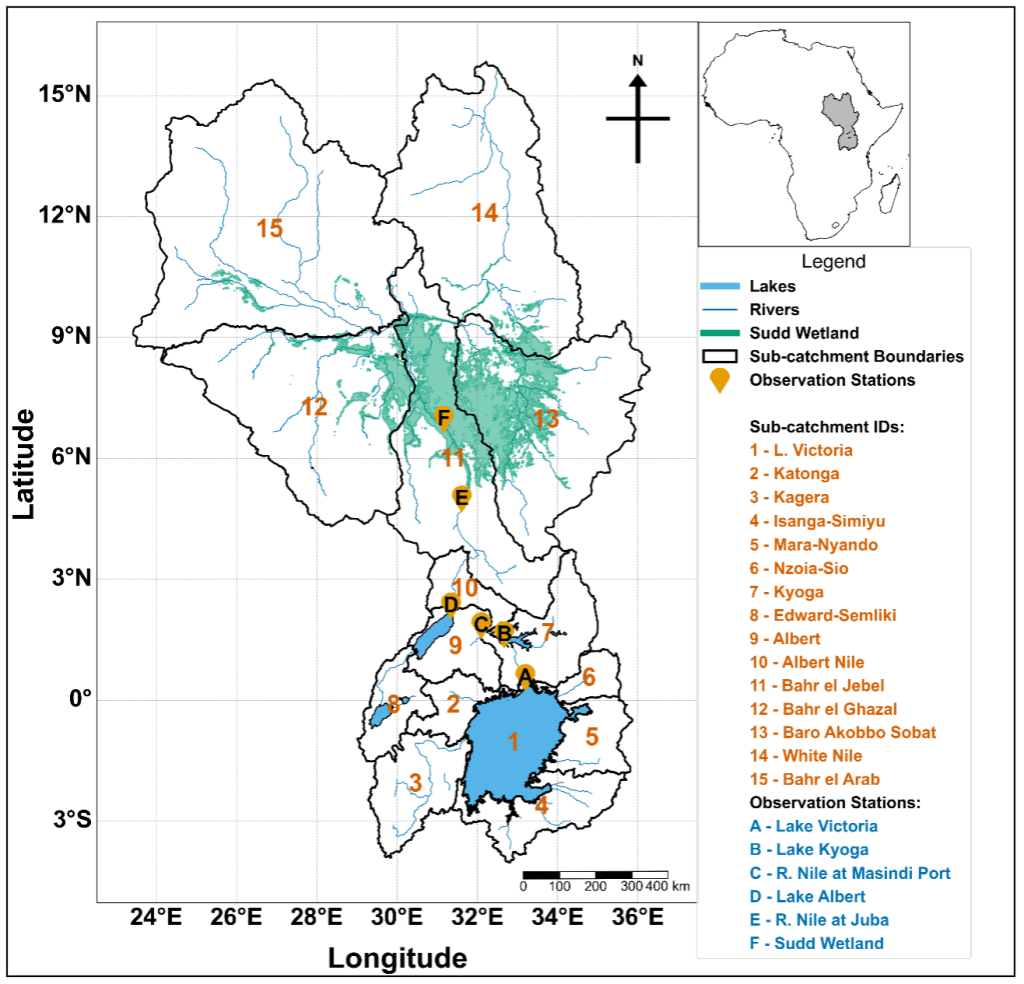
The White Nile forms one of the world’s most complex lake, river, and wetland systems, extending from Lake Victoria through Lakes Kyoga and Albert into the Sudd. Hydrologically, it is a system of connected reservoirs that store, delay, and gradually release floodwaters downstream.
For decades, operational planning assumed that floodwaters take roughly five months to travel from Lake Victoria to the Sudd. That estimate was never actually tested with data; it originated as a rule of thumb based on Lake Victoria annual maxima in May and peak flooding in South Sudan in September/October.
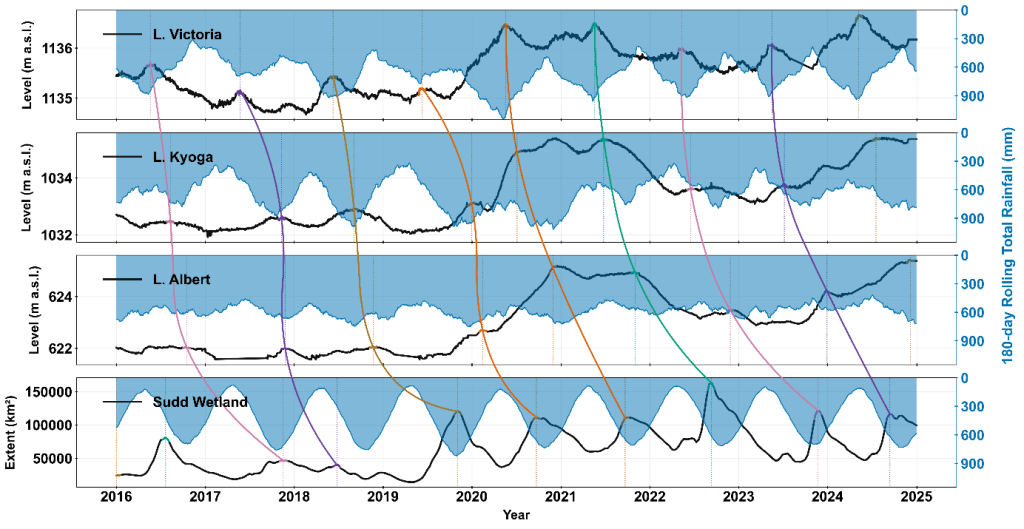
Our recent study challenged that assumption. By combining daily lake-level and discharge data (1950–2024) with CHIRPS rainfall and MODIS flood-extent records (2002–2024), we tracked how flood peaks propagated through the system, segment by segment. Using an automated peak-matching algorithm, we quantified the lag between successive annual maxima peaks in Lake Victoria, Lake Kyoga, Lake Albert, and the Sudd Wetland.
The unprecedented high-water regime of 2019-2024
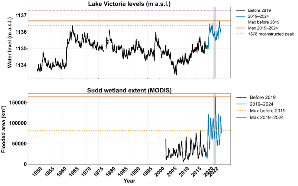
Between 2019 and 2024, both Lake Victoria and the Sudd reached record levels. Lake Victoria exceeded its historic 1964 peak in 2020, 2021, and 2024, while the Sudd expanded to more than twice its previous maximum extent. Each year from 2019 to 2024 stayed above any pre-2019 record, revealing that this was not a single flood season but a sustained multi-year regime.
The persistence of the 2019–2024 high-water regime mirrors earlier basin-wide episodes, including the 1961–64 and 1870s floods, when elevated lake levels and wetland extents were sustained across multiple years rather than confined to a single rainy season. However, the 2020s stand out as the most extensive amongst all the episodes since the start of the 20th century. These data confirm that both the headwaters and terminal floodplain remained at record levels for several consecutive years during 2019–2024, highlighting the unprecedented nature of this sustained high-water phase in the modern observational era.
2019–2024: How Multi-Year Rainfall Triggers Propagated a Basin-Wide Flood
The sequence of flood events began with the exceptionally strong positive Indian Ocean Dipole of 2019, which brought extreme rainfall across the Lake Victoria basin. This marked the first in a series of four consecutive anomalous rainfall seasons that sustained elevated inflows into the lake system. The October–December 2019 short rains were among the wettest on record, followed by above-normal rainfall in the March–May 2020 long rains, another wet short-rains season in late 2020, and continued high rainfall through early 2021. Together, these back-to-back wet seasons kept catchments saturated and prevented any significant drawdown of lake levels between seasons. Lake Victoria rose by more than 1.4 metres between September 2019 and May 2020, the highest increase since the 1960s, and remained near the 1960s historical maximum for consecutive years. As that excess water propagated downstream, Lakes Kyoga and Albert filled and stayed high through 2021. Even when regional rainfall weakened in 2022, these upstream lakes continued releasing stored water into the White Nile. The flood peak that reached the Sudd in 2022 corresponded closely to the 2021 Lake Victoria high-water phase.
This sequence shows that the 2022 disaster was not driven by a single rainfall event but by cumulative wetness over multiple seasons. Each lake acted as a slow reservoir that buffered and then released the 2019 to 2021 excess water, resulting in multi-year flooding that persisted long after rainfall had returned to near-normal levels.
Transit Time and Floodwave Propagation
Quantitative tracking showed that it takes an average of 16.8 months for a floodwave to travel from Lake Victoria to the Sudd. The fastest transmission occurs between Victoria and Kyoga (around 4 months), while the slowest and most attenuated segment lies between Albert and the Sudd (around 9 months).
This overturns the long-held assumption of a five-month travel time and reveals a system dominated by floodplain storage and delayed release. The 2019–2021 period showed relatively faster propagation because of high upstream storage, while 2022 exhibited the longest lag as the Sudd absorbed and held vast volumes of water. By establishing this timing empirically, the study offers a more realistic foundation for early-warning systems.
Wetland Activation and Flood Persistence
Satellite flood-extent maps reveal how the Sudd responded once the inflow arrived. The wetland expanded through multiple activation arms that progressively connected different sub-catchments:
- 2019: rainfall-fed expansion on the east (Baro–Akobo–Sobat and White Nile sub-basins)
- 2020–2021: a central-western arm from Bahr el Jebel extending into Bahr el Ghazal and a north-western connection from Bahr el Jebel to Bahr el Arab connected around Bentiu in Unity State.
- 2022: The two activated arms persisted so the JJAS seasonal rainfall in South Sudan and the inflow from the upstream lakes just compounded the activation leading to the massive flooding in Bentiu, turning the town into an island surrounded by water.
This geometry confirms that the Sudd functions not as a single floodplain but as a network of hydraulically linked basins. Once activated, these wetlands store and recycle water through backwater effects, evaporation, and lateral flow between channels. That internal connectivity explains why flooding persisted long after rainfall declined.
The Bigger Picture
Understanding these long lags is vital for effective flood forecasting and anticipatory humanitarian action. Current early-warning systems in South Sudan and Uganda mainly rely on short-term rainfall forecasts, which cannot capture the multi-season cumulative storage and delayed release that drive multi-year flooding.
By the time floodwaters reach the Sudd Wetland, the hydrological signature of releases from Lake Victoria has been substantially transformed by storage, delay, and attenuation within the intermediate lakes and wetlands. This means that downstream flood conditions are not a direct reflection of upstream releases but the result of cumulative interactions across the basin’s interconnected reservoirs.
The results suggest that antecedent storage conditions in Lakes Victoria, Kyoga, and Albert should be incorporated into regional flood outlooks. When upstream lake levels are exceptionally high, downstream alerts should remain elevated even if rainfall forecasts appear moderate. This approach aligns with impact-based forecasting, where decisions are informed not only by rainfall predictions but also by hydrological memory, system connectivity and potential impact of the floods.
The 2019–2024 high-water regime joins earlier basin-wide flood episodes in the 1870s, 1910s, and 1960s, each linked to multi-year wet phases across the equatorial lakes. The 1961–64 event raised Lake Victoria by about 2.5 metres and reshaped the Nile’s flow for several years. The 1870s flood appears even more extensive, showing that compound, persistent flooding is part of the White Nile’s natural variability.
Climate-change attribution studies indicate that the 2019–2020 rainfall anomaly was intensified by anthropogenic warming, increasing both its magnitude and probability. If such events become more frequent, the basin’s long-memory behaviour could convert short bursts of rainfall into multi-year high-water regimes.
This work reframes how we view the White Nile. It is not a fast, responsive river system but a slow-moving memory corridor in which floodwaves propagate, store, and echo over many months. Recognising this behaviour opens practical opportunities: it enables longer forecast lead times based on upstream indicators, supports coordinated management of lake releases, and strengthens early-action planning for humanitarian agencies across the basin.
It also highlights the need for continued monitoring and data sharing across national borders. Sparse observations remain a major limitation: station gaps, satellite blind spots, and non-public lake-release data all reduce our ability to model the system in real time. Improving this observational backbone is essential if we are to translate scientific insight into effective flood preparedness.
By Douglas Mulangwa (PhD researcher, Department of Meteorology, University of Reading), with contributions from Evet Naturinda, Charles Koboji, Benon T. Zaake, Emily Black, Hannah Cloke, and Elisabeth M. Stephens.
Acknowledgements
This research was conducted under the INFLOW project, funded through the CLARE programme (FCDO and IDRC), with collaboration from the Uganda Ministry of Water and Environment, the South Sudan Ministry of Water Resources and Irrigation, the World Food Programme(WFP), IGAD Climate Prediction and Application Centre (ICPAC), Médecins Sans Frontières (MSF), the Red Cross Red Crescent Climate Centre, Uganda Red Cross Society (URCS), the South Sudan Red Cross Red Crescent Society (SSRCS) and the Red Cross Red Crescent Climate Centre (RCCC).