By Khomkrit (Guy) Onkaew – k.onkaew@pgr.reading.ac.uk
If you look out at a cornfield or a dense forest, you see green. That’s chlorophyll, the pigment plants use to turn sunlight into energy. But there is something else happening in those leaves that the human eye completely misses. While they are basking in the sun, plants are also glowing.
During photosynthesis, plants absorb sunlight to create food. However, they don’t use 100% of the light they take in. A small fraction of that unused solar energy is re-emitted by the plant as a faint, reddish glow. This phenomenon is called Solar-Induced Chlorophyll Fluorescence, or SIF.
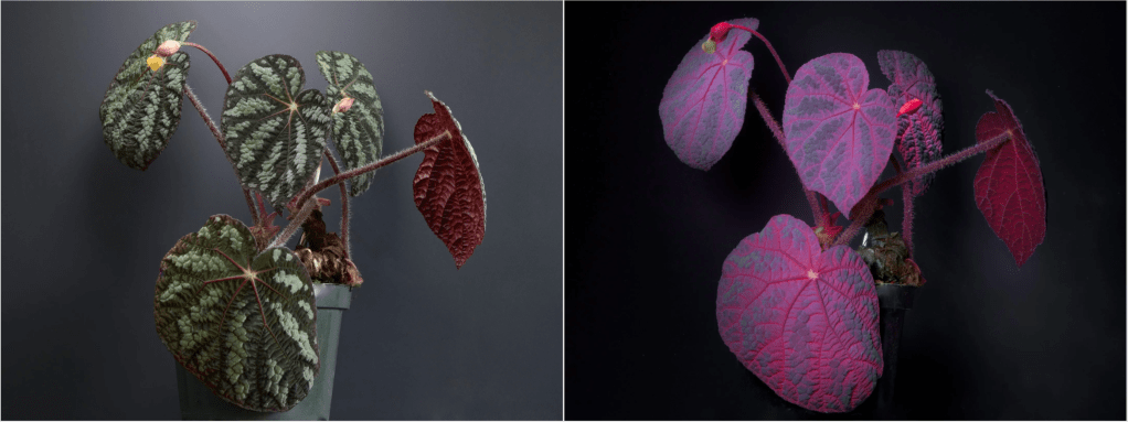
Left: Plant under daylight (535 nm). Right: Plant under UV light (365 nm), showing the reddish glow. (image source: https://www.exoticaesoterica.com/magazine/plantuvfluorescence)
Think of SIF as the “heartbeat” of a plant’s metabolism. When a plant is healthy and photosynthesising vigorously, this glow follows a regular pattern. But when a plant gets stressed — perhaps it’s too hot, or it hasn’t rained in weeks — that heartbeat changes.
For years, scientists have used special satellites to measure this glow from space to estimate how well vegetation is growing. Ideally, this glow would tell us exactly how productive the plants are. But there is a catch: a plant’s glow isn’t just determined by how much sun it gets; it is also determined by its “efficiency” in using that light.
This brings us to a question: What happens to that efficiency when the soil dries out?
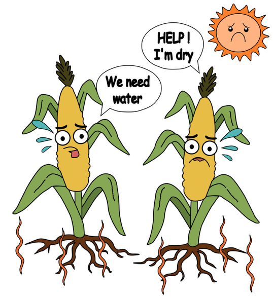
Imagine you kink a garden hose: as you restrict the water, the flow changes. Similarly, when plants run out of water in the soil, they close their stomata — tiny pores on their leaves — to save moisture. This shuts down photosynthesis. The plant then has to deal with all that incoming sunlight that it can no longer use. To protect itself, the plant dissipates that excess energy as heat, which causes the fluorescence glow to dim or change in efficiency.
In other words, this means that long before a crop turns yellow and dies from drought, its glow changes. If we can understand the relationship between soil moisture and glow, we could potentially predict crop failures and droughts much earlier than we can by just looking at how green the plants are.
Decoding the Signal: A New Study on Africa’s Ecosystems
This is where our study steps in. We focused on the African continent to solve a specific puzzle: How does soil moisture stress change the fluorescence efficiency of plants?
Africa offers the perfect laboratory for this question because it holds almost every type of ecosystem imaginable, from the bone-dry Sahara and the semi-arid savannas to the lush Congo rainforest. We combined satellite data from The TROPOspheric Monitoring Instrument TROPOMI, which measures the SIF glow, with a sophisticated land model, the Joint UK Land Environment Simulator (JULES), which estimates soil moisture deep in the ground.
We tested two different models to see which one better predicted the actual glow observed by satellites:
1. The Baseline Model: Assumed the glow depends only on the light the plant absorbs.
2. The Soil Moisture Model: Assumed the glow is influenced by both the light absorbed and how wet the soil is.
African Plants’ Thirst Strategies
Our study produced some fascinating results regarding how different plants handle thirst. We found that fluorescence efficiency is not one-size-fits-all; it depends entirely on the plant’s “lifestyle”.
1. The “Panickers”: Croplands and Grasslands
We discovered that croplands and grasslands are the “drama queens” of the plant world; they easily panic as soon as the soil dries. These plants show the strongest reaction to soil moisture. When the topsoil dries out, their efficiency plummets; when the soil is wet, their efficiency spikes. This makes sense because crops like maize usually have shallow roots. They live and die by the moisture in the top layer of dirt, making them incredibly sensitive monitors for agricultural drought.
2. The “Resilient”: Evergreen Forests
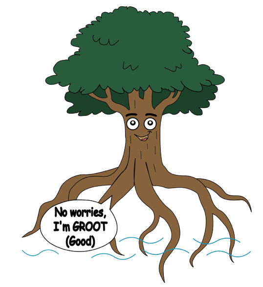
On the other hand, evergreen forests (like those in the Congo basin) were surprisingly indifferent. Their fluorescence efficiency barely changed even when soil moisture levels changed. Why? These trees have deep, complex root systems that can tap into groundwater reserves far below the surface. They don’t panic when the topsoil gets dry because they have a backup water supply.
3. The “Balancers”: Savannas and Shrublands

Moreover, we found that plants in semi-arid regions like the Sahel have evolved to be adaptive. They ramp up their efficiency quickly at the first sign of rain, but don’t waste extra energy once they have “enough” water.
The Map of Improvement
We found that adding soil moisture data to these models significantly improved their ability to simulate the plant glow in semi-arid regions, such as the Sahel and Southern Africa (the blue area in Figure C). In these water-limited environments, you cannot understand the plant’s light signal without understanding the water in the soil.
However, the study also highlighted where the models fail. In wetlands such as the Okavango Delta and the Sudd Swamp (Locations 5 and 6 in Figure C, respectively), adding soil moisture data worsened the model or yielded no improvement. This is likely because satellite models struggle to understand complex water systems where water flows horizontally or sits just below the surface, keeping plants happy even when the model thinks they should be dry.
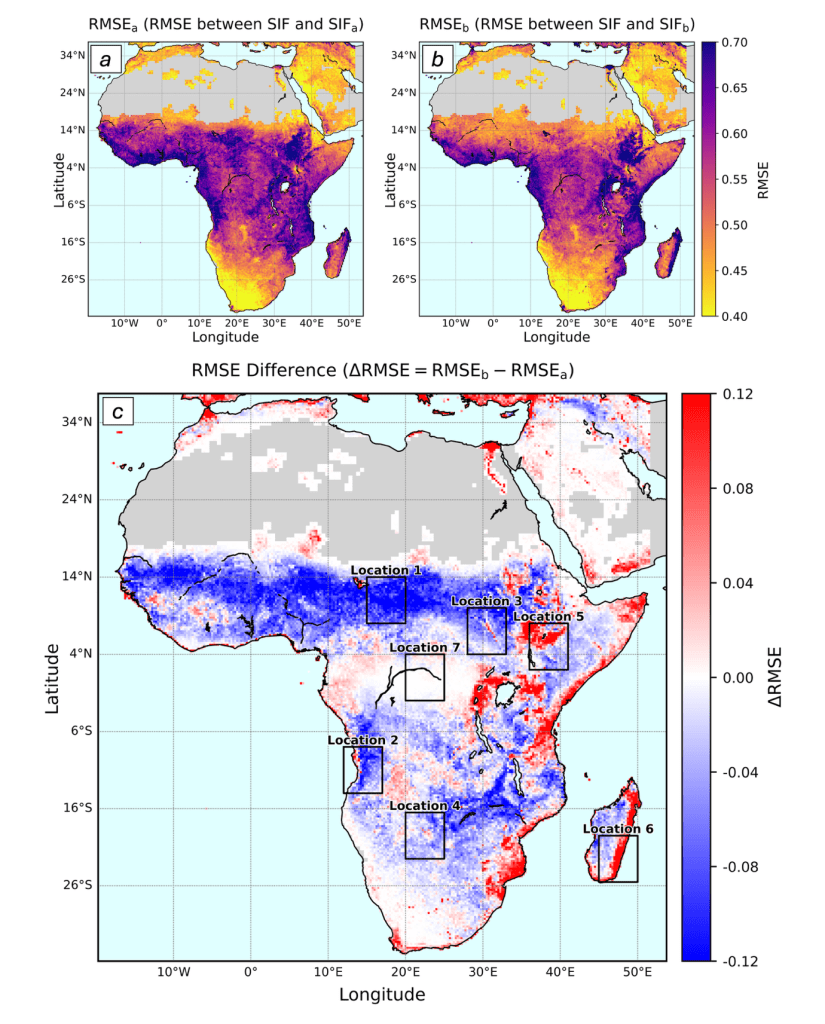
Spatial distribution maps of RMSE for two SIF simulation models across Africa. (a) RMSE between observed SIF and the Baseline Model (SIFa), which does not include soil moisture availability (β). (b) RMSE between observed SIF and the Soil Moisture Model (SIFb), which includes β. (c) RMSE difference (ΔRMSE = RMSEb − RMSEa). Blue regions (ΔRMSE < 0) indicate areas where including β improves model performance (Model 2 outperforms), while red areas (ΔRMSE > 0) show regions where including β worsens the fit. Grey areas indicate missing data.
The Takeaway
This research is a step toward “context-dependent” monitoring. We can’t just look at a satellite image and apply a single rule to the whole planet. To truly monitor the health of our food systems and forests from space, we have to treat a shallow-rooted cornfield in a semi-arid zone differently from a deep-rooted tree in a tropical forest. By linking the “glow” of the plants to the water in the soil, we are getting closer to a real-time health check for the Earth’s vegetation.
More details from the paper: https://doi.org/10.1080/01431161.2026.2618097