A hackathon, from the words hack (meaning exploratory programming, not the alternate meaning of breaching computer security) and marathon, is usually a sprint-like event where programmers collaborate intensively with the goal of creating functioning software by the end of the event. From 2 to 4 June 2021, more than a hundred early career climate scientists and enthusiasts (mostly PhDs and Postdocs) from UK universities took part in a climate hackathon organised jointly by Universities of Bristol, Exeter and Leeds, and the Met Office. The common goal was to quickly analyse certain aspects of Climate Model Intercomparison Project 6 (CMIP6) data to output cutting-edge research that could be worked into a published material and shown in this year’s COP26.
Before the event, attendees signed up to their preferred project from a choice of ten. Topics ranged from how climate change will affect migration of arctic terns to the effects of geoengineering by stratospheric sulfate injections and more… Senior academics from a range of disciplines and institutions led each project.
Group photo of participants at the CMIP6 Data Hackathon
How is this virtual hackathon different to a usual hackathon?
Like many other events this year, the hackathon took place virtually, using a combination of video conferencing (Zoom) for seminars and teamwork, and discussion forums (Slack).
Brian:
Compared to two 24-hour non-climate related hackathons I previously attended, this one was spread out for three days, so I managed not to disrupt my usual sleep schedules! The experience of pair programming with one or two other team members was as easy, since I shared one of my screens on Zoom breakout rooms throughout the event. What I really missed were the free meals, plenty of snacks and drinks usually on offer at normal hackathons to keep me energised while I programmed.
Chloe:
I’ve been to a climate campaign hackathon before, and I did a hackathon style event to end a group project during the computer science part of my undergraduate; we made the boardgame buccaneer in java. But this was set out completely differently. And, it was not as time intensive as those which was nice. I missed not being in a room with those you are on a project with and still missing out on free food – hopefully not for too much longer. But we made use of Zoom and Slack for communication. And Jasmin and the version control that git offers with individuals working on branches and then these were merged at the end of the hackathon.
What did we do?
Brian:
Project 2: How well do the CMIP6 models represent the tropical rainfall belt over Africa?
Using Gaussian parameters in Nikulin & Hewitson 2019 to describe the intensity, mean meridional position and width of the tropical rainfall belt (TRB), the team I was in investigated three aspects of CMIP6 models for capturing the Africa TRB, namely the model biases, projections and whether there was any useful forecast information in CMIP6 decadal hindcasts. These retrospective forecasts were generated under the Decadal Climate Prediction Project (DCPP), with an aim of investigating the skill of CMIP models in predicting climate variations from a year to a decade ahead. Our larger group of around ten split ourselves amongst these three key aspects. I focused on aspect of CMIP6 decadal hindcasts, where I compared different decadal models at different model lead times with three observation sources.
Chloe:
Project 10: Human heat stress in a warming world
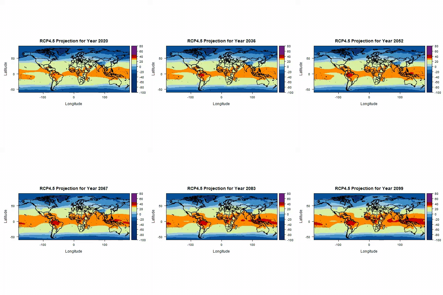
Our team leader Chris had calculated the universal thermal climate index (UTCI) – a heat stress index for a bunch of the CMIP6 climate models. He was looking into bias correction against the ERA5 HEAT reanalysis dataset whilst we split into smaller groups. We looked at a range of different things from how the intensity of heat stress changed to how the UTCI compared to mortality. I ended up coding with one of my (5) PhD supervisors Claudia Di Napoli and we made amongst other things the gif below.
See the Annual Means of the UTCI for RCP4.5 (medium emissions) projection from 2020 to 2099. Notice Brazil having a particularly tough time with heat stress 🥵🌿.
Would we recommend meteorology/climate-related hackathon?
Brian:
Yes! The three days was a nice break from my own radar research work. The event was nevertheless good training for thinking quickly and creatively to approach research questions other than those in my own PhD project. The experience also sharpened my coding and data exploration skills, while also getting the chance to quickly learn advanced methods for certain software packages (such as xarray and iris). I was amazed at the amount of scientific output achieved in only three short days!
Chloe:
Yes, but also make sure if it’s online you block out the time and dedicate all your focus to the hackathon. Don’t be like me. The hackathon taught me more about python handling of netcdfs, but I am not yet a python plotting convert, there are some things R is just nicer for. And I still love researching heat stress and heatwaves, so that’s good!
We hope that the CMIP hackathon runs again next year to give more people the opportunity to get involved.
During the summer of 2003, Europe experienced two heatwaves with, until then, unprecedented temperatures. The 2003 summer temperature record was shattered in 2010 by the Russian heatwave, which broke even Paleo records. The question remained, if climate change influenced these two events. Many contribution studies based on the likelihood of the dynamical situation were published, providing important input to answering this question. However, the position of low and high-pressure systems and other dynamical aspects of climate change are noisy and uncertain. The storyline method attributes the thermodynamic aspects of climate change (e.g. temperature), which are visible in observations and far more certain.
Storylines
All of us regularly think in terms of what ifand if only. It is the human way of calculating hypothetic results in case we would have made a different choice. This helps us think in future scenarios, trying to figure out what choice will lead to which consequence. It is a tool to reduce risk by finding a future scenario that seems the best or safest outcome. In the storyline method, we use this exact mind-set. What ifthere was no climate change, would this heatwave be the same? What if the world was 2°C warmer, what would this heatwave have looked like then? With the help of an atmospheric model we can calculate what a heatwave would have been like in a world without climate change or increased climate change.
In our study, we have two storylines: 1) the world as we know it that includes a changing climate, which we call the ‘factual’ storyline and 2) a world that could have been without climate change, which we call the ‘counterfactual’ storyline. We simulate the dynamical aspects of the weather extreme exactly the same in both storylines using a spectral nudging technique and compare the differences in temperatures. To put it more precise, the horizontal wind flow is made up out of vorticity (circular movement) and divergence (spreading out or closing in). We nudge (or push) these two variables in the higher atmosphere to, on large scale, be the same in the factual and counterfactual simulations.
Figure 1. What if we had another world where climate change did not happen? Would the heatwave have been different? Thinking in counterfactual worlds where we made (or will make) different decisions is a common way of thinking to estimate risk. Now we apply this idea in atmospheric modelling.
European 2003 and Russian 2010 heatwaves
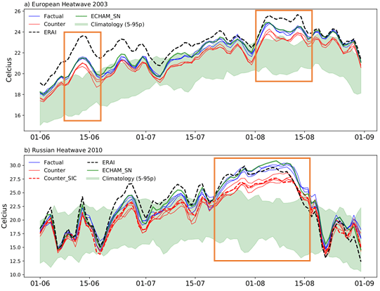
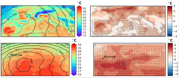
Both the European heatwave in 2003 and the Russian heatwave in 2010 were extremes with unprecedented high temperatures for long periods of time. Besides, there had been little rain already from spring in either case, which reduced the cooling effect from moisty soil to nearly nothing. In our analysis we averaged the near surface temperatures in both storylines and compared their output to each other as well as the local climatology. Figure 2 shows the results of that averaging for the European heatwave in panel a and the Russian heatwave in panel b. We focus on the orange boxes, where the blue lines (factual storyline) and the red lines (counterfactual storyline) exceed the 5th-95th percentile climatology (green band). This means that during those days the atmosphere near the surface was uncommonly hot (thus a heatwave). The most important result in this graph is that the blue and red lines are separate from each other in the orange boxes. This means that the average temperature of the world with climate change (blue, factual) is higher than in the world without climate change (red, counterfactual).
“Even though there would have been a heatwave with or without climate change, climate change has made the heat more extreme”
Figure 2. Daily mean temperature at 2 meters height for (a) European summer 2003 and (b) Russian summer 2010. The orange boxes are the heatwaves, where the temperatures of the factual (blue) and counterfactual (red) are above the green band of 5th – 95th percentile climatology temperatures.
The difference between these temperatures are not the same everywhere, it strongly depends on where you are in Europe or Russia. Let me explain what I mean with the help of Figure 3 with the difference between factual and counterfactual temperatures (right panels) on a map. In both Europe and Russia, we see that there are local regions with temperature differences of almost 0°C, and we see regions where the differences are almost 2.5°C (for Europe) or even 4°C (for Russia). A person living south from Moscow would therefore not have experienced 33°C but 29°C in a world without climate change. It is easy to imagine that such a temperature difference changes the impacts a heatwave has on e.g. public health and agriculture.
Figure 3. Upper left: Average Temperature at 2 meter height and Geopotential height over Europe at z500 for 1-15thof August 2003, Lower left: Same as upper left but for 1-15th of Russia August 2010. Upper right: Factual minus Counterfactual average temperature at 2 meter height over Europe for 1-15th ofAugust 2003, Lower right: same as lower left but for 1-15th of Russia August 2010. Stippling indicates robust results (all factuals are >0.1°C warmer than all counterfactuals)
“The 2003 European and 2010 Russian heatwaves could locally have been 2.5°C – 4°C cooler in a world without climate change”
We can conclude therefore, that with the help of our nudged storyline method, we can study the climate signal in extreme events with larger certainty.
If you are interested in the elaborate explanation of the method and analysis of the two case studies, please take a look at our paper:
van Garderen, L., Feser, F., and Shepherd, T. G.: A methodology for attributing the role of climate change in extreme events: a global spectrally nudged storyline, Nat. Hazards Earth Syst. Sci., 21, 171–186, https://doi.org/10.5194/nhess-21-171-2021 , 2021.
If you have questions or remarks, please contact Linda van Garderen at linda.vangarderen@hzg.de.
The Arctic region is rapidly changing, with surface temperatures warming at around twice the global average and sea ice extent is rapidly declining, particularly in the summer. These changes affect the local ecosystems and people as well as the rest of the global climate. The decline in sea ice has corresponded with cold winters over the Northern Hemisphere mid-latitudes and an increase in other extreme weather events (Cohen et al., 2014). There are many suggested mechanisms linking changes in the sea ice to changes in the stratospheric jet, midlatitude jet and storm tracks; however this is an area of active research, with much ongoing debate.
Figure 1. Time-series of September sea ice extent from 20 CMIP5 models (colored lines), individual ensemble members are dotted lines and the individual model mean is solid. Multi-model ensemble mean from a subset of the models is shown in solid black with +/- 1 standard deviation in dotted black. The red line shows observations. From Stroeve et al. (2012)
It is therefore important that we are able to understand and predict the changes in the Arctic, however there is still a lot of uncertainty. Stroeve et al. (2012) calculated time series of September sea ice extent for different CMIP5 models, shown in Figure 1. In general the models do a reasonable job of reproducing the recent trends in sea ice decline, although there is a large inter-model spread and and even larger spread in future projections. One area of model development is increasing the horizontal resolution – where the size of the grid cells used to calculate the model equations is reduced.
The aim of my PhD is to investigate the impact that climate model resolution has on the representation of the Arctic climate. This will help us understand the benefits that we can get from increasing model resolution. The first part of the project was investigating the impact of atmospheric resolution. We looked at three experiments (using HadGEM3-GC2), each at a different atmospheric resolutions: 135km (N512), 60km (N216) and 25km (N96).
Figure 2. Annual mean sea ice concentration for observations (HadISST) and the bias of each different experiment from the observations N96: low resolution, N216: medium resolution, N512: high resolution.
The annual mean sea ice concentration for observations and the biases of the 3 experiments are shown in Figure 2. The low resolution experiment does a good job of producing the sea extent seen in observations with only small biases in the marginal sea ice regions. However, in the higher resolution experiments we find that the sea ice concentration is much lower than the observations, particularly in the Barents Sea (north of Norway). These changes in sea ice are consistent with warmer temperatures in the high resolution experiments compared to the low resolution.
To understand where these changes have come from we looked at the energy transported into the ocean by the atmosphere and the ocean. We found that there is an increase in the total energy being transported into the Arctic which is consistent with the reduced sea ice and warmer temperatures. Interestingly, the increase in energy is being transported into the Arctic by the ocean (Figure 3), even though it is the atmospheric resolution that is changing between the experiments. In the high resolution experiments the ocean energy transport into the Arctic, 0.15 petawatts (PW), is in better agreement with observational estimates, 0.154 PW, from Tsubouchi et al. (2018). Interestingly, this is in contrast to the worse representation of sea ice concentration in the high resolution experiments. (It is important to note that the model was tuned at the low resolution and as little as possible was changed when running the high resolution experiments which may contribute to the better sea ice concentration in the low resolution experiment.)
Location of ocean gateways into the Arctic. Red: Bering Strait, Green: Davis Strait, Blue: Fram Strait, Magenta: Barents Sea
Figure 3. Ocean energy transport for each resolution experiment through the four ocean gateways into the Arctic. The four gateways form a closed boundary into the Arctic.
We find that the ocean is very sensitive to the differences in the surface winds between the high and low resolution experiments. In different regions the differences in winds arise from different processes. In the Davis Strait the effect of coastal tiling is important, where at higher resolution a smaller area is covered by atmospheric grid cells that cover both land and ocean. In a cell covering both land and ocean the model usually produces wind speeds to low for over the ocean. Therefore in the higher resolution experiment we find that there are higher wind speeds over the ocean near the coast. Whereas over the Fram Strait and the Barents Sea instead we find that there are large scale atmospheric circulation changes that give the differences in surface winds between the experiments.
References
Cohen, J., Screen, J. A., Furtado, J. C., Barlow, M., Whittleston, D., Coumou, D., Francis, J., Dethloff, K., Entekhabi, D., Overland, J. & Jones, J. 2014: Recent Arctic amplification and extreme mid-latitude weather. Nature Geoscience, 7(9), 627–637, http://dx.doi.org/10.1038/ngeo2234
Stroeve, J. C., Kattsov, V., Barrett, A., Serreze, M., Pavlova, T., Holland, M., & Meier, W. N., 2012: Trends in Arctic sea ice extent from CMIP5, CMIP3 and observations. Geophysical Research Letters, 39(16), 1–7, https://doi.org/10.1029/2012GL052676
Tsubouchi, T., Bacon, S., Naveira Garabato, A. C., Aksenov, Y., Laxon, S. W., Fahrbach, E., Beszczynska-Möller, A., Hansen, E., Lee, C.M., Ingvaldsen, R. B. 2018: The Arctic Ocean Seasonal Cycles of Heat and Freshwater Fluxes: Observation-Based Inverse Estimates. Journal of Physical Oceanography, 48(9), 2029–2055, http://journals.ametsoc.org/doi/10.1175/JPO-D-17-0239.1
Williams, R. S., Hegglin, M. I., Kerridge, B. J., Jöckel, P., Latter, B. G., and Plummer, D. A.: Characterising the seasonal and geographical variability in tropospheric ozone, stratospheric influence and recent changes, Atmos. Chem. Phys., 19, 3589–3620, https://doi.org/10.5194/acp-19-3589-2019, 2019.
Approximately 90 % of atmospheric ozone (O3) today resides in the stratosphere, which we know as the ozone layer (extending from ~15-35 km), where it plays a critical role in filtering out most of the harmful ultraviolet (UV) rays from the sun. The gradual formation of the ozone layer from around 600 million years ago was key in Earth’s evolutionary history, as it enabled life to flourish on land. Lesser known is the importance of the remaining ~ 10 % of atmospheric ozone, which is found in the troposphere and has implications for air quality, radiative forcing and the oxidation capacity of the troposphere. Whilst ozone is a pollutant at ground level, contributing to an estimated 6 million premature deaths globally per year, it also acts to cleanse the troposphere by breaking down a large number of pollutants, along with some greenhouse gases. Ozone is however a greenhouse gas in itself – where it has a maximum radiative forcing in the upper troposphere. It is an example of a non-well mixed gas, owing to its spatially and temporally highly varying sources and sinks, as well as its relatively short global mean tropospheric lifetime of about 3 weeks.
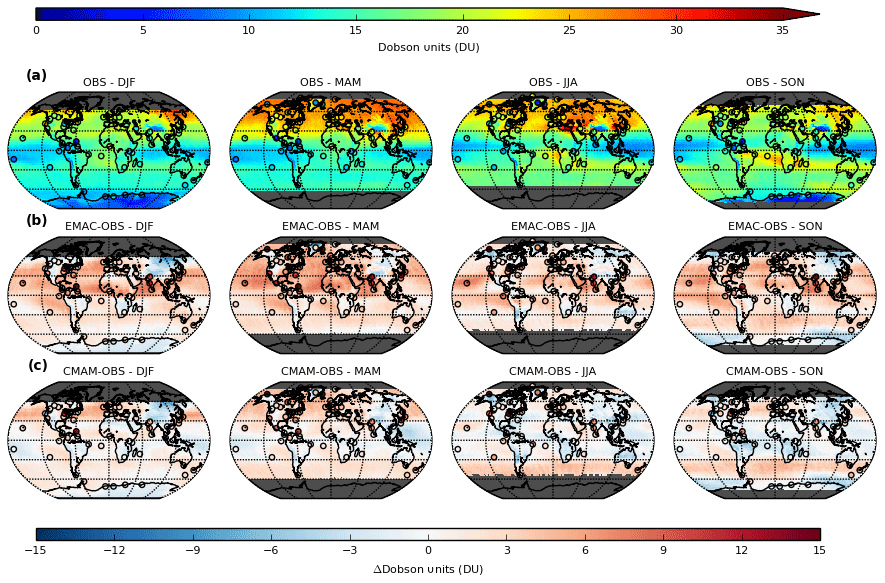
Figure 1 – Seasonal composites of monthly averaged 1000-450 hPa (0-5.5 km) subcolumn O3 (DU) for 2005-2010 (left to right) from (a) OMI, (b) EMAC minus OMI and (c) CMAM minus OMI. Circles denote (a) equivalent ozone-sonde derived subcolumn O3 (DU), (b) EMAC minus ozone-sonde differences and (c) CMAM minus ozone-sonde differences. All data were regridded to 2.5° resolution (~ 275 km). 1 Dobson Unit (DU) equates to a thickness of 0.01 mm if it were compressed at sea level.
A major source of tropospheric ozone is the photochemical reactions of emission precursors such as carbon monoxide (CO), nitrogen oxides (NOx) and volatile organic compounds (VOCs), which have both natural and anthropogenic sources, in addition to the natural influx of ozone-rich air from the stratosphere. The magnitude of these two competing influences has been poorly quantified until the recent advent of satellite observations and the development of comprehensive chemistry-climate models (CCMs), which simulate interactive chemistry and are stratospherically well-resolved.
Our study aimed to update and extend the knowledge of a previous key study (Lamarque et al., 1999), that investigated the role of stratosphere-troposphere exchange (STE) on tropospheric ozone, using two contemporary state-of-the-art CCMs (EMAC and CMAM) with stratospheric-tagged ozone tracers as a diagnostic. We first sought to validate the realism of the model ozone estimates with respect to satellite observations from the Ozone Monitoring Instrument (OMI), together with spatially and temporally limited vertical profile information provided from ozonesondes, which we resolved globally on a seasonal basis for the troposphere (1000-450 hPa) (Figure 1).
Whilst we found broad overall agreement with both sets of observations, an overall systematic bias in EMAC of + 2-8 DU (Dobson Units) and regionally and seasonally varying biases in CMAM (± 4 DU) can be seen in the respective difference panels (Figure 1b and 1c). A height-resolved comparison of the models with respect to regionally aggregated ozonesonde observations helped us to understand the origin of these model biases. We showed that apparent closer agreement in CMAM arises due to compensation of a low bias in photochemically produced ozone in the troposphere, resulting from the omission of a group of emission precursors in this model, by excessive smearing of ozone from the lower stratosphere due to an inherent high bias. This smearing is induced when accounting for the satellite observation geometry of OMI, necessary to ensure a direct comparison with vertically well-resolved models, which has limited vertical resolution due to its nadir field of view. The opposite was found to be the case in EMAC, with a high (low) bias in the troposphere (lower stratosphere) relative to ozonesondes. Given the similarity in the emission inventories used in both models, the high bias in this model indicates that excess in situ photochemical production from emission precursors is simulated within the interactive chemistry scheme. These findings emphasise the importance of understanding the origin of such biases, which can help prevent erroneous interpretations of subsequent model-based evaluations.
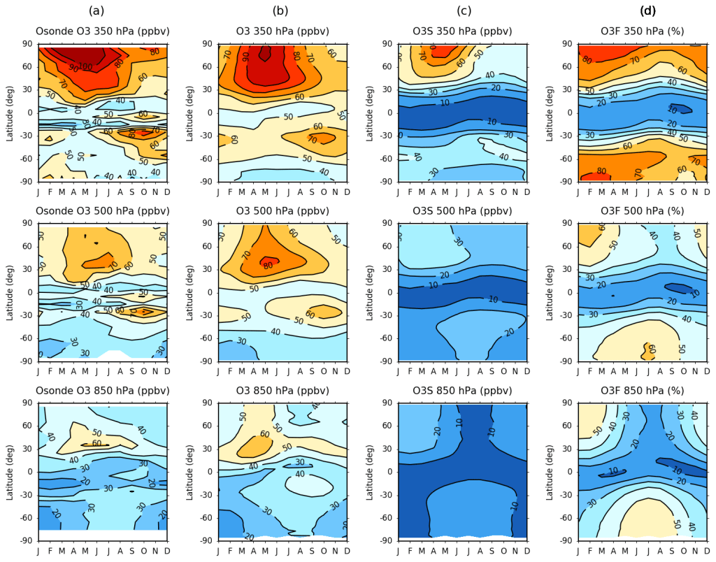
Noting these model biases, we next exploited the fine scale vertical resolution offered by the CCMs to investigate the regional and seasonal variability of the stratospheric influence. Analysis of the model stratospheric ozone (O3S) tracers revealed large differences in the burden of ozone in the extratropical upper troposphere-lower stratosphere (UTLS) region, with some 50-100 % more ozone in CMAM compared to EMAC. We postulated that CMAM must simulate a stronger lower branch of the Brewer-Dobson Circulation, the meridional stratospheric overturning circulation, since the stratospheric influence is isolated using these simulations. This has implications for the simulated magnitude and distribution of the downward flux of ozone from the stratosphere in each model. Shown in Figure 2 is the zonal-mean monthly evolution of ozone volume mixing ratio (ppbv) from ozonesondes and EMAC over the period 1980-2013 for the upper (350 hPa), middle (500 hPa) and lower (850 hPa) troposphere, together with the EMAC O3S and derived fraction of ozone of stratospheric origin (O3F) (%) evolution.
We found that the ozonesonde evolution closely resembles that of both EMAC and CMAM (not shown) throughout the troposphere. A clear correspondence in the seasonality of ozone is also evident for the EMAC O3S tracer, and in turn the O3F evolution, particularly towards the upper troposphere. Nonetheless, both models imply that over 50 % of near-surface ozone is derived from the stratosphere during wintertime in the extratropics, which is substantially greater than that estimated by Lamarque et al. (1999) (~ 10-20 %), and still considerably higher than more recent studies (~ 30-50 %) (e.g. Banarjee et al., 2016). This indicates that the stratospheric influence may indeed be larger than previously thought and is thus an important consideration when attempting to understand past, present and future trends in tropospheric ozone.
Figure 2 – Zonal-mean monthly mean evolution of ozone (O3) volume mixing ratio (ppbv) derived from (a) ozonesondes and (b) EMAC. The evolution of the (c) EMAC stratospheric ozone (O3S) tracer and (d) stratospheric fraction (O3F) (%) are additionally included over the period 1980-2010 for 350 hPa (top row), 500 hPa (middle row) and 850 hPa (bottom row).
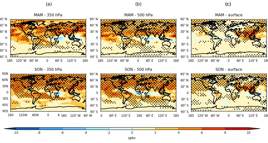
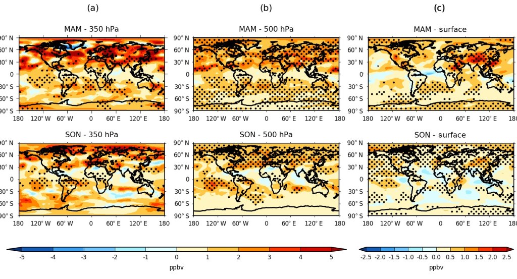
Finally, we analysed height-resolved seasonal changes in both the model O3 and O3S between 1980-89 and 2001-10. The calculated hemispheric springtime (MAM/SON) changes in ozone are shown in Figure 3, and equivalently for O3S in Figure 4, for the upper and middle troposphere (350 and 500 hPa), as well as for the surface model level. A general increase in tropospheric ozone was found worldwide in all seasons, which is maximised overall during spring in both the Northern Hemisphere (~ 4-6 ppbv) and the Southern Hemisphere subtropics (~ 2-6 ppbv), corresponding to a relative increase of about 5-10 %. Respectively, a significant stratospheric contribution to this change of ~ 3-5 ppbv and ~ 1-4 ppbv is estimated using the model O3S tracers (~ 50-80 % of the total change), although with substantial inter-model disagreement over the magnitude and sometimes the sign of the attributable change for any given region or season from the stratosphere.
Figure 3 – Seasonal change in EMAC ozone volume mixing ratio (O3) (ppbv) between 1980-89 and 2001-10 for MAM (top) and SON (bottom) at (a) 350 hPa, (b) 500 hPa and (c) the surface model level. Stippling denotes regions of statistical significance according to a paired two-sided t-test (p < 0.05).
Although surface ozone changes are dominated by regional changes in precursor emissions between the two periods – the largest, statistically significant increases (> 6 ppbv) being over south-east Asia – the changing influence from the stratosphere were estimated to be up to 1–2 ppbv between the two periods in the Northern Hemisphere, albeit with high regional, seasonal and inter-model variability. In relative terms, the stratosphere can be seen to typically explain 25-30 % of the surface change over regions such as the Himalayas, although locally it may represent the dominant driver (> 50 %) where changes in emission precursors are negligible or even declining due to the enforcement of more stringent air quality regulations over regions such as western Europe and eastern North America in recent years.
Figure 4 – Seasonal change in EMAC stratospheric ozone volume mixing ratio (O3S) (ppbv) between 1980-89 and 2001-10 for MAM (top) and SON (bottom) at (a) 350 hPa, (b) 500 hPa and (c) the surface model level. Stippling denotes regions of statistical significance according to a paired two-sided t-test (p < 0.05). Note the scale difference between (a-b) and (c).
To summarise, our paper highlights some of the shortcomings of the EMAC and CMAM CCMs with respect to observations and we emphasise the importance of understanding model bias origins when performing subsequent model-based evaluations. Additionally, our evaluations highlight the necessity of a well-resolved stratosphere in models for quantifying the stratospheric influence on tropospheric ozone. We find evidence that the stratospheric influence may be larger than previously thought, compared with previous model-based studies, which is a highly significant finding for understanding tropospheric ozone trends.
References: Lamarque, J. F., Hess, P. G. and Tie, X. X.: Three‐dimensional model study of the influence of stratosphere‐troposphere exchange and its distribution on tropospheric chemistry., J. Geophys. Res. Atmos., 104(D21), 26363-26372, https://doi:10.1029/1999JD900762, 1999.
Banerjee, A., Maycock, A. C., Archibald, A. T., Abraham, N. L., Telford, P., Braesicke, P., and Pyle, J. A.: Drivers of changes in stratospheric and tropospheric ozone between year 2000 and 2100., Atmos. Chem. Phys., 16, 2727-2746, https://doi.org/10.5194/acp-16-2727-2016, 2016.
Current generation climate models are typically run with horizontal resolutions of 25–50 km. This means that the models cannot explicitly represent atmospheric phenomena that are smaller than these resolutions. An analogy for this is with the resolution of a camera: in a low-resolution, blocky image you cannot make out all the finer details. In the case of climate models, the unresolved phenomena might still be important for what happens at the larger, resolved scales. This is true for convective clouds – clouds such as cumulus and cumulonimbus that are formed from differences in density, caused by latent heat release, between the clouds and the environmental air. Convective clouds are typically around hundreds to thousands of metres in their horizontal size, and so are much smaller than the size of individual grid-columns of a climate model.
Convective clouds are produced by instability in the atmosphere. Air that rises ends up being warmer, and so less dense, than the air that surrounds it, due to the release of latent heat as water is formed by the condensation of water vapour. The heating they produce acts to reduce this instability, leading to a more stable atmosphere. To ensure that this stabilizing effect is included in climate model simulations, convective clouds are represented through what is called a convection parametrization scheme – the stabilization is boiled down to a small number of parameters that model how the clouds act to reduce the instability in a given grid-column. The parametrization scheme then models the action of the clouds in a grid-column by heating the atmosphere higher up, which reduces the instability.
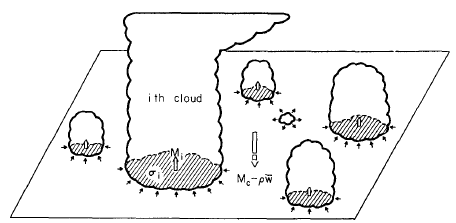
Convection parametrization schemes work by making a series of assumptions about the convective clouds in each grid-column. These include the assumption that there will be many individual convective clouds in grid-columns where convection is active (Fig. 1), and that these clouds will only interact through stabilizing a shared environment. However, in nature, many forms of convective organization are observed, which are not currently represented by convection parametrization schemes.
Figure 1: From Arakawa and Schubert, 1974. Cloud field with many clouds in it – each interacting with each other only by modifying a shared environment.
In my PhD, I am interested in how vertical wind shear can cause the organization of convective cloud fields. Wind shear occurs when the wind is stronger at one height than another. When there is wind shear in the lower part of the atmosphere – the boundary layer – it can organize individual clouds into much larger cloud groups. An example of this is squall lines, which are often seen over the tropics and in mid-latitudes over the USA and China. Squall lines are a type of Mesoscale Convective System (MCS), which account for a large part of the total precipitation over the tropics – between 50 – 80 %. Including their effects in a climate model can therefore have an impact of the distribution of precipitation over the tropics, which is one area where there are substantial discrepancies between climate models and observations.
The goal of my PhD is to work out how to represent shear-induced organization of cloud fields in a climate model’s convection parametrization scheme. The approach I am taking is as follows. First, I need to know where in the climate model the organization of convection is likely to be active. To do this, I have developed a method for examining all of the wind profiles that are produced by the climate model over the tropics, and grouping these into a set of 10 wind profiles that are probably associated with the organization of convection. The link between organization and each grid-column is made by checking that the atmospheric conditions have enough instability to produce convective clouds, and that there is enough low-level shear to make organization likely to happen. With these wind profiles in hand, where they occur can be worked out (Fig. 2 shows the distribution for one of these profiles). The distributions can be compared with distributions of MCSs from satellite observations, and the similarities between the distributions builds confidence that the method is finding wind profiles that are associated with the organization of convection.
Figure 2: Geographical distribution of one of the 10 wind profiles that represents where organization is likely to occur over the tropics. The profile shows a high degree of activity in the north-west tropical Pacific, an area where organization of convection also occurs. This region can be matched to an area of high MCS activity from a satellite derived climatology produced by Mohr and Zipser, 1996.
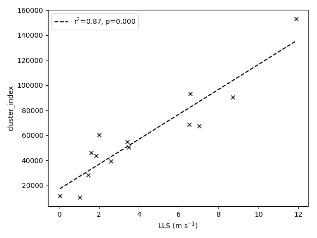
Second, with these profiles, I can run a set of high-resolution idealized models. The purpose of these is to check that the wind profiles do indeed cause the organization of convection, then to work out a set of relationships that can be used to parametrize the organization that occurs. Given the link between low-level shear and organization, it seems like a good place to start is to check that this link appears in my experiments. Fig. 3 shows the correlation between the low-level shear, and a measure of organization. A clear relationship is seen to hold between these two variables, providing a simple means of parametrizing the degree of organization from the low-level shear in a grid-column.
Figure 3: Correlation of low-level shear (LLS) against a measure of organization (cluster_index). A high degree of correlation is seen, and r-squared values close to 1 indicate that a lot of the variance of cluster_index is explained by the LLS. A p-value of less than 0.001 indicates this is unlikely to have occurred by chance.
Finally, I will need to modify a convection parametrization scheme in light of the relationships that have been uncovered and quantified. To do this, the way that the parametrization scheme models the convective cloud field must be changed to reflect the degree of organization of the clouds. One way this could be done would be by changing the rate at which environmental air mixes into the clouds (the entrainment rate), based on the amount of organization predicted by the new parametrization. From the high-resolution experiments, the strength of the clouds was also seen to be related to the degree of organization, and this implies that a lower value for the entrainment rate should be used when the clouds are organized.
The proof of the pudding is, as they say, in the eating. To check that this change to a parametrization scheme produces sensible changes to the climate model, it will be necessary to make the changes and to run the model. Then the differences in, for example, the distribution of precipitation between the control and the changed climate model can be tested. The hope is then that the precipitation distributions in the changed model will agree more closely with observations of precipitation, and that this will lead to increased confidence that the model is representing more of the aspects of convection that are important for its behaviour.
Arakawa, A., & Schubert, W. H. (1974). Interaction of a cumulus cloud ensemble with the large-scale environment, Part I. Journal of the Atmospheric Sciences, 31(3), 674-701.
Mohr, K. I., & Zipser, E. J. (1996). Mesoscale convective systems defined by their 85-GHz ice scattering signature: Size and intensity comparison over tropical oceans and continents. Monthly Weather Review, 124(11), 2417-2437.