James Fallon – j.fallon@pgr.reading.ac.uk
Ecosystem collapse and climate change threaten all of our futures. What power do scientists have to avoid this looming catastrophe?
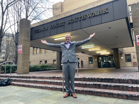
Last week, a jury at Southwark Crown Court heard statements from two scientists facing charges of criminal damage. They had taken action by calling on members of the Royal Society and the wider scientific community to engage in civil disobedience and non-violent direct action: to act as if the science is real, demonstrating a response commensurate with the catastrophic effects being predicted.
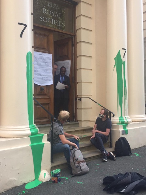
The defence rested on legal “consent”: that those working at the institute would, when confronted with the facts, consent to their actions. Had the Royal Society realised the potential of scientists to drive political change through activism, they would have agreed that the damage to their building was justified in pursuit of averting climate and ecological collapse. Dr. Tim Hewlett, astrophysicist, and Mike Lynch-White, former theoretical physicist, were unanimously acquitted on Friday.
Despite new bills being introduced to criminalise protests [1], and available legal defences being constrained, many court juries are in fact still finding climate activists not guilty for non-violent direct action .
In this blog post, I want to introduce some key ideas which explain the power and impact these types of protest can have when used by climate activists today.
Radical Intervention: What needs to happen?
According to Morrison et al. 2020, “meaningful climate action requires interventions that are preventative, effective, and systemic – interventions that are radical rather than conventional” [2]. The term “radical” can assume different definitions, categorised in Figure 2:
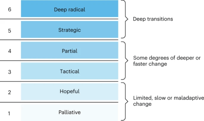
Current approaches to address climate change focus on what may be considered category “1” and “2” interventions: avoiding systemic changes and focusing on “techno fixes” and soft economic changes (such as carbon accounting). To businesses and politicians, these approaches are often desirable and successful , because they can be rapidly implemented and offer hope. But many of these approaches can suffer from a lack of follow-up, loopholes, or may even inadvertently generate new environmental or social problems.
More radical intervention is challenging, because root drivers of climate and ecological breakdown are “deeply embedded in existing societal structures, practices and values at multiple scales, and manifest in diverse ways; including as constraints on women’s reproductive rights, through irresponsible practices of technological innovation and overconsumption, and via political obsessions with ‘small’ government”.
What might a “deep” (5 and 6) radical intervention look like? Changing our future course from one of climate collapse, to a resilient world will “require disruption of [overlooked drivers including] capitalism, colonialism and global inequality”. We should be actively questioning whether economic systems reliant on infinite growth are sustainable on a planet of finite resources, and then propose new systems that prioritise wellbeing and sustainable development within our planetary boundaries [3].
Legal Consent in Activism
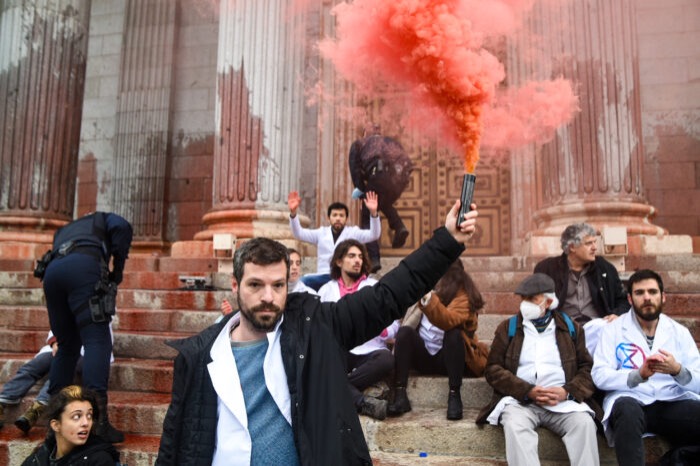
Actions like throwing soup on Van Goghs, gluing a hand to a window, daubing institutions in paint may all seem disconnected from the issues protestors wish to highlight. But these actions put the focus on the absurdity of a system that has greater contempt for property damage than the knowing and wilful destruction of nature. A system where economic inequality is rising whilst the wealthiest individuals are the leading driver of emissions [4].
As Greta Thunberg says, “Our house is on fire”. Defending non-violent actions at the Royal Society and Shell’s London Offices, Dr. Hewlett used this metaphor in his closing statement:
“If I smashed a window to drag you from a burning building, most would consent to that damage; Shell has set our house on fire, and when people understand the full extent of their crimes they do not generally object to a splash of paint, they object to the crime of arson. And when scientists come to appreciate our potential to raise the fire alarm, they generally do not object to the non-violent means used to bring them to that understanding, in fact they are often grateful for having their eyes opened. In order to find us guilty, you must be sure that we did not honestly believe they might consent. If we did not honestly believe in consent, why would we even try to mobilise our community?”
Although the argument of “consent” was successfully used to reach an acquittal in the case of the Royal Society, during the same trial and facing the same jury, Tim was found guilty of a similar protest at Shell [5]. The deliberations of a jury are known only to the jury members, so we cannot know for sure why this conclusion was reached. Tim is currently seeking legal advice. Out of 45 pieces of evidence against Shell only 2 were accepted by the judge (the rest were hidden from the jury). Expert witnesses were denied the opportunity to talk about Shell’s human rights abuses and the company’s failure to align with the Paris agreement.
Had Tim been allowed to make arguments relevant to his protest in the Shell case, it is likely that he would have been found innocent in this case as well.
“From Publications to Public Actions”: How do we accelerate systemic changes?
Given the urgency of climate and ecological emergency, Gardner et al. 2021 suggest that universities must “expand their conception of how they contribute to the public good, and explicitly recognise engagement with advocacy as part of the work mandate of their academic staff”, and outline how work models should be adapted to support this [6].
In the most read Social Metwork blog post of 2021 [7], Gabriel Perez wrote about how our own ways of thinking are influenced by external factors, and therefore there is a need for us to be aware of our roles as scientists across all levels of politics and society. By supporting and even taking part in different forms of protest, scientists can make uniquely important contributions.
It is possible to lend additional credibility to the demands of climate activists by supporting and engaging with movements. This can range from simply signing a letter, to joining in with “low-risk” activities such as talking about these movements with friends and colleagues, joining in with marches, or engaging in outreach activities. We can even join in provocative non-violent direct actions which may pose risk to our liberty (although not everyone is as equally comfortable to do this, with potential visa issues, childcare commitment, and financial struggles being some of the barriers activists may face).
As scientists, we each have a powerful toolkit to use in activism: we are trained in statistics and comprehension of complicated reports; we present our findings to different audiences; we might have experience publishing, maintaining websites, communicating across sectors, teaching. These are all valuable skills for activists to have, and we have many of them at once!
Climate activists are sometimes depicted as dangerous radicals. But, the truly dangerous radicals are the countries that are increasing the production of fossil fuels. (António Guterres, UN Secretary-General)
Closing thoughts
Climate and ecological collapse pose existential risks to humanity. If we are to avert the worst effects, and place ourselves in a position best able to support the most impacted, then we need to rethink the purpose of our societies.
Taking non-violent direct action sparks controversy, and is shocking. But as a disruptive tactic, it is successful at initiating debate.
[1] Anita Mureithi 2023 “Scrap plans to give cops more power, say women as David Carrick jailed for life” OpenDemocracy news https://www.opendemocracy.net/en/public-order-bill-metropolitan-police-david-carrick-protest
[2] Morrison, T.H., Adger, W.N., Agrawal, A. et al. Radical interventions for climate-impacted systems. Nat. Clim. Chang. 12, 1100–1106 (2022). https://doi.org/10.1038/s41558-022-01542-y
[3] Doughnut Economics Action Lab – About https://doughnuteconomics.org/about-doughnut-economics
[4] Oxfam “Survival Of The Richest: How We Must Tax The Super-Rich Now To Fight Inequality” 2023 https://www.oxfam.ca/publication/davos-report-2023
[5] Rikki Blue, “Listen to the science. Civil disobedience by 1000 scientists.”, Real Media https://realmedia.press/listen-to-the-science
[6] Gardner, C.J, Thierry, A., Rowlandson, W., Steinberger, J.K. From Publications to Public Actions: The Role of Universities in Facilitating Academic Advocacy and Activism in the Climate and Ecological Emergency. Frontiers in Sustainability. 2, 2022. https://doi.org/10.3389/frsus.2021.679019
[7] Gabriel Perez, Climate Science and Power, The Social Metwork https://socialmetwork.blog/2021/11/05/climate-science-and-power