
On 28th January to 1st February I attended the APPLICATE (Advanced Prediction in Polar regions and beyond: modelling, observing system design and LInkages associated with a Changing Arctic climaTE (bold choice)) General Assembly and Early Career Science event at ECMWF in Reading. APPLICATE is one of the EU Horizon 2020 projects with the aim of improving weather and climate prediction in the polar regions. The Arctic is a region of rapid change, with decreases in sea ice extent (Stroeve et al., 2012) and changes to ecosystems (Post et al., 2009). These changes are leading to increased interest in the Arctic for business opportunities such as the opening of shipping routes (Aksenov et al., 2017). There is also a lot of current work being done on the link between changes in the Arctic and mid-latitude weather (Cohen et al., 2014), however there is still much uncertainty. These changes could have large impacts on human life, therefore there needs to be a concerted scientific effort to develop our understanding of Arctic processes and how this links to the mid-latitudes. This is the gap that APPLICATE aims to fill.
The overarching goal of APPLICATE is to develop enhanced predictive capacity for weather and climate in the Arctic and beyond, and to determine the influence of Arctic climate change on Northern Hemisphere mid-latitudes, for the benefit of policy makers, businesses and society.
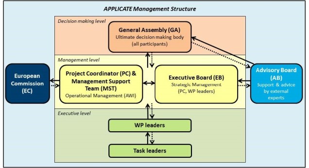
Attending the General Assembly was a great opportunity to get an insight into how large scientific projects work. The project is made up of different work packages each with a different focus. Within these work packages there are then a set of specific tasks and deliverables spread out throughout the project. At the GA there were a number of breakout sessions where the progress of the working groups was discussed. It was interesting to see how these discussions worked and how issues, such as the delay in CMIP6 experiments, are handled. The General Assembly also allows the different work packages to communicate with each other to plan ahead, and for results to be shared.
One of the big questions APPLICATE is trying to address is the link between Arctic sea-ice and the Northern Hemisphere mid-latitudes. Many of the presentations covered different aspects of this, such as how including Arctic observations in forecasts affects their skill over Eurasia. There were also initial results from some of the Polar Amplification (PA)MIP experiments, a project that APPLICATE has helped coordinate.

At the end of the week there was the Early Career Science Event which consisted of a number of talks on more soft skills. One of the most interesting activities was based around engaging with stakeholders. To try and understand the different needs of a variety of stakeholders in the Arctic (from local communities to shipping companies) we had to try and lobby for different policies on their behalf. This was also a great chance to meet other early career scientists working in the field and get to know each other a bit more.


What a difference a day makes, heavy snow getting the ECMWF’s ducks in the polar spirit.
Email: sally.woodhouse@pgr.reading.ac.uk
References
Aksenov, Y. et al., 2017. On the future navigability of Arctic sea routes: High-resolution projections of the Arctic Ocean and sea ice. Marine Policy, 75, pp.300–317.
Cohen, J. et al., 2014. Recent Arctic amplification and extreme mid-latitude weather. Nature Geoscience, 7(9), pp.627–637.
Post, E. & Others, 24, 2009. Ecological Dynamics Across the Arctic Associated with Recent Climate Change. Science, 325(September), pp.1355–1358.
Stroeve, J.C. et al., 2012. Trends in Arctic sea ice extent from CMIP5, CMIP3 and observations. Geophysical Research Letters, 39(16), pp.1–7.


 A true revolutionary in the field of theoretical physics and abstract algebra, Amelie Emmy Noether was a German-born inspiration thanks to her perseverance and passion for research. Instead of teaching French and English to schoolgirls, Emmy pursued the study of mathematics at the University of Erlangen. She then taught under a man’s name and without pay because she was a women. During her exploration of the mathematics behind Einstein’s general relativity alongside renowned scientists like Hilbert and Klein, she discovered the fundamentals of conserved quantities such as energy and momentum under symmetric invariance of their respective quantities: time and homogeneity of space. She built the bridge between conservation and symmetry in nature, and although Noether’s Theorem is fundamental to our understanding of nature’s conservation laws, Emmy has received undeservedly small recognition throughout the last century.
 Claudine Hermann is a French physicist and Emeritus Professor at the École Polytechnique in Paris. Her work, on physics of solids (mainly on photo-emission of polarized electrons and near-field optics), led to her becoming the first female professor at this prestigious school. Aside from her work in Physics, Claudine studied and wrote about female scientists’ situation in Europe and the influence of both parents’ works on their daughter’s professional choices. Claudine wishes to give girls “other examples than the unreachable Marie Curie”. She is the founder of the Women and Sciences association and represented it at the European Commission to promote gender equality in Science and to help women accessing scientific knowledge. Claudine is also the president of the European Platform of Women Scientists which represents hundreds of associations and more than 12,000 female scientists.
 For most people being handpicked to be one of three students to integrate West Virginia’s graduate schools would probably be the most notable life achievements. However for Katherine Johnson’s this was just the start of a remarkable list of accomplishments. In 1952 Johnson joined the all-black West Area Computing section at NACA (to become NASA in 1958). Acting as a computer, Johnson analysed flight test data, provided maths for engineering lectures and worked on the trajectory for America’s first human space flight.
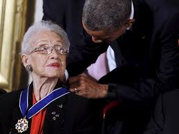
 Women however were not allowed on such ships, thus Marie Tharp was stationed in the lab, checking and plotting the data. Her drawings showed the presence of the North Atlantic Ridge, with a deep V-shaped notch that ran the length of the mountain range, indicating the presence of a rift valley, where magma emerges to form new crust. At this time the theory of plate tectonics was seen as ridiculous. Her supervisor initially dismissed her results as ‘girl talk’ and forced her to redo them. The same results were found. Her work led to the acceptance of the theory of plate tectonics and continental drift.
 Ada Lovelace was a 19th century Mathematician popularly referred to as the “first computer programmer”. She was the translator of “Sketch of the Analytical Engine, with Notes from the Translator”, (said “notes” tripling the length of the document and comprising its most striking insights) one of the documents critical to the development of modern computer programming. She was one of the few people to understand and even fewer who were able to develop for the machine. That she had such incredible insight into a machine which didn’t even exist yet, but which would go on to become so ubiquitous is amazing!

