Hannah Croad h.croad@pgr.reading.ac.uk
The focus of my PhD project is investigating the physical mechanisms behind the growth and evolution of summer-time Arctic cyclones, including the interaction between cyclones and sea ice. The rapid decline of Arctic sea ice extent is allowing human activity (e.g. shipping) to expand into the summer-time Arctic, where it will be exposed to the risks of Arctic weather. Arctic cyclones produce some of the most impactful Arctic weather, associated with strong winds and atmospheric forcings that have large impacts on the sea ice. Hence, there is a demand for improved forecasts, which can be achieved through a better understanding of Arctic cyclone mechanisms.
My PhD project is closely linked with a NERC project (Arctic Summer-time Cyclones: Dynamics and Sea-ice Interaction), with an associated field campaign. Whereas my PhD project is focused on Arctic cyclone mechanisms, the primary aims of the NERC project are to understand the influence of sea ice conditions on summer-time Arctic cyclone development, and the interaction of cyclones with the summer-time Arctic environment. The field campaign, originally planned for August 2021 based in Svalbard in the Norwegian Arctic, has now been postponed to August 2022 (due to ongoing restrictions on international travel and associated risks for research operations due to the evolving Covid pandemic). The field campaign will use the British Antarctic Survey’s low-flying Twin Otter aircraft, equipped with infrared and lidar instruments, to take measurements of near-surface fluxes of momentum, heat and moisture associated with cyclones over sea ice and the neighbouring ocean. These simultaneous observations of turbulent fluxes in the atmospheric boundary layer and sea ice characteristics, in the vicinity of Arctic cyclones, are needed to improve the representation of turbulent exchange over sea ice in numerical weather prediction models.
Those wishing to fly onboard the Twin Otter research aircraft are required to do Helicopter Underwater Escape Training (HUET). Most of the participants on the course travel to and from offshore facilities, as the course is compulsory for all passengers on the helicopters to rigs. In the unlikely event that a helicopter must ditch on the ocean, although the aircraft has buoyancy aids, capsize is likely because the engine and rotors make the aircraft top heavy. I was apprehensive about doing the training, as having to escape from a submerged aircraft is not exactly my idea of fun. However, I realise that being able to fly on the research aircraft in the Arctic is a unique opportunity, so I was willing to take on the challenge!
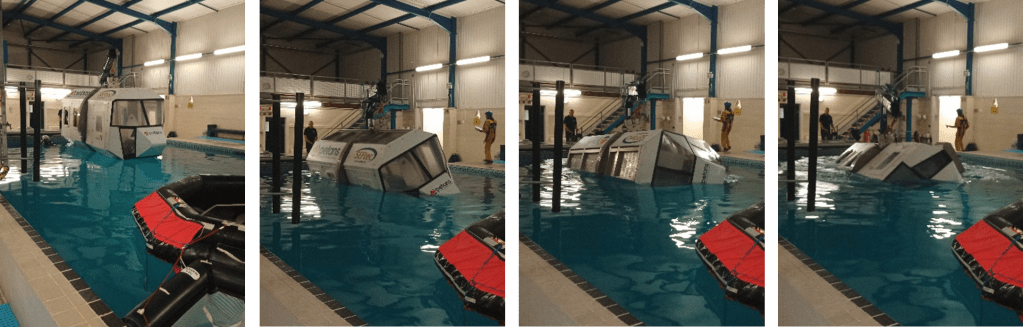
The HUET course is provided by the Petans training facility in Norwich. John Methven, Ben Harvey, and I drove to Norwich the night before, in preparation for an early start the next day. We spent the morning in the classroom, covering helicopter escape procedures and what we should expect for the practical session in the afternoon. We would have to escape from a simulator recreating a crash landing on water. The simulator replicates a helicopter fuselage, with seats and windows, attached to the end of a mechanical arm for controlled submersion and rotation. The procedure is (i) prepare for emergency landing: check seatbelt is pulled tight, headgear is on, and that all loose objects are tucked away, (ii) assume the brace position on impact, and (iii) keep one hand on the window exit and the other on your seatbelt buckle. Once submerged, undo your seatbelt and escape through the window. After a nervy lunch, it was time to put this into practice.
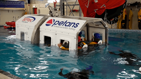
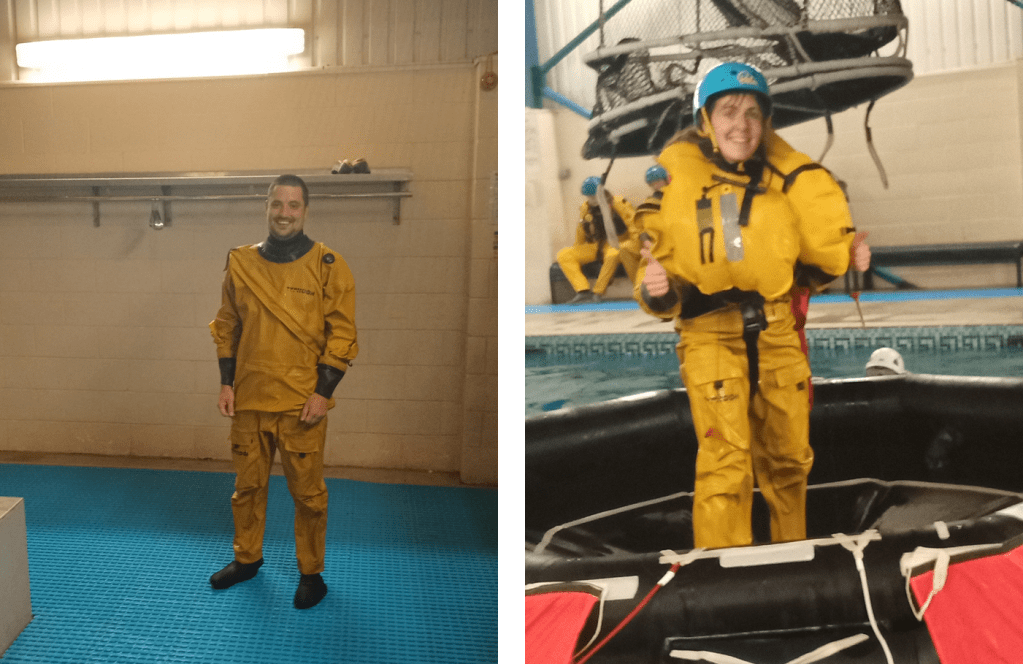
The practical part of the course took place in a pool (the temperature resembled lukewarm bath water, much warmer than the North Atlantic!). We were kitted up with two sets of overalls over our swimming costumes, shoes, helmets, and jackets containing a buoyancy aid. We then began the training in the aircraft simulator. Climb into the aircraft and strap yourself into a seat. The seatbelt had to be pulled tight, and was released by rotating the central buckle. On the pilots command, prepare for emergency landing. Assume the brace position, and the aircraft drops into the water. Hold on to the window and your seatbelt buckle, and as the water reaches your chest, take a deep breath. Wait for the cabin to completely fill with water and stop moving – only then undo your seatbelt and get out!
The practical session consisted of three parts. In the first exercise, the aircraft was submerged, and you had to escape through the window. The second exercise was similar, except that panes were fitted on the windows, which you had to push out before escaping. In the final exercise, the aircraft was submerged and rotated 180 degrees, so you ended up upside down (and with plenty of water up your nose), which was very disorientating! Each exercise required you to hold your breath for roughly 10 seconds at a time. Once we had escaped and reached the surface, we deployed our buoyancy aids, and climbed to safety onto the life raft.
The experience was nerve-wracking, and really forced me to push myself out of my comfort zone. I didn’t need to be too worried though, even after struggling with undoing the seatbelt a couple of times, I was assisted by the diving team and encouraged to go again. I was glad to get through the exercises, and pass the course along with the others. This was an amazing experience (definitely not something I expected to do when applying for a PhD!), and I’m now looking forward to the field campaign next year.