Better Data… with MetaData!

James Fallon – j.fallon@pgr.reading.ac.uk

As researchers, we familiarise ourselves with many different datasets. Depending on who put together the dataset, the variable names and definitions that we are already familiar from one dataset may be different in another. These differences can range from subtle annoyances to large structural differences, and it’s not always immediately obvious how best to handle them.

One dataset might be on an hourly time-index, and the other daily. The grid points which tell us the geographic location of data points may be spaced at different intervals, or use entirely different co-ordinate systems!

However most modern datasets come with hidden help in the form of metadata – this information should tell us how the data is to be used, and with the right choice of python modules we can use the metadata to automatically work with different datasets whilst avoiding conversion headaches.

First attempt…

Starting my PhD, my favourite (naïve, inefficient, bug prone,… ) method of reading data with python was with use of the built-in function open() or numpy functions like genfromtxt(). These are quick to set up, and can be good enough. But as soon as we are using data with more than one field, complex coordinates and calendar indexes, or more than one dataset, this line of programming becomes unwieldy and disorderly!

>>> header = np.genfromtxt(fname, delimiter=',', dtype='str', max_rows=1)
>>> print(header)
['Year' 'Month' 'Day' 'Electricity_Demand']
>>> data = np.genfromtxt(fnam, delimiter=',', skip_header=1)
>>> print(data)
array([[2.010e+03, 1.000e+00, 1.000e+00, 0.000e+00],
       [2.010e+03, 1.000e+00, 2.000e+00, 0.000e+00],
       [2.010e+03, 1.000e+00, 3.000e+00, 0.000e+00],
       ...,
       [2.015e+03, 1.200e+01, 2.900e+01, 5.850e+00],
       [2.015e+03, 1.200e+01, 3.000e+01, 6.090e+00],
       [2.015e+03, 1.200e+01, 3.100e+01, 6.040e+00]])

The above code reads in year, month, day data in the first 3 columns, and Electricity_Demand in the last column.

You might be familiar with such a workflow – perhaps you have refined it down to a fine art!

In many cases this is sufficient for what we need, but making use of already available metadata can make the data more readable, and easier to operate on when it comes to complicated collocation and statistics.

Enter pandas!

Pandas

In the previous example, we read in our data to numpy arrays. Numpy arrays are very useful, because they store data more efficiently than a regular python list, they are easier to index, and have many built in operations from simple addition to niche linear algebra techniques.

We stored column labels in an array called header, but this means our metadata has to be handled separately from our data. The dates are stored in three different columns alongside the data – but what if we want to perform an operation on just the data (for example add 5 to every value). It is technically possible but awkward and dangerous – if the column index changes in future our code might break! We are probably better splitting the dates into another separate array, but that means more work to record the column headers, and an increasing number of python variables to keep track of.

Using pandas, we can store all of this information in a single object, and using relevant datatypes:

>>> data = pd.read_csv(fname, parse_dates=[['Year', 'Month', 'Day']], index_col=0)
>>> data
Electricity_Demand
Year_Month_Day      
2010-01-01      0.00
2010-01-02      0.00
2010-01-03      0.00
2010-01-04      0.00
2010-01-05      0.00
...              ...
2015-12-27      5.70
2015-12-28      5.65
2015-12-29      5.85
2015-12-30      6.09
2015-12-31      6.04

[2191 rows x 1 columns]

This may not immediately appear a whole lot different to what we had earlier, but notice the dates are now saved in datetime format, whilst being tied to the data Electricity_Demand. If we want to index the data, we can simultaneously index the time-index without any further code (and possible mistakes leading to errors).

Pandas also makes it really simple to perform some complicated operations. In this example, I am only dealing with one field (Electricity_Demand), but this works with 10, 100, 1000 or more columns!

  • Flip columns with data.T
  • Calculate quantiles with data.quantile
  • Cut to between dates, eg. data.loc['2010-02-03':'2011-01-05']
  • Calculate 7-day rolling mean: data.rolling(7).mean()

We can insert new columns, remove old ones, change the index, perform complex slices, and all the metadata stays stuck to our data!

Whilst pandas does have many maths functions built in, if need-be we can also export directly to numpy using numpy.array(data['Electricity_Demand']) or data.to_numpy().

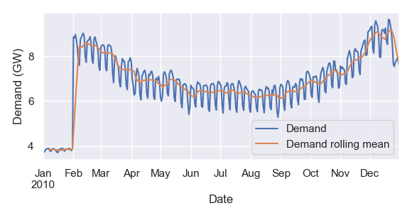
Pandas can also simplify plotting – particularly convenient when you just want to quickly visualise data without writing import matplotlib.pyplot as plt and other boilerplate code. In this example, I plot my data alongside its 7-day rolling mean:

ax = data.loc['2010'].plot(label='Demand', ylabel='Demand (GW)')
data.loc['2010'].rolling(7).mean().plot(ax=ax, label='Demand rolling mean')
ax.legend()

Now I can visualise the anomalous values at the start of the dataset, a consistent annual trend, a diurnal cycle, and fairly consistent behaviour week to week.

Big datasets

Pandas can read from and write to many different data formats – CSV, HTML, EXCEL, … but some filetypes like netCDF4 that meteorologists like working with aren’t built in.

xarray is an extremely versatile tool that can read in many formats including netCDF, GRIB. As well as having built in functions to export to pandas, xarray is completely capable of handling metadata on its own, and many researchers work directly with objects such as xarray DataArray objects.

There are more xarray features than stars in the universe[citation needed], but some that I find invaluable include:

open_mfdataset – automatically merge multiple files (eg. for different dates or locations)
assign_coords – replace one co-ordinate system with another
where – replace xarray values depending on a condition

Yes you can do all of this with pandas or numpy. But you can pass metadata attributes as arguments, for example we can get the latitude average with my_data.mean('latitude'). No need to work in indexes and hardcoded values – xarray can do all the heavy lifting for you!

Have more useful tips for working effectively with meteorological data? Leave a comment here or send me an email j.fallon@pgr.reading.ac.uk 🙂

The EGU Experience 2021: a PhD student perspective

Max Coleman – m.r.coleman@pgr.reading.ac.uk

Chloe Brimicombe – c.r.brimicombe@pgr.reading.ac.uk

The European Geoscience Union General Assembly is one of the big annual conferences for atmospheric science (and Earth sciences more generally). The two of us were fortunate to have the opportunity to attend and present our research at this year’s vEGU21 conference. As has been done in previous years like in 2019 we’re here to give you an account of our EGU experience 😀 (so you can compare our virtual experience with the previous posts if you like 😉) 

Entrance hall to virtual EGU (Source: Linda Speight) 

What was vEGU21? 

EGUv21 was the general assembly for 2021 online. It took place from the 19th to the 30th April EGU. Through an impressive virtual conference center and mostly Zoom. 

What was your presentation on? 

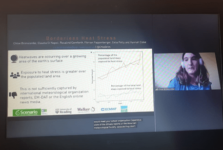
Chloe –  I presented borderless heat stress in the extreme heat events session, which is based on a paper currently under review at Earth’s Future, where we show that heat stress is growing in the area during the month of August. The invited speaker to the session was Laura Suarez-Gutierrez and it was a great presentation on the dynamics of increasing heat extremes with climate change across Europe. I really enjoyed learning about the latest research in the extreme heat area. 

Max – I presented on my work using model nudging to study aerosol radiative adjustments. I presented in the session ‘Chemistry, Aerosols and Radiative Forcing in CMIP6-era models’, which was convened and hosted by Reading’s very own Bill Collins. There were many interesting presentations in this session, including presentations on the balance between climate and air quality benefits by Robert Allen and Steve Turnock; a summary of the Aerosol Chemistry Model Intercomparison Project (AerChemMIP) findings by UoR’s Gill Thornhill; and a personal favourite concerned the impacts of different emissions pathways in Africa on local and global climate, and local air pollution effects on mortality, presented by Chris Wells. 

Chloe presenting: would win an award for most interesting screenshot. (Source: Maureen Wanzala) 

What were your favourite aspects of the conference? 

Chloe – Apart from my session one of my favorite’s was on climate services. This focused on the application of meteorological and hydrology data to services for example health heat impacts and growing grapes and olives. I also enjoyed the panel on the climate and ecological emergency in light of COVID-19 including Katherine Hayhoe and the session on equality, diversity and inclusion; it was interesting how ‘listening’ to those impacted was an overlapping theme in these. The weirdest, loveliest experience was my main supervisor sending me a colouring page of her face

Max – As with any conference it was a great opportunity to learn about the latest research in my specific field, as well as learning about exciting developments in other fields, from machine learning applications in earth science to observational studies of methane emissions. Particularly, it’s a nice change from just reading about them in papers.Having conversations with presenters gives you the opportunity to really dive in and find out what motivated their research initially and discuss future applications. For example, one conversation I had went from discussing their application of unsupervised machine learning in classifying profiles of earth system model output, to learning about it’s potential for use in model intercomparisons.  

Katherine Hayhoe in the session Climate and Ecological Emergency: can a pandemic help save us? (Source: Chloe Brimicombe) 

What was your least favourite aspect? 

Chloe – I did manage to do a little networking. But I’d love to experience an in person conference where I present. I have never presented my research in real life at a conference or research group/department seminar 😱. We also miss out on a lot of free food and pens not going to any in life conferences, which is what research is about 😉. Also, I find it difficult to stay focused on the conference when it’s online.  

Max – For me the structure of two minute summaries followed by breakout Zoom rooms for each speaker had some definite drawbacks. For topics outside one’s own field, I found it difficult to really learn much from many of the summaries – it’s not easy to fit something interesting for experts and non-experts into two minutes! In theory you can go speak to presenters in their breakout rooms, but there’s something awkward about entering a zoom breakout room with just you and the presenter, particularly when you aren’t sure exactly how well you understood their two minute summary.  

In light of your vEGU21 experience, what are your thoughts on remote vs traditional conferencing? 

Max – Overall I think virtual conferencing has a way to go before it can match up to the in person experience. There were the classic technical issues of anything hosted remotely: the ‘I think you’re on mute’ experience, other microphone issues, and even the conference website crashing on the first day of scientific sessions (though the organisers did a swift job getting the conference back up and running). But there’s also the less obvious, such as it feeling actually quite a lonely experience. I’ve only been to a couple of in-person conferences, but there were always some people I knew and could meet up with. But it’s challenging to recreate this online, especially for early career researchers who don’t have as many established connections, and particularly at a big conference like the EGU general assembly. Perhaps a big social media presence can somewhat replace this, but not everyone (including myself!) is a big social media user. .  

On the other hand, it’s great that we can still have conferences during a global pandemic, and no doubt is better than an absence of them entirely. Above all else, it’s also much greener and more accessible to those with less available funding for conference travel (though new challenges of accessibility, such as internet quality and access, undoubtedly arise). Plus, the facility to upload various display materials and people to look back at them whenever they like, regardless of time zones, is handy.  

Chloe – I’d just add, as great as Twitter is and can be for promoting your research, it’s not the same as going for a good old cup of tea (or cocktail) with someone. Also, you can have the biggest brightest social media, but actually be terrible at conveying your research in person. 

Summary 

Overall it was interesting to take part in vEGU21, and we were both glad we went. It didn’t quite live up to the in person experience – and there is definitely room for improvements for virtual conferencing – but it’s great we can still have these experiences, albeit online.  

Coding lessons for the newly initiated

Better coding skills and tooling enable faster, more useful results. 

Daniel Ayers – d.ayers@pgr.reading.ac.uk

This post presents a collection of resources and tips that have been most useful to me in the first 18 months I’ve been coding – when I arrived at Reading, my coding ability amounted to using excel formulas. These days, I spend a lot of time coding experiments that test how well machine learning algorithms can provide information on error growth in low-dimensional dynamical systems. This requires fairly heavy use of Scikit-learn, Tensorflow and Pandas. This post would have been optimally useful at the start of the year, but perhaps even the coding veterans will find something of use – or better, they can tell me about something I am yet to discover!  

First Steps: a few useful references 

  • A byte of python. A useful and concise reference for the fundamentals. 
  • Python Crash Course, Eric Matthes (2019). Detailed, lots of examples, and covers a wider range of topics (including, for example, using git). There are many intro to Python books around; this one has certainly been useful to me.1 There are many good online resources for python, but it can be helpful initially to have a coherent guide in one place. 

How did I do that last time? 

Tip: save snippets. 

There are often small bits of code that contain key tricks that we use only occasionally. Sometimes it takes a bit of time reading forums or documentation to figure out these tricks. It’s a pain to have to do the legwork again to find the trick a second or third time. There were numerous occasions when I knew I’d worked out how to do something previously, and then spent precious minutes trawling through various bits of code and coursework to find the line where I’d done it. Then I found a better solution: I started saving snippets with an online note taking tool called Supernotes. Here’s an example:  

I often find myself searching through my code snippets to remind myself of things. 

Text editors, IDEs and plugins. 

If you haven’t already, it might be worth trying some different options when it comes to your text editor or IDE. I’ve met many people who swear by PyCharm. Personally, I’ve been getting on well with Visual Studio Code (VS Code) for a year now. 

Either way, I also recommend spending some time installing useful plugins as these can make your life easier. My recommendations for VS Code plugins are: Hungry Delete, Rainbow CSV, LaTeX Workshop, Bracket Pair Colorizer 2, Rewrap and Todo Tree

Linters & formatters 

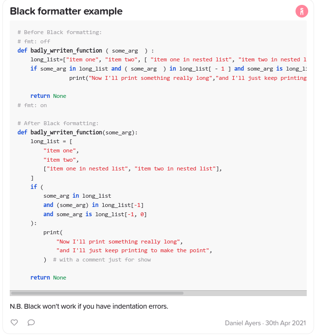
Linters and formatters check your code for syntax errors or style errors. I use the Black formatter, and have it set to run every time I save my file. This seems to save a lot of time, and not only with formatting: it becomes more obvious when I have used incorrect syntax or made a typo. It also makes my code easier to read and look nicer. Here’s an example of Black in anger:  

Some other options for linters and formatters include autopep, yapf and pylint. 

Metadata for results 

Data needs metadata in order to be understood. Does your workflow enable you to understand your data? I tend to work with toy models, so my current approach is to make a new directory for each version of my experiment code. This way I can make notes for each version of the experiment (usually in a markdown file). In other words, what not to do, is to run the code to generate results and then edit the code (excepting, of course, if your code has a bug). At a later stage you may want to understand how your results were calculated, and this cannot be done if you’ve changed the code file since the data was generated (unless you are a git wizard). 

A bigger toolbox makes you a more powerful coder 

Knowing about the right tool for the job can make life much easier.2 There are many excellent Python packages, and the more you explore, the more likely you’ll know of something that can help you. A good resource for the modules of the Python 3 standard library is Python Module of The Week. Some favourite packages of mine are Pandas (for processing data) and Seaborn (a wrapper on Matplotlib that enables quick and fancy plotting of data). Both are well worth the time spent learning to use them. 

Some thoughts on Matplotlib 

Frankly some of the most frustrating experiences in my early days with python was trying to plot things with Matplotlib. At times it seemed inanely tedious, and bizarrely difficult to achieve what I wanted given how capable a tool others made it seem. My tips for the uninitiated would be: 

  • Be a minimalist, never a perfectionist. I often managed to spend 80% of my time plotting trying to achieve one obscure change. Ask: Do I really need this bit of the plot to get my point across? 
  • Can you hack it, i.e. can you fix up the plot using something other than Matplotlib? For example, you might spend ages trying to tell Matplotlib to get some spacing right, when for your current purpose you could get the same result by editing the plot in word/pages in a few clicks. 
  • Be patient. I promise, it gets easier with time. 

Object oriented programming 

I’m curious to know how many of us in the meteorology department code with classes. In simple projects, it is possible to do without classes. That said, there’s a reason classes are a fundamental of modern programming: they enable more elegant and effective problem solving, code structure and testing. As Hans Petter Langtangen states in A Primer on Scientific Programming with Python, “classes often provide better solutions to programming problems.”  

What’s more, if you understand classes and object- oriented programming concepts then understanding others’ code is much easier. For example, it can make Matplotlib’s documentation easier to understand and, in the worse caseworst case scenario, if you had to read the Matplotlib source code to understand what was going on under the hood, it will make much more sense if you know how classes work. As with Pandas, classes are worth the time buy in! 

Have any suggestions or other useful resources for wannabe pythonistas? Please comment below or email me at d.ayers@pgr.reading.ac.uk. 

Support vector machine for classification of space weather

Carl Haines – carl.haines@pgr.reading.ac.uk

In a recent blog post, I discussed the use of the analogue ensemble (AnEn), or “similar-day” approach to forecasting geomagnetic activity. In this post I will look at the use of support vector machines (SVMs), a machine learning approach, to the same problem and compare the performance of the SVM to the AnEn. An implementation of the SVM has been developed for this project in python and is available at https://doi.org/10.5281/zenodo.4604485

Space weather encompasses a range of impacts on Earth caused by changes in the near-earth plasma due to variable activity at the Sun. These impacts include damage to satellites, interruptions to radio communications and damage to power grids. For this reason, it is useful to forecast the occurrence, intensity and duration of heightened geomagnetic activity, which we call geomagnetic storms.  

As in the previous post, the measure of geomagnetic activity used is the aaH index which has been developed by Mike Lockwood in Reading. The  aaH  index  gives a global measure of geomagnetic activity at a 3-hour resolution. In this index, the minimum value is zero and larger values represent more intense geomagnetic activity. 

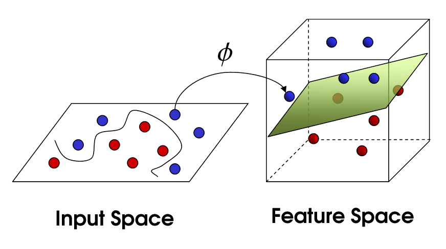
The SVM is a commonly used classification algorithm which we implement here to classify whether a storm will occur. Given a sample of the input and the associated classification labels, the SVM will find a function that separates these input features by their class label. This is simple if the classes are linearly separable, as the function is a hyperplane. The samples lying closest to the hyperplane are called support vectors and the distance between these samples and the hyperplane is maximised. 

Figure 1 – A diagram explaining the kernel trick used by SVMs. This figure has been adopted from (Towards data science, n.d.) 

Typically, the samples are not linearly separable, so we employ Cover’s theorem which states that linearly inseparable classification problems are more likely to be linearly separable when cast non-linearly into a higher dimensional space. Therefore, we use a kenel trick to throw the inputs into a higher dimensional feature space, as depicted in Figure 1, to make it more separable. Further explanation is available in (Towards data science, n.d.) 

Based on aaH values in the 24-hour training window, the SVM predicts whether the next 3 hours will be either a storm or not. By comparing this dichotomous hindcast with the observed aaH, the outcome will be one of True Positive (TP, where a storm is correctly predicted), True Negative (TN, where no storm is correctly predicted), False Positive (FP, where a storm is predicted but not observed), or False Negative (FN, where a storm is not predicted but is observed). This is shown in the form of a contingency table in Figure 2. 

Figure 2 – Contingency table for the SVM classifying geomagnetic activity into the “no-storm” and “storm” classes. THe results have been normalised across the true label.

For development of the SVM, the aaH data has been separated into independent training and test intervals. These intervals are chosen to be alternate years. This is longer than the auto-correlation in the data (choosing, e.g. alternate 3-hourly data points, would not generate independent training and test data sets) but short enough that we assume there will not be significant aliasing with solar cycle variations. 

Training is an iterative process, whereby a cost function is minimised. The cost function is a combination of the relative proportion of TP, TN, FP and FN. Thus, while training itself, an SVM attempts to classify labelled data i.e., data belonging to a known category, in this case “storm” and “no storm” on the basis of the previous 24 hours of aaH. If the SVM makes an incorrect prediction it is penalised through a cost function which the SVM minimises.  The cost parameter determines the degree to which the SVM is penalised for a misclassification in training which allows for noise in the data.  

It is common that data with a class imbalance, that is containing many more samples from one class than the other, causes the classifier to be biased towards the majority class. In this case, there are far more non-storm intervals than storm intervals. Following (McGranaghan, Mannucci, Wilson, Mattman, & Chadwick, 2018), we define the cost of mis-classifying each class separately. This is done through the weight ratio Wstorm : Wno storm. Increasing the Wstorm increases the frequency at which the SVM predicts a storm and it follows that it predicts no storm at a reduced frequency. In this work we have varied Wstorm and kept Wno storm constant at 1. A user of the SVM method for forecasting may wish to tune the class weight ratio to give an appropriate ratio of false alarms and hit rate dependent on their needs. 

Different forecast applications will have different tolerances for false alarms and missed events.  To accommodate this, and as a further comparison of the hindcasts, we use a Cost/Loss analysis. In short, C is the economic cost associated with taking mitigating action when an event is predicted (whether or not it actually occurs) and L is the economic loss suffered due to damage if no mitigating action is taken when needed. For a deterministic method, such as the SVM, each time a storm is predicted will incur a cost C. Each time a storm is not predicted but a storm occurs a loss L is incurred. If no storm is predicted and no storm occurs, then no expense in incurred. By considering some time interval, the total expense can be computed by summing C and L. Further information, including the formular for computing the potential economic value (PEV) can be found in (Owens & Riley, 2017). 

A particular forecast application will have a C/L ratio in the domain (0,1). This is because a C/L of 0 would mean it is most cost effective to take constant mitigating action and a C/L of 1 or more means that mitigating action is never cost effective. In either case, no forecast would be helpful. The power of a Cost/Loss analysis is that it allows us to evaluate our methods for the entire range of potential forecast end users without specific knowledge of the forecast application requirements. End users can then easily interpret whether our methods fit their situation.  

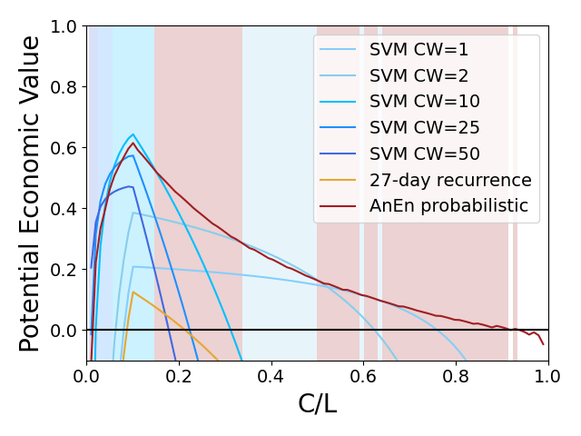
Figure 3 – A cost loss analysis comparing the potential economic value of a range of SVMs to the AnEn. 

Figure 3 shows the potential economic value (PEV) of the SVM with a range of class weights (CW), probabilistic AnEn and 27-day recurrence. The shaded regions indicate which hindcast has the highest PEV for that Cost/Loss ratio. The probabilistic AnEn has the highest PEV for the majority of the Cost/Loss domain although SVM has higher PEV for lower Cost/Loss ratios. It highlights that the `best’ hindcast is dependent on the context in which it is to be employed. 

In summary, we have implemented an SVM for the classification of geomagnetic storms and compared the performance to that of the AnEn which was discussed in a previous blog post. The SVM and AnEn generally perform similarly in a Cost/Loss analysis and the best method will depend on the requirements of the end user. The code for the SVM is available at  https://doi.org/10.5281/zenodo.4604485 and the AnEn at https://doi.org/10.5281/zenodo.4604487

References 

Burges, C. (1998). A tutorial on support vector machines for pattern recognition. Data mining an knowledge discovery

McGranaghan, R., Mannucci, A., Wilson, B., Mattman, C., & Chadwick, R. (2018). New Capabilities for Prediction of High-Latitude Ionospheric Scin-669tillation: A Novel Approach With Machine Learning. Space Weather

Owens, M., & Riley, P. (2017). Probabilistic Solar Wind Forecasting Using Large Ensembles of Near-Sun Conditions With a Simple One-Dimensional “Upwind” Scheme. Space weather

Towards data science. (n.d.). Retrieved from https://towardsdatascience.com/the-kernel-trick-c98cdbcaeb3f 

Quantifying Arctic Storm Risk in a Changing Climate

Alec Vessey (Final Year PhD Student) – alexandervessey@pgr.reading.ac.uk 
Supervisors: Kevin Hodges (UoR), Len Shaffrey (UoR), Jonny Day (ECMWF), John Wardman (AXA XL)
 

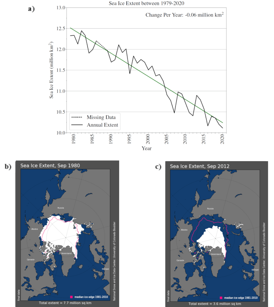
Arctic sea ice extent has reduced dramatically since it was first monitored by satellites in 1979 – at a rate of 60,000 km2 per year (see Figure 1a). This is equivalent to losing an ice sheet the size of London every 10 days. This dramatic reduction in sea ice extent has been caused by global temperatures increasing, which is a result of anthropogenic climate change. The Arctic is the region of Earth that has undergone the greatest warming in recent decades, due to the positive feedback mechanism of Arctic Amplification. Global temperatures are expected to continue to increase into the 21st century, further reducing Arctic sea ice extent. 

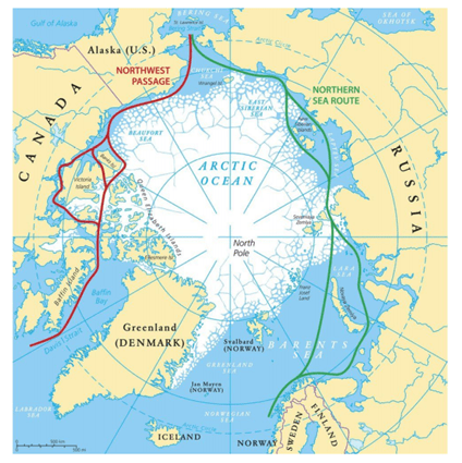
Consequently, the Arctic Ocean has become increasingly open and navigable for ships (see Figure 1b and 1c). The Arctic Ocean provides shorter distances between ports in Europe and North America to ports in Asia than more traditional routes in the mid-latitudes that include the Suez Canal Route and the routes through the Panama Canal. There are two main shipping routes in the Arctic, the Northern Sea Route (along the coastline of Eurasia) and the Northwest Passage (through the Canadian Archipelago) (see Figure 2). For example, the distance between the Ports of Rotterdam and Tokyo can be reduced by 4,300 nautical-miles if ships travel through the Arctic (total distance: 7,000 nautical-miles) rather than using the mid-latitude route through the Suez Canal (total distance: 11,300 nautical-miles). Travelling through the Arctic could increase profits for shipping companies. Shorter journeys will require less fuel to be spent on between destinations and allow more time for additional shipping contracts to be pursued. It is expected that the number of ships in the Arctic will increase exponentially in the near future, when infrastructure is developed, and sea ice extent reduces further.  

Figure 1. Reductions in Arctic sea ice extent from 1979 – 2020. a) Annual Arctic sea ice extent per year between 1979-2020. b) Spatial distribution of Arctic sea ice in September 1980. c) Spatial distribution of Arctic sea ice in September 2012 (the lowest sea ice extent on record). Sourced from the National Sea and Ice Data Center.
Figure 2. A map of the two main shipping routes through the Arctic. The Northwest Passage connects North America with the Bering Strait (and onto Asia), and the Northern Sea Route connects Europe with the Bering Strait (and onto Asia). Source: BBC (2016).

However, as human activity in the Arctic increases, the vulnerability of valuable assets and the risk to life due to exposure to hazardous weather conditions also increases.  Hazardous weather conditions often occur during the passage of storms.  Storms cause high surface wind speeds and high ocean waves. Arctic storms have also been shown to lead to enhanced break up of sea ice, resulting in additional hazards when ice drifts towards shipping lanes. Furthermore, the Arctic environment is extremely cold, with search and rescue and other support infrastructure poorly established. Thus, the Arctic is a very challenging environment for human activity. 

Over the last century, the risks of mid-latitude storms and hurricanes have been a focal-point of research in the scientific community, due to their damaging impact in densely populated areas. Population in the Arctic has only just started to increase. It was only in 2008 that sea ice had retreated far enough for both of the Arctic shipping lanes to be open simultaneously (European Space Agency, 2008). Arctic storms are less well understood than these hazards, mainly because they have not been a primary focus of research. Reductions in sea ice extent and increasing human activity mean that it is imperative to further the understanding of Arctic storms. 

This is what my PhD project is all about – quantifying the risk of Arctic storms in a changing climate. My project has four main questions, which try to fill the research gaps surrounding Arctic storm risk. These questions include: 

  1. What are the present characteristics (frequency, spatial distribution, intensity) of Arctic storms, and, what is the associated uncertainty of this when using different datasets and storm tracking algorithms? 
  1. What is the structure and development of Arctic storms, and how does this differ to that of mid-latitude storms? 
  1. How might Arctic storms change in a future climate in response to climate change? 
  1. Can the risk of Arctic storms impacting shipping activities be quantified by combining storm track data and ship track data? 

Results of my first research question are summarised in a recent paper (https://link.springer.com/article/10.1007/s00382-020-05142-4 – Vessey et al. 2020).  I previously wrote a blog post on the The Social Metwork summarising this paper, which can be found at https://socialmetwork.blog/2020/02/21/arctic-storms-in-multiple-global-reanalysis-datasets/. This showed that there is a seasonality to Arctic storms, with most winter (DJF) Arctic storms occurring in the Greenland, Norwegian and Barents Sea region, whereas, summer (JJA) Arctic storms generally occur over the coastline of Eurasia and the high Arctic Ocean. Despite the dramatic reductions in Arctic sea ice over the past few decades (see Figure 1), there is no trend in Arctic storm frequency. In the paper, the uncertainty in the present climate characteristics of Arctic storms is assessed, by using multiple reanalysis datasets and tracking methods. A reanalysis datasets is our best approximation of past atmospheric conditions, that combines past observations with state-of-the-art Numerical Weather Prediction Models. 

The deadline for my PhD project is the 30th of June 2021, so I am currently experiencing the very busy period of writing up my Thesis. Hopefully, there aren’t too many hiccups over the next few months, and perhaps I will be able to write some of my research chapters up as papers.  

References: 

BBC, 2016, Arctic Ocean shipping routes ‘to open for months’. https://www.bbc.com/news/science-environment-37286750. Accessed 18 March 2021. 

European Space Agency, 2008: Arctic sea ice annual freeze-up underway. https://www.esa.int/Applications/Observing_the_Earth/Space_for_our_climate/Arctic_sea_ice_annual_freeze_nobr_-up_nobr_underway. Accessed 18 March 2021. 

National Snow & Ice Data Centre, (2021), Sea Ice Index. https://nsidc.org/data/seaice_index. Accessed 18 March 2021. 

Vessey, A.F., K.I., Hodges, L.C., Shaffrey and J.J. Day, 2020: An Inter-comparison of Arctic synoptic scale storms between four global reanalysis datasets. Climate Dynamics, 54 (5), 2777-2795. 

Dialogue Concerning the Obvious and Obscurity of Scientific Programming in Python: A Lost Script

Disclaimer: The characters and events depicted in this blog post are entirely fictitious. Any similarities to names, incidents or source code are entirely coincidental.

Antonio (Professor): Welcome to the new Masters module and PhD training course, MTMX101: Introduction to your worst fears of scientific programming in Python. In this course, you will be put to the test–to spot and resolve the most irritating ‘bugs’ that will itch, sorry, gl-itch your software and intended data analysis.

Berenice (A PhD student): Before we start, would you have any tips on how to do well for this module?

Antonio: Always read the code documentation. Otherwise, there’s no reason for code developers to host their documentation on sites like rtfd.org (Read the Docs).

Cecilio (An MSc student): But… didn’t we already do an introductory course on scientific computing last term? Why this compulsory module?

Antonio: The usual expectation is for you to have to completed last term’s introductory computing module, but you may also find that this course completely changes what you used to consider to be your “best practices”… In other words, it’s a bad thing that you have taken that module last term but also a good thing you have taken that module last term. There may be moments where you may think “Why wasn’t I taught that?” I guess you’ll all understand soon enough! As per the logistics of the course, you will be assessed in the form of quiz questions such as the following:

Example #0: The Deviations in Standard Deviation

Will the following print statements produce the same numeric values?

import numpy as np
import pandas as pd

p = pd.Series(np.array([1,1,2,2,3,3,4,4]))
n = np.array([1,1,2,2,3,3,4,4])

print(p.std())
print(n.std())

Without further ado, let’s start with an easy example to whet your appetite.

Example #1: The Sum of All Fears

Antonio: As we all know, numpy is an important tool in many calculations and analyses of meteorological data. Summing and averaging are common operations. Let’s import numpy as np and consider the following line of code. Can anyone tell me what it does?

>>> hard_sum = np.sum(np.arange(1,100001))

Cecilio: Easy! This was taught in the introductory course… Doesn’t this line of code sum all integers from 1 to 100 000?

Antonio: Good. Without using your calculators, what is the expected value of hard_sum?

Berenice: Wouldn’t it just be 5 000 050 000?

Antonio: Right! Just as quick as Gauss. Let’s now try it on Python. Tell me what you get.

Cecilio: Why am I getting this?

>>> hard_sum = np.sum(np.arange(1,100001))
>>> print(hard_sum)
705082704

Berenice: But I’m getting the right answer instead with the same code! Would it be because I’m using a Mac computer and my MSc course mate is using a Windows system?

>>> hard_sum = np.sum(np.arange(1,100001))
>>> print(hard_sum)
5000050000

Antonio: Well, did any of you get a RuntimeError, ValueError or warning from Python, despite the bug? No? Welcome to MTMX101!

Cecilio: This is worrying! What’s going on? Nobody seemed to have told me about this.

Berenice: I recall learning something about the computer’s representation of real numbers in one of my other modules. Would this be problem?

Antonio: Yes, I like your thinking! But that still doesn’t explain why you both got different values in Python. Any deductions…? At this point, I will usually set this as a homework assignment, but since it’s your first MTMX101 lecture, here is the explanation on Section 2.2.5 of your notes.

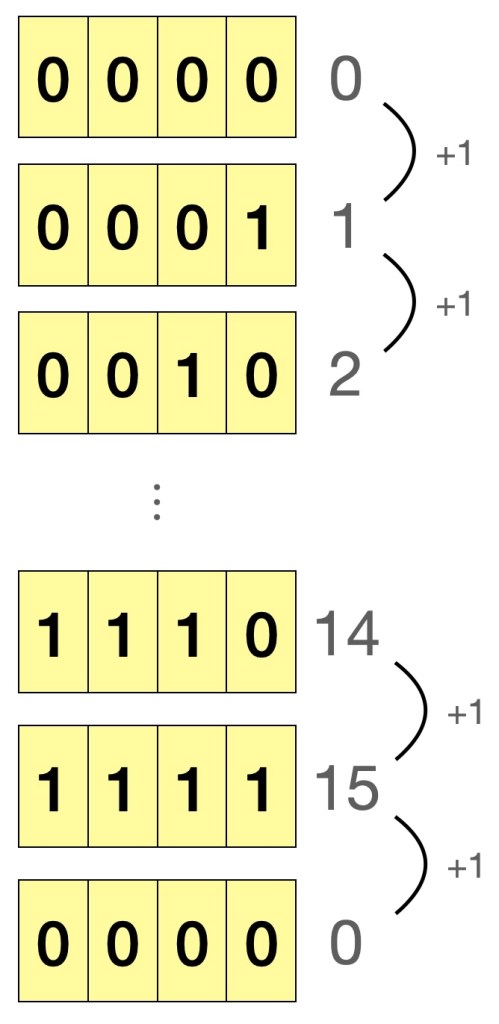
If we consider the case of a 4-bit binary, and start counting from 0, the maximum number we can possibly represent is 15. Adding 1 to 15, would lead to 0 being represented, as shown in Figure 1. This is called integer overflow, just like how an old car’s analogue 4-digit odometer “resets” to zero after recording 9999 km. As for the problem of running the same code and getting different results on a Windows and Mac machine, a numpy integer array on Windows defaults to 32-bit integer, whereas it is 64-bit on Mac/Linux, and as expected, the 64-bit integer has more bits and can thus represent our expected value of 5000050000. So, how do we mitigate this problem when writing future code? Simply specify the type argument and force Python to use 64-bit integers when needed.

>>> hard_sum = np.sum(np.arange(1,100001), dtype=np.int64)
>>> print(type(hard_sum))
<class 'numpy.int64'>
>>> print(hard_sum)
5000050000

As to why we got the spurious value of 705082704 from using 32-bit integers, I will leave it to you to understand it from the second edition of my book, Python Puzzlers!

Figure 1: Illustration of overflow in a 4-bit unsigned integer

Example #2: An Important Pointer for Copying Things

Antonio: On to another simple example, numpy arrays! Consider the following two-dimensional array of temperatures in degree Celsius.

>>> t_degrees_original = np.array([[2,1,0,1], [-1,0,-1,-1], [-3,-5,-2,-3], [-5,-7,-6,-7]])

Antonio: Let’s say we only want the first three rows of data, and in this selection would like to set all values on the zeroth row to zero, while retaining the values in the original array. Any ideas how we could do that?

Cecilio: Hey! I’ve learnt this last term, we do array slicing.

>>> t_degrees_slice = t_degrees_original[0:3,:]
>>> t_degrees_slice[0,:] = 0

Antonio: I did say to retain the values in the original array…

>>> print(t_degrees_original)
[[ 0  0  0  0]
[-1  0 -1 -1]
[-3 -5 -2 -3]
[-5 -7 -6 -7]]

Cecilio: Oh oops.

Berenice: Let me suggest a better solution.

>>> t_degrees_original = np.array([[2,1,0,1], [-1,0,-1,-1], [-3,-5,-2,-3], [-5,-7,-6,-7]])
>>> t_degrees_slice = t_degrees_original[[0,1,2],:]
>>> t_degrees_slice[0,:] = 0
>>> print(t_degrees_original)
[[ 2  1  0  1]
[-1  0 -1 -1]
[-3 -5 -2 -3]
[-5 -7 -6 -7]]

Antonio: Well done!

Cecilio: What? I thought the array indices 0:3 and 0,1,2 would give you the same slice of the numpy array.

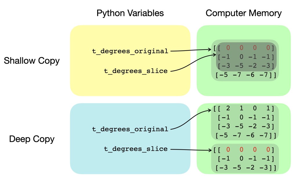
Antonio: Let’s clarify this. The former method of using 0:3 is standard indexing and only copies the information on where the original array was stored (i.e. “view” of the original array, or “shallow copy”), while the latter 0,1,2 is fancy indexing and actually makes a new separate array with the corresponding values from the original array (i.e. “deep copy”). This is illustrated in Figure 2 showing variables and their respective pointers for both shallow and deep copying. As you now understand, numpy, is really not as easy as pie…

Figure 2: Simplified diagram showing differences in variable pointers and computer memory for shallow and deep copying

Cecilio: That was… deep.

Berenice: Is there a better way to deep copy numpy arrays rather than having to type in each index like I did e.g. [0,1,2]?

Antonio: There is definitely a better way! If we replace the first line of your code with the line below, you should be able to do a deep copy of the original array. Editing the copied array will not affect the original array.

>>> t_degrees_slice = np.copy(t_degrees_original[0:2,:])

I would suggest this method of np.copy to be your one– and preferably only one –obvious way to do a deep copy of a numpy array, since it’s the most intuitive and human-readable! But remember, deep copy only if you have to, since deep copying a whole array of values takes computation time and space! It’s now time for a 5-minute break.

Cecilio: More like time for me to eat some humble (num)py.


Antonio: Hope you all had a nice break. We now start with a fun pop quiz!

Consider the following Python code:

short_a = "galileo galilei"
short_b = "galileo galilei"
long_a = "galileo galilei " + "linceo"
long_b = "galileo galilei " + "linceo"
 
print(short_a == short_b)
print(short_a is short_b)
print(long_a == long_b)
print(long_a is long_b)

Which the correct sequence of booleans that will be printed out?
1. True, True, True, True
2. True, False, True, False
3. True, True, True, False

Antonio: In fact, they are all correct answers. It depends on whether you are running Python 3.6.0, Python 3.8.5 and whether you ran the code in a script or in the console! Although there is much more to learn about “string interning”, the quick lesson here is to always compare the value of strings using double equal signs (==) instead of using is.

Example #3: Array manipulation – A Sleight of Hand?

Antonio: Let’s say you are asked to calculate the centered difference of some quantity (e.g. temperature) in one dimension \frac{\partial T}{\partial x} with gird points uniformly separated by \Delta x of 1 metre. What is some code that we could use to do this?

Berenice: I remember this from one of the modelling courses. We could use a for loop to calculate most elements of \frac{\partial T}{\partial x} \approx \frac{T_{i+1} - T_{i-1}}{2\Delta x} then deal with the boundary conditions. The code may look something like this:

delta_x = 1.0
temp_x = np.random.rand(1000)
dtemp_dx = np.empty_like(temp_x)
for i in range(1, len(temp_x)-1):
    dtemp_dx[i] = (temp_x[i+1] - temp_x[i-1]) / (2*delta_x)

# Boundary conditions
dtemp_dx[0] = dtemp_dx[1]
dtemp_dx[-1] = dtemp_dx[-2]

Antonio: Right! How about we replace your for loop with this line?

dtemp_dx[1:-1] = (temp_x[2:] - temp_x[0:-2]) / (2*delta_x)

Cecilio: Don’t they just do the same thing?

Antonio: Yes, but would you like to have a guess which one might be the “better” way?

Berenice: In last term’s modules, we were only taught the method I proposed just now. I would have thought both methods were equally good.

Antonio: On my computer, running your version of code 10000 times takes 6.5 seconds, whereas running my version 10000 times takes 0.1 seconds.

Cecilio: That was… fast!

Berenice: Only if my research code could run with that kind of speed…

Antonio: And that is what we call vectorisation, the act of taking advantage of numpy’s optimised loop implementation instead of having to write your own!

Cecilio: I wish we knew all this earlier on! Can you tell us more?

Antonio: Glad your interest is piqued! Anyway, that’s all the time we have today. For this week’s homework, please familiarise yourself so you know how to

import this

module or import that package. In the next few lectures, we will look at more bewildering behaviours such as the “Mesmerising Mutation”, the “Out of Scope” problem that is in the scope of this module. As we move to more advanced aspects of this course, we may even come across the “Dynamic Duck” and “Mischievous Monkey”. Bye for now!

Do local or non-local sources of moisture contribute to extratropical cyclone precipitation?

Sophie Cuckow – s.cuckow@pgr.reading.ac.uk 

Introduction 

Transient corridors of strong horizontal water vapour transport, called atmospheric rivers have been linked to flooding over Europe and the US (Ralph et al. 2004, Lavers et al. (2011), Corringham et al. (2019)). Despite this, the relationship between atmospheric rivers and the precipitation associated with extratropical cyclones is debated in literature. It is often thought that atmospheric rivers feed moisture from the tropics directly to the cyclone where it rises to form precipitation (Ralph et al. (2004), Neiman et al. 2008)). However, this would only be the case if the cyclone propagation velocity is slower than the vapour transport, which might not occur when a cyclone is developing. Thus, arises the question, where does the moisture that produces the precipitation come from? The tropics via atmospheric rivers or from another location via a different mechanism? Understanding which moisture sources contribute to extratropical precipitation would help to improve forecasts and mitigate the risk of damage from flooding events. 

Case Study – Storm Bronagh

To investigate different moisture sources, we examined our case study, storm Bronagh, in an Earth relative and system relative framework. Storm Bronagh tracked over the UK during the 20th and 21st September 2018 and bought over 50mm of rainfall in 24 hours to parts of Wales and England. This led to flooding in mid-Wales and Sheffield (Met Office). The Earth relative framework allows us to investigate whether the storm has an associated atmospheric river. The cyclone relative framework allows us to investigate airstreams called conveyor belts, which are moving faster than the cyclone propagation velocity. To transition to this framework, we calculated the propagation velocity of the cyclone using the tracks produced by the tracking algorithm of Hodges (1995). We then subtracted the velocity from the Earth relative wind fields (European Centre for Mid-range Weather Forecasts Re-analysis 5, ERA5) to give the cyclone relative wind fields (Carlson (1980)).

Figure 1: The 300K isentropic surface on 21st September 2018 00:00UTC with the center of the storm (red cross, the isobars (white contours) and masked areas depicting where the surface intersects the ground are shown. Left hand side: The Earth relative moisture flux (streamlines) and the magnitude of the Earth relative moisture flux (filled contours). Right hand side: The system relative moisture flux (streamlines) and the magnitude of the system relative moisture flux (filled contours).

The Earth relative and system relative moisture flux (q\overline{U}) on the 300K isentropic surface for storm Bronagh on 21st September 2018 00:00UTC are shown in figure 1. In the Earth relative framework on the left-hand side of this figure, there is an atmospheric river approaching from the West as shown by the blue arrow. This suggests that the source of moisture for this storm was the tropics. However, the cyclone relative framework suggests there is in fact a local source of moisture. This can be seen on the right-hand side of figure 1 where three important airstreams can be seen: the warm conveyor belt (red), the dry intrusion (blue) and the feeder airstream (green). 

The warm conveyor belt is responsible for most of the cloud and precipitation associated with the cyclone. As shown in figure 1, it ascends ahead of the cold front and turns cyclonically to form the upper part of the cloud head, resulting in the iconic comma shape. Also shown in figure 1 is the dry intrusion which descends from behind the cold front into the centre of the cyclone. As this is a dry airflow, it creates a cloud free area between the cold frontal cloud band and the cloud head.

The feeder airstream is a low-level moist airflow that supplies moisture to the base of the warm conveyor belt where it rises. This can be seen in figure 1 where an airstream approaches from the East and splits into two branches, one of which joins the base of the warm conveyor belt. Therefore, in the cyclone relative framework, the moisture originates in the environment ahead of the cyclone rather than the tropics. Furthermore, the other branch of the feeder airstream indicates that the atmospheric river is a result of the moisture being left behind by the cyclone as it propagates. This supports the findings of Dacre et al. (2019) where the feeder airstream was identified by examining 200 of the most intense winter storms over 20 years. 

Therefore, the question arises, which cyclones have a local moisture source? Is it just the intense cyclones or do weaker ones have one too? In order to answer these questions, a diagnostic that identifies the feeder airstream has been developed thus, determining whether there is a local or non-local source of moisture.  

Identification Diagnostic

As seen in figure 1, the feeder airstream is synonymous with a saddle point where it splits into two branches. Therefore, the basis of the feeder airstream’s identification is a saddle point in the system relative moisture flux on an isentropic surface. Utilising theory from non-linear dynamics, the flow around a minimum or fixed point can be identified. Taking the Jacobian matrix of a field and Taylor expanding around a fixed-point, results in a quadratic equation which includes the determinant and trace of the field. By solving this equation and plotting the trace and determinant of the field gives insight into how each flow can be characterised (Drazin (1992)). This is shown in figure 2 where positive values of determinant of the field characterises spiral sources and sinks, whereas the negative values of determinant of the field characterises a saddle point. The determinant of a field is calculated using an equation which calculates the gradient of the field around the fixed point. Therefore, the feeder airstream can be identified by a minimum in the system relative moisture flux field coinciding with an area of negative determinant of the system relative moisture flux field.  Applying this theory to the case study, the feeder air stream for storm Bronagh was successfully identified for 21st September 2018 at 00:00UTC.

Figure 2: Poincare diagram based on Hundley (2012). This diagram describes how the flow around a fixed point in field A can be characterised using the determinant and trace of the field.

Conclusion and Future Work

In conclusion, the moisture source for the precipitation associated with storm Bronagh on 21st September 2018 00:00UTC is ahead of the environment rather than the tropics. This moisture is transported to the base of the warm conveyor belt via one branch of a low-level moist airflow called the feeder airstream. The second branch forms the atmospheric river which is a result of moisture being left behind by the cyclone as it propagates. To determine the source of moisture associated with Bronagh in an objective manner, an identification diagnostic has successfully been developed using the determinant of the system relative moisture flux field on an isentropic surface.

In order to develop the identification diagnostic further, it will be adapted to identify the feeder airstream in different stages of storm Bronagh’s evolution. This would verify whether the diagnostic is successfully identifying the feeder airstream and will give us more insight into the relative sources of moisture as the storm evolves. Future work would involve applying the identification diagnostic to a climatology of cyclones with varying intensity, genesis location and durations so that we can ascertain the dependance of the moisture sources on these parameters.

References

Carlson, T. N. (1980), ‘Airflow Through Midlatitude Cyclones and the Comma Cloud Pattern’, Monthly Weather Review

Corringham, T. W., Martin Ralph, F., Gershunov, A., Cayan, D. R., & Talbot, C. A. (2019).

Atmospheric rivers drive flood damages in the western United States. Science Advances, 5(12). https://doi.org/10.1126/sciadv.aax4631

Dacre, H. F., Martınez-Alvarado, O. & Mbengue, C. O. (2019), ‘Linking Atmospheric Rivers and Warm Conveyor Belt Airflows’, Journal of Hydrometeorology

Douglas R. Hundley. “Poincare Diagram: Classification of phase portraits in (detA, TrA) – plane.” Whitman College, WA, Fall 2012. http://people.whitman.edu/~hundledr/ courses/M244F12/M244/PoincareDiagram.jpg

Drazin, P. G. (1992), Nonlinear Systems, Cambridge Texts in Applied Mathematics, Cambridge University Press

Hodges, K. I. (1995), ‘Feature Tracking on the Unit Sphere’, Monthly Weather Review 123(12)

Lavers, D. A., Villarini, G., Allan, R. P., Wood, E. F. & Wade, A. J. (2012), ‘The detection of atmospheric rivers in atmospheric reanalyses and their links to British winter floods and the large-scale climatic circulation’, Journal of Geophysical Research Atmospheres

Neiman, P. J., Ralph, F. M., Wick, G. A., Lundquist, J. D. & Dettinger, M. D. (2008), ‘Meteorological Characteristics and Overland Precipitation Impacts of Atmospheric Rivers Affecting the West Coast of North America Based on Eight Years of SSM/I Satellite Observations’, Journal of Hydrometeorology

Met Office – “Strong Winds and Heavy Rain from Storms Ali and Bronagh” https://www.metoffice.gov.uk/binaries/content/assets/metofficegovuk/pdf/weather/learn-about/uk-past-events/interesting/2018/strong-winds-and-heavy-rain-from-storms-ali-and-bronagh—met-office.pdf

Ralph, F. M., Neiman, P. J. & Wick, G. A. (2004), ‘Satellite and CALJET Aircraft Observations of Atmospheric Rivers over the Eastern North Pacific Ocean during the Winter of 1997/98’, Monthly Weather Review

High-resolution Dispersion Modelling in the Convective Boundary Layer

Lewis Blunn – l.p.blunn@pgr.reading.ac.uk

In this blog I will first give an overview of the representation of pollution dispersion in regional air quality models (AQMs). I will then show that when pollution dispersion simulations in the convective boundary layer (CBL) are run at \mathcal{O}(100 m) horizontal grid length, interesting dynamics emerge that have significant implications for urban air quality. 

Modelling Pollution Dispersion 

AQMs are a critical tool in the management of urban air pollution. They can be used for short-term air quality (AQ) forecasts, and in making planning and policy decisions aimed at abating poor AQ. For accurate AQ prediction the representation of vertical dispersion in the urban boundary layer (BL) is key because it controls the transport of pollution away from the surface. 

Current regional scale Eulerian AQMs are typically run at \mathcal{O}(10 km) horizontal grid length (Baklanov et al., 2014). The UK Met Office’s regional AQM runs at 12 km horizontal grid length (Savage et al., 2013) and its forecasts are used by the Department for Environment Food and Rural Affairs (DEFRA) to provide a daily AQ index across the UK (today’s DEFRA forecast). At such horizontal grid lengths turbulence in the BL is sub-grid.  

Regional AQMs and numerical weather prediction (NWP) models typically parametrise vertical dispersion of pollution in the BL using K-theory and sometimes with an additional non-local component so that 

F=-K_z \frac{\partial{c}}{\partial{z}} +N_l 

where F is the flux of pollution, c is the pollution concentration, K(z) is a turbulent diffusion coefficient and z is the height from the ground. N_l is the non-local term which represents vertical turbulent mixing under convective conditions due to buoyant thermals (Lock et al., 2000; Siebesma et al., 2007).  

K-theory (i.e. N_l=0) parametrisation of turbulent dispersion is consistent mathematically with Fickian diffusion of particles in a fluid. If K(z) is taken as constant and particles are released far from any boundaries (i.e. away from the ground and BL capping inversion), the mean square displacement of pollution particles increases proportional to the time since release. Interestingly, Albert Einstein showed that Brownian motion obeys Fickian diffusion. Therefore, pollution particles in K-theory dispersion parametrisations are analogous to memoryless particles undergoing a random walk. 

It is known however that at short timescales after emission pollution particles do have memory. In the CBL, far from undergoing a random trajectory, pollution particles released in the surface layer initially tend to follow the BL scale overturning eddies. They horizontally converge before being transported to near the top of the BL in updrafts. This results in large pollution concentrations in the upper BL and low concentrations near the surface at times on the order of one CBL eddy turnover period since release (Deardorff, 1972; Willis and Deardorff, 1981). This has important implications for ground level pollution concentration predicted by AQMs (as demonstrated later). 

Pollution dispersion can be thought of as having two different behaviours at short and long times after release. In the short time “ballistic” limit, particles travel at the velocity within the eddy they were released into, and the mean square displacement of pollution particles increases proportional to the time squared. At times greater than the order of one eddy turnover (i.e. the long time “diffusive” limit) dispersion is less efficient, since particles have lost memory of the initial conditions that they were released into and undergo random motion.  For further discussion of atmospheric diffusion and memory effects see this blog (link).

In regional AQMs, the non-local parametrisation component does not capture the ballistic dynamics and K-theory treats dispersion as being “diffusive”. This means that at CBL eddy turnover timescales it is possible that current AQMs have large errors in their predicted concentrations. However, with increases in computing power it is now possible to run NWP for research purposes at \mathcal{O}(100 m) horizontal grid length (e.g. Lean et al., 2019) and routinely at 300 m grid length (Boutle et. al., 2016). At such grid lengths the dominant CBL eddies transporting pollution (and therefore the “ballistic” diffusion) becomes resolved and does not require parametrisation. 

To investigate the differences in pollution dispersion and potential benefits that can be expected when AQMs move to \mathcal{O}(100 m) horizontal grid length, I have run NWP at horizontal grid lengths ranging from 1.5 km (where CBL dispersion is parametrised) to 55 m (where CBL dispersion is mostly resolved). The simulations are unique in that they are the first at such grid lengths to include a passive ground source of scalar representing pollution, in a domain large enough to let dispersion develop for tens of kilometres downstream. 

High-Resolution Modelling Results 

A schematic of the Met Office Unified Model nesting suite used to conduct the simulations is shown in Fig. 1. The UKV (1.5 km horizontal grid length) model was run first and used to pass boundary conditions to the 500 m model, and so on down to the 100 m and 55 m models. A puff release, homogeneous, ground source of passive scalar was included in all models and its horizontal extent covered the area of the 55 m (and 100 m) model domains. The puff releases were conducted on the hour, and at the end of each hour scalar concentration was set to zero. The case study date was 05/05/2016 with clear sky convective conditions.  

Figure 1: Schematic of the Unified Model nesting suite.

Puff Releases  

Figure 2 shows vertical cross-sections of puff released tracer in the UKV and 55 m models at 13-05, 13-20 and 13-55 UTC. At 13-05 UTC the UKV model scalar concentration is very large near the surface and approximately horizontally homogeneous. The 55 m model concentrations however are either much closer to the surface or elevated to great heights within the BL in narrow vertical regions. The heterogeneity in the 55 m model field is due to CBL turbulence being largely resolved in the 55 m model. Shortly after release, most scalar is transported predominantly horizontally rather than vertically, but at localised updrafts scalar is transported rapidly upwards. 

Figure 2: Vertical cross-sections of puff released passive scalar. (a), (b) and (c) are from the UKV model at 13-05, 13-20 and 13-55 UTC respectively. (d), (e) and (f) are from the 55 m model at 13-05, 13-20 and 13-55 UTC respectively. The x-axis is from south (left) to north (right) which is approximately the direction of mean flow. The green line is the BL scheme diagnosed BL height.

By 13-20 UTC it can be seen that the 55 m model has more scalar in the upper BL than lower BL and lowest concentrations within the BL are near the surface. However, the scalar in the UKV model disperses more slowly from the surface. Concentrations remain unrealistically larger in the lower BL than upper BL and are very horizontally homogeneous, since the “ballistic” type dispersion is not represented. By 13-55 UTC the concentration is approximately uniform (or “well mixed”) within the BL in both models and dispersion is tending to the “diffusive” limit. 

It has thus been demonstrated that unless “ballistic” type dispersion is represented in AQMs the evolution of the scalar concentration field will exhibit unphysical behaviour. In reality, pollution emissions are usually continuously released rather than puff released. One could therefore ask the question – when pollution is emitted continuously are the detailed dispersion dynamics important for urban air quality or does the dynamics of particles released at different times cancel out on average?  

Continuous Releases  

To address this question, I included a continuous release, homogeneous, ground source of passive scalar. It was centred on London and had dimensions 50 km by 50 km which is approximately the size of Greater London. Figure 3a shows a schematic of the source.  

The ratio of the 55 m model and UKV model zonally averaged surface concentration with downstream distance from the southern edge of the source is plotted in Fig. 3b. The largest difference in surface concentration between the UKV and 55m model occurs 9 km downstream, with a ratio of 0.61. This is consistent with the distance calculated from the average horizontal velocity in the BL (\approx7 ms-1) and the time at which there was most scalar in the upper BL compared to the lower BL in the puff release simulations (\approx 20 min). The scalar is lofted high into the BL soon after emission, causing reductions in surface concentrations downstream. Beyond 9 km downstream distance a larger proportion of the scalar in the BL has had time to become well-mixed and the ratio increases.  

Figure 3: (a) Schematic of the continuous release source of passive scalar. (b) Ratio of the 55 m model and UKV model zonally averaged surface concentration with downstream distance from the southern edge of the source at 13-00 UTC.

Summary  

By comparing the UKV and 55 m model surface concentrations, it has been demonstrated that “ballistic” type dispersion can influence city scale surface concentrations by up to approximately 40%. It is likely that by either moving to \mathcal{O}(100 m) horizontal grid length or developing turbulence parametrisations that represent “ballistic” type dispersion, that substantial improvements in the predictive capability of AQMs can be made. 

References 

  1. Baklanov, A. et al. (2014) Online coupled regional meteorology chemistry models in Europe: Current status and prospects https://doi.org/10.5194/acp-14-317-2014 
  1. Boutle, I. A. et al. (2016) The London Model: Forecasting fog at 333 m resolution https://doi.org/10.1002/qj.2656 
  1. Deardorff, J. (1972) Numerical Investigation of Neutral and Unstable Planetary Boundary Layers https://doi.org/10.1175/1520-0469(1972)029<0091:NIONAU>2.0.CO;2 
  1. DEFRA – air quality forecast https://uk-air.defra.gov.uk/index.php/air-pollution/research/latest/air-pollution/daqi 
  1. Lean, H. W. et al. (2019) The impact of spin-up and resolution on the representation of a clear convective boundary layer over London in order 100 m grid-length versions of the Met Office Unified Model https://doi.org/10.1002/qj.3519 
  1. Lock, A. P. et al. A New Boundary Layer Mixing Scheme. Part I: Scheme Description and Single-Column Model Tests https://doi.org/10.1175/1520-0493(2000)128<3187:ANBLMS>2.0.CO;2 
  1. Savage, N. H. et al. (2013) Air quality modelling using the Met Office Unified Model (AQUM OS24-26): model description and initial evaluation https://doi.org/10.5194/gmd-6-353-2013 
  1. Siebesma, A. P. et al. (2007) A Combined Eddy-Diffusivity Mass-Flux Approach for the Convective Boundary Layer https://doi.org/10.1175/JAS3888.1 
  1. Willis. G and J. Deardorff (1981) A laboratory study of dispersion from a source in the middle of the convectively mixed layer https://doi.org/10.1016/0004-6981(81)90001-9